Brand Design
Having the opportunity to be a part of a brand’s visual story is something that can be empowering as a designer. Being able to leave your mark on a voice that has the opportunity to reach so many people and be part of a company’s history and legacy. From logos to business cards, these things become markers for how people interact and remember brands for years to come.
I’ve been fortunate to have had the chance to work with some incredible teams at companies I love, I’m particularly proud of the work I was part of at Vpod Solutions and at Sprinklr, where I had the chance to push the boundaries of the visual identities of these companies, and take their brands to bold new places.
Rebranding Vpod
As the lead designer for the full rebranding of Vpod, a London based workplace tech company, I had the opportunity to use and further develop my skills in graphic design, motion graphics, video production, video editing and photography. The company's products and core values were the foundation for the design language, which aimed to communicate technology, minimalism, human-centricity and sustainability.
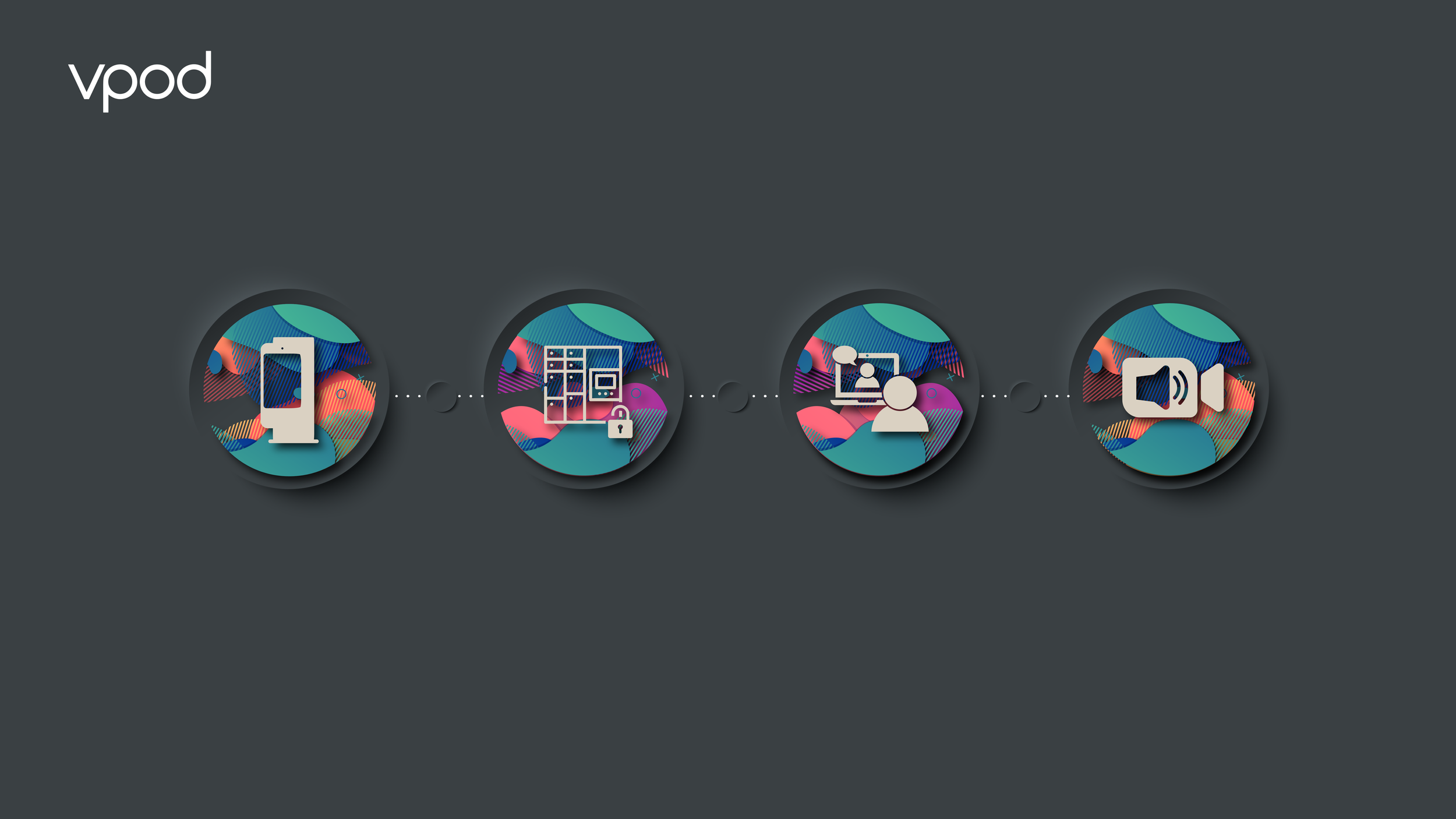
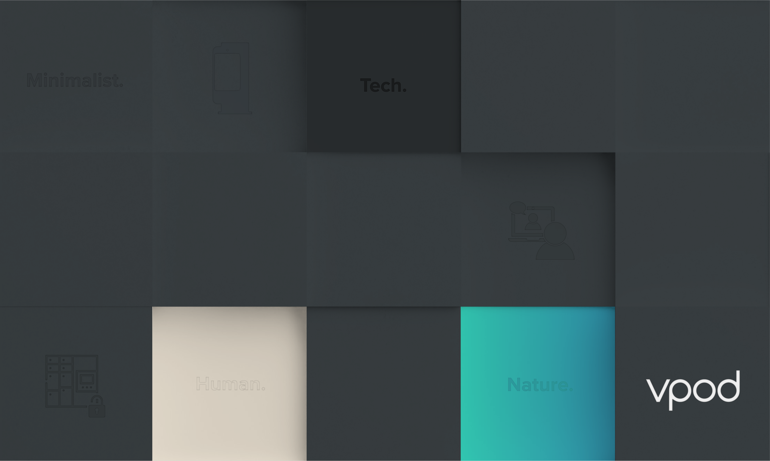
The design language was centered around four core color ideas: minimalism, human, nature, and tech. The minimalism aspect reflected the company's commitment to simplicity and ease of use in its products. The human aspect represented the company's focus on customer needs and experience, while the nature aspect reflected its commitment to environmental sustainability. Finally, the tech aspect represented the company's expertise and innovation in technology.
The graphic design and motion graphics incorporated these color ideas through simple and clean lines, organic shapes, and vibrant colors. The video production and video editing captured the company's brand essence and showcased its products in a dynamic and engaging way. The website redesign utilized modern design elements and intuitive navigation.
As the lead designer, I was grateful for the opportunity to work on such a unique brand and help bring its vision to life through design. The rebranding successfully communicated the company's values and offerings to its target audience, setting the foundation for continued growth and success. It was a collaborative approach that required working with Vpod’s in-house marketing and managing director, as well as developers. It was a project that pushed me as a creative and required experimentation, iteration and a desire to create something truly unique.
Vpod
Great design is all about communication and language. During the process of creating Vpod’s new visual identity, I was given a month to work alone creatively and experiment without the influence of anyone, Vpod’s Managing Director Sam Farrant encouraged me to come back with my own vision for the company. Having worked at Vpod for around six months prior, I thought about my knowledge of the company, its culture and its products and infused it with my own creativity. During that month, I experimented not only with different visuals but also words and phrases, one that stuck was ‘Simple & Human’ it embodied what I felt was the company’s core value. After presenting my designs to the company this phrase would go on to become the company’s official tagline and influence everything we did as a brand.

Simple & Human.
Brand Collateral
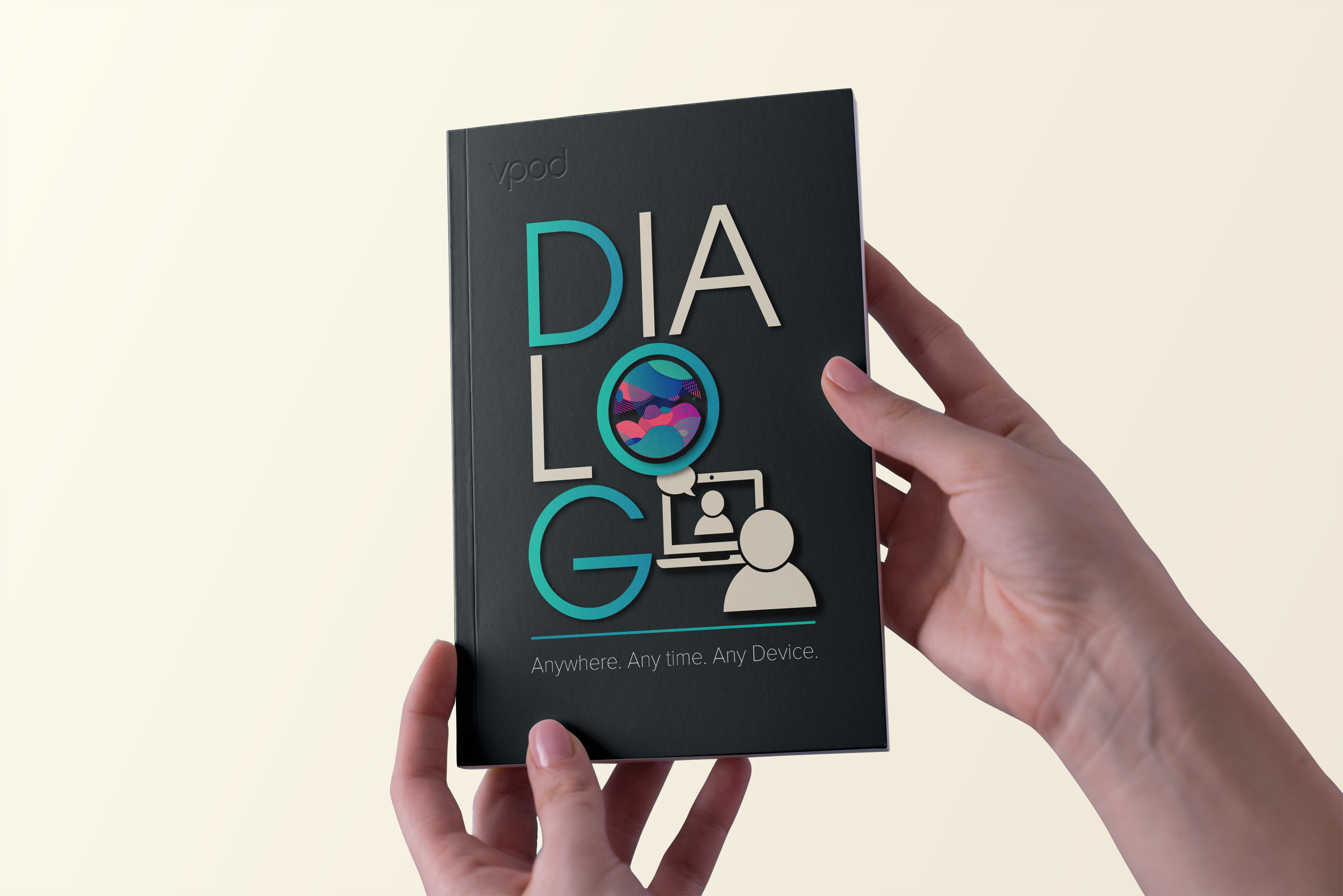
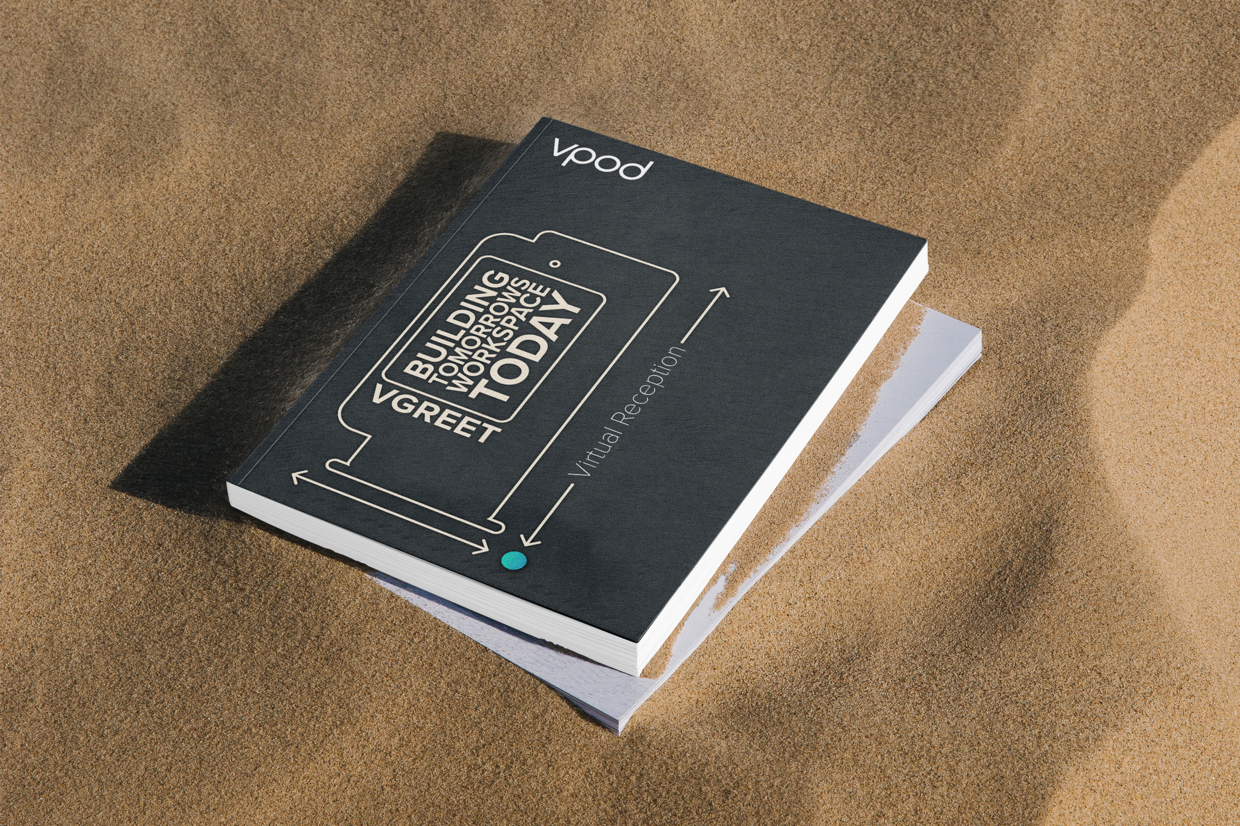
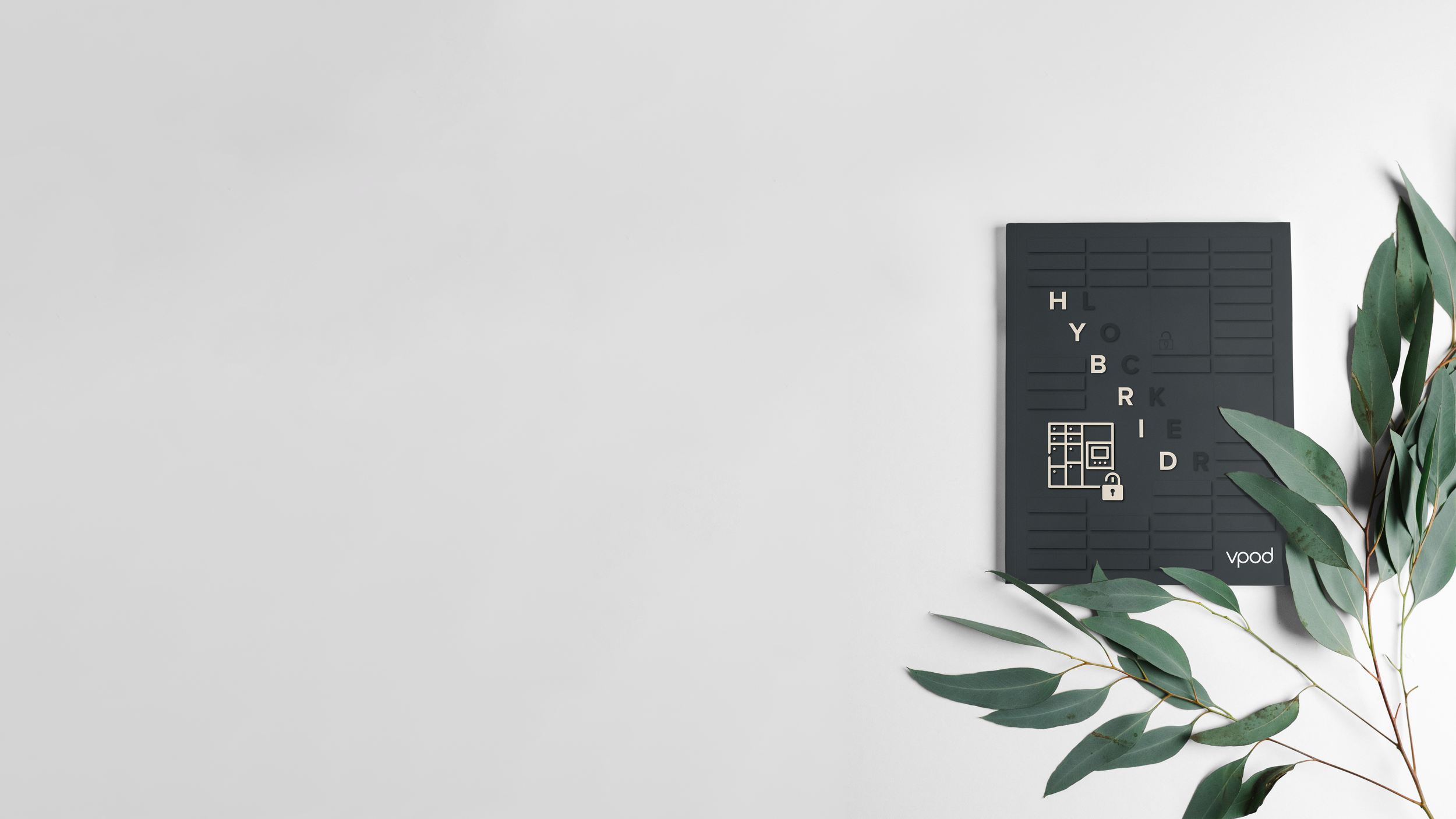
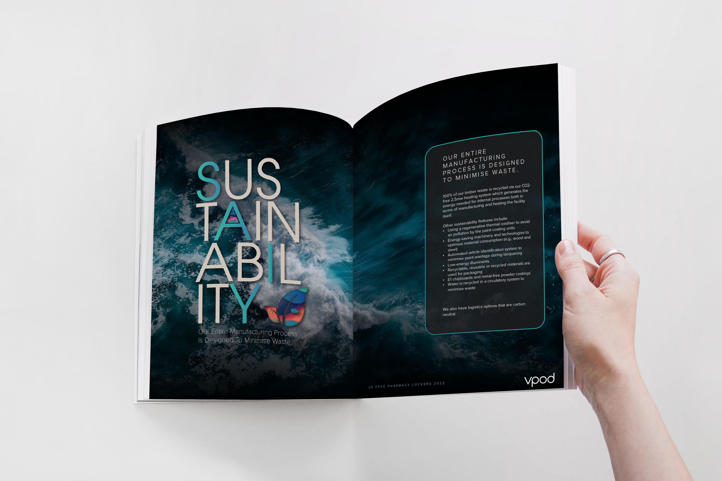
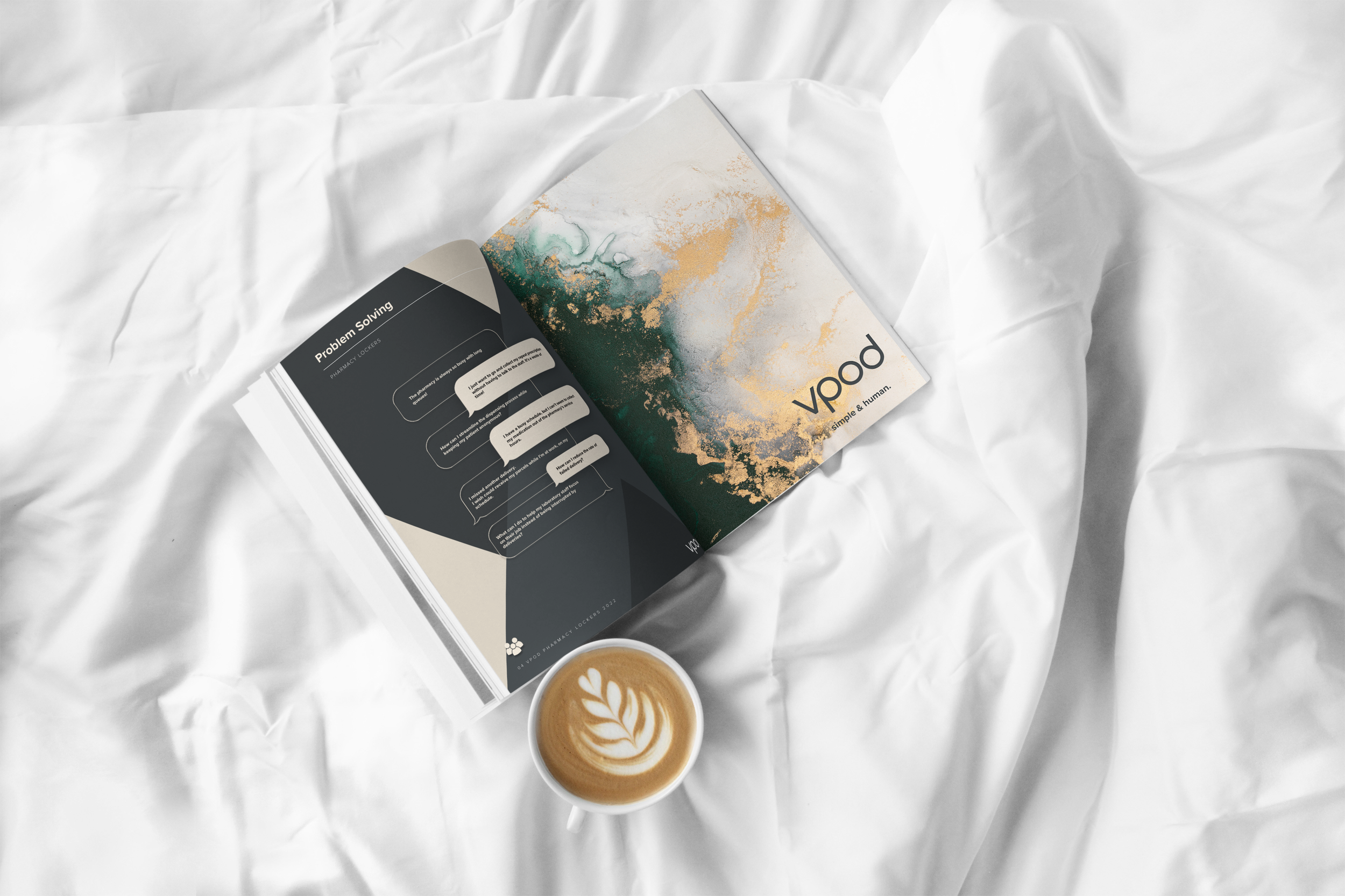
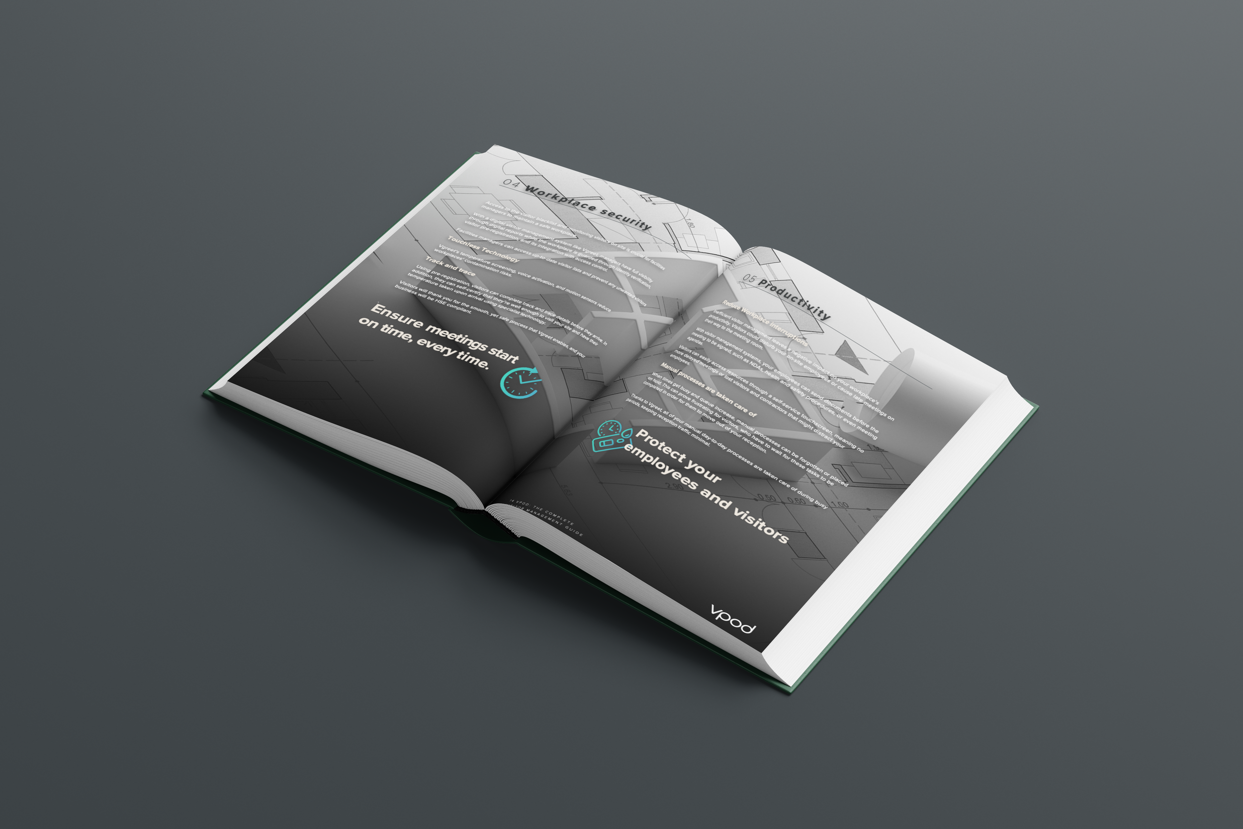
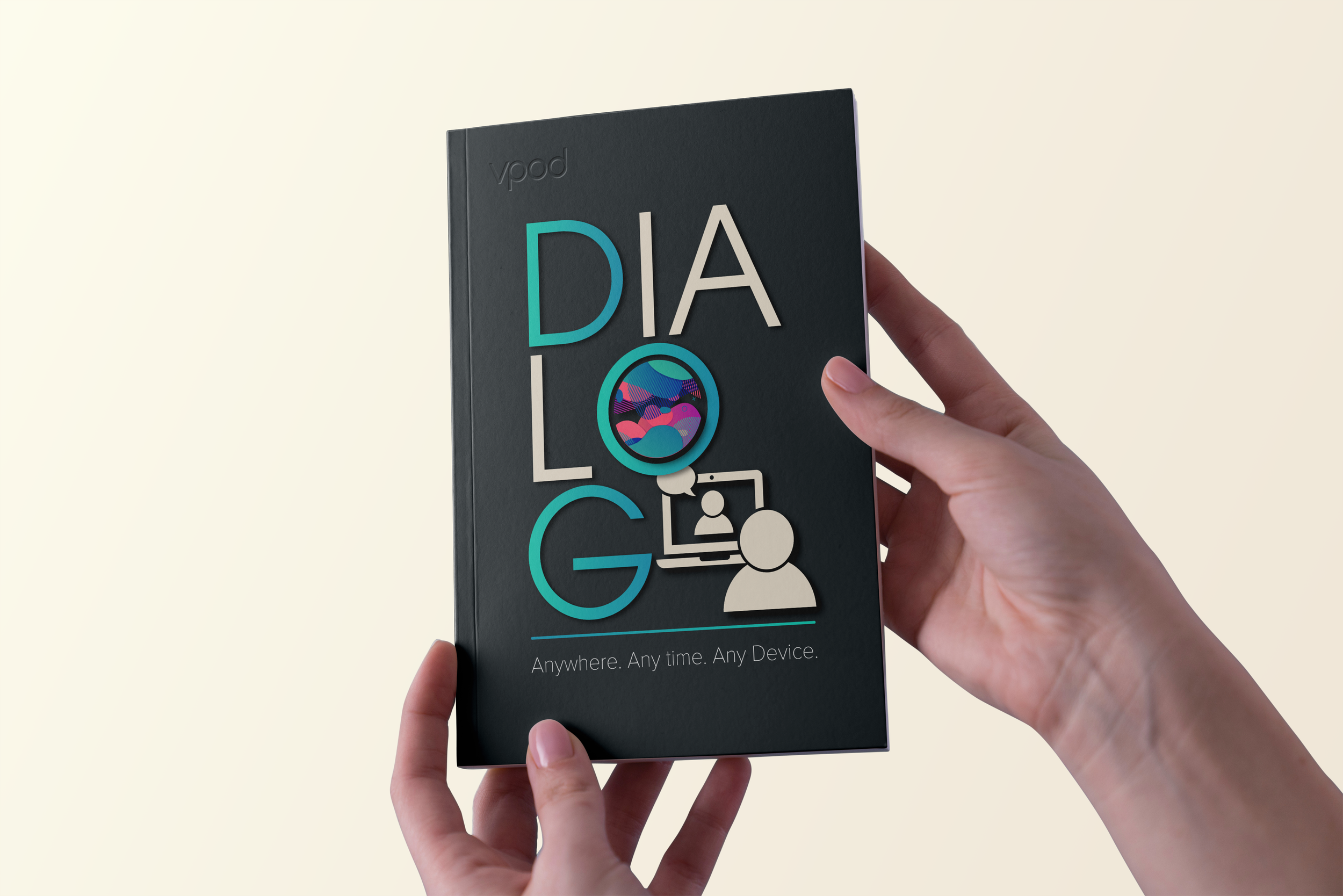
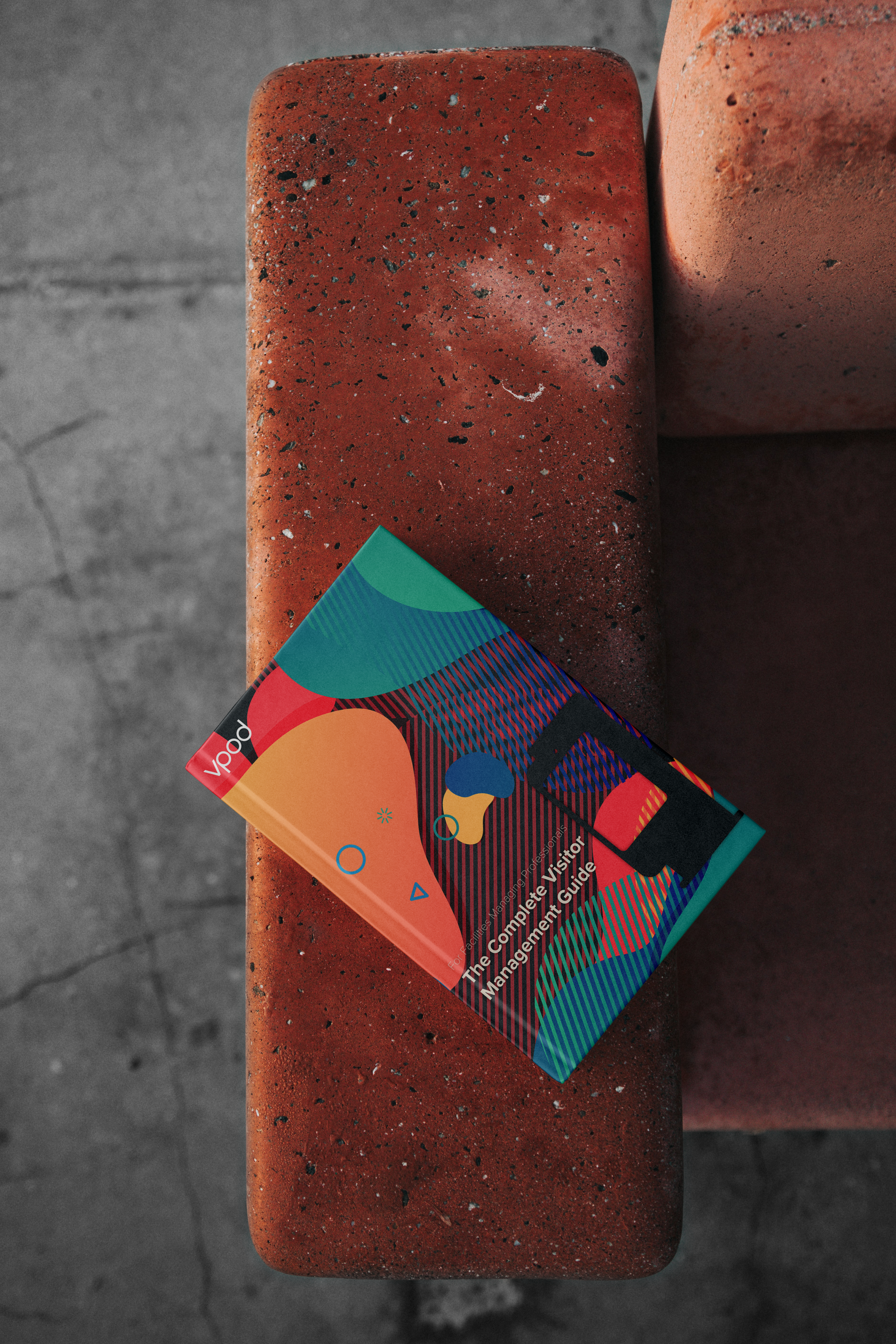
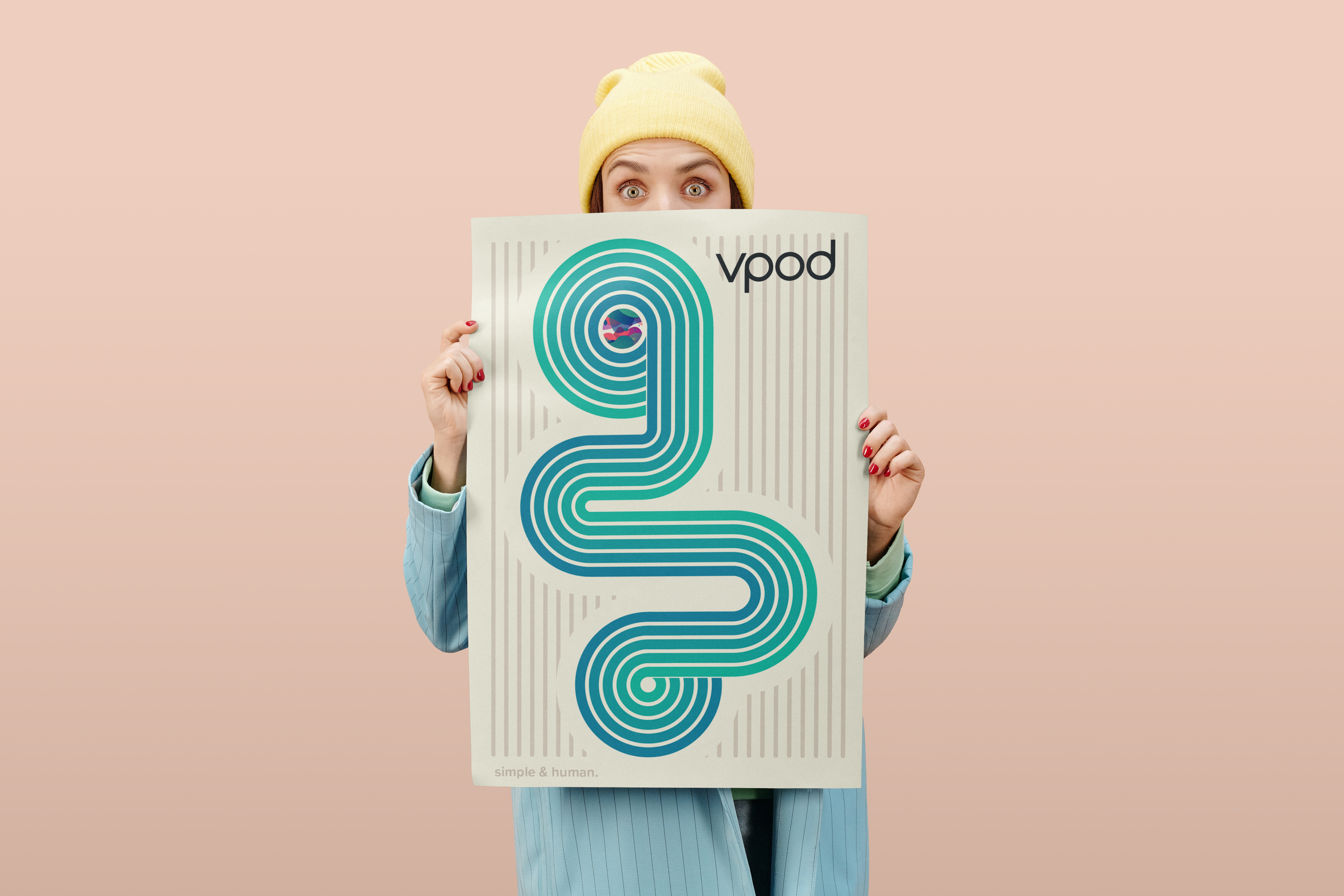
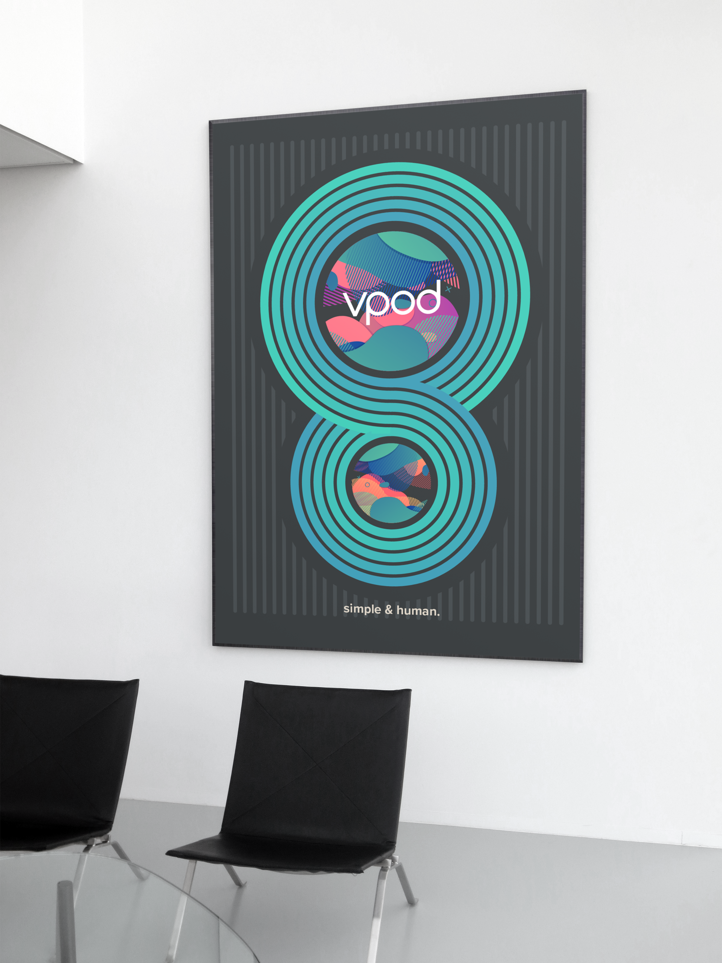
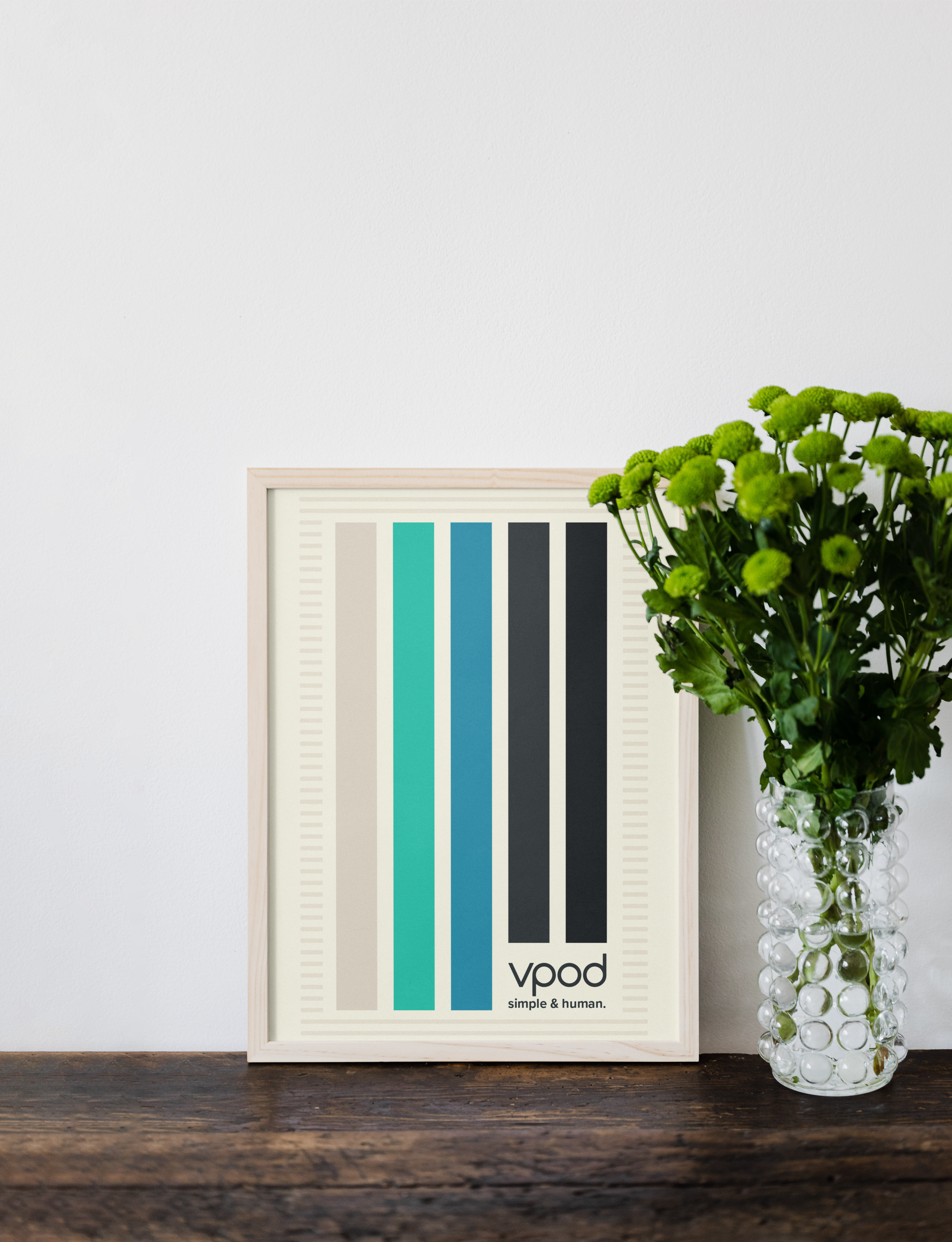
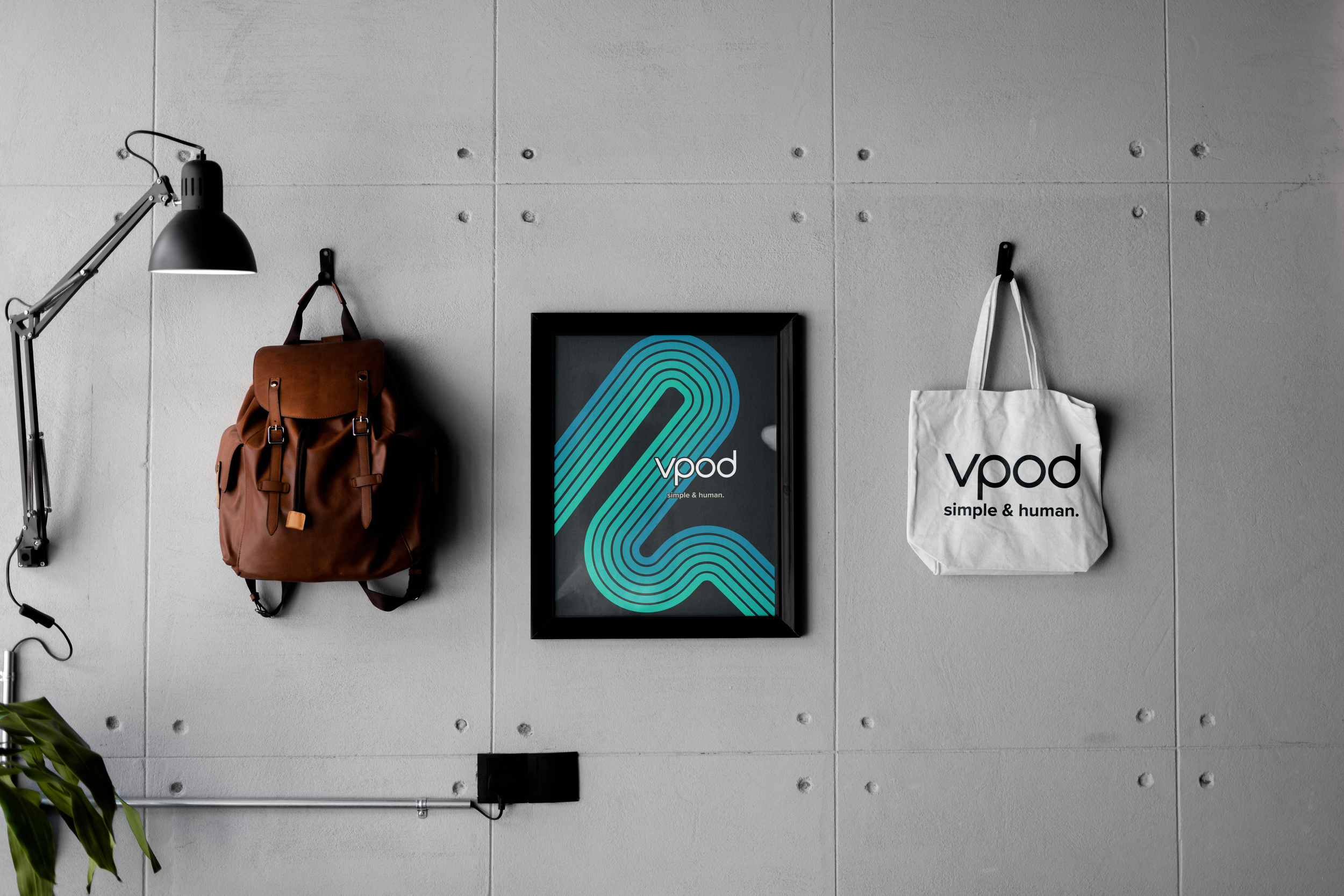
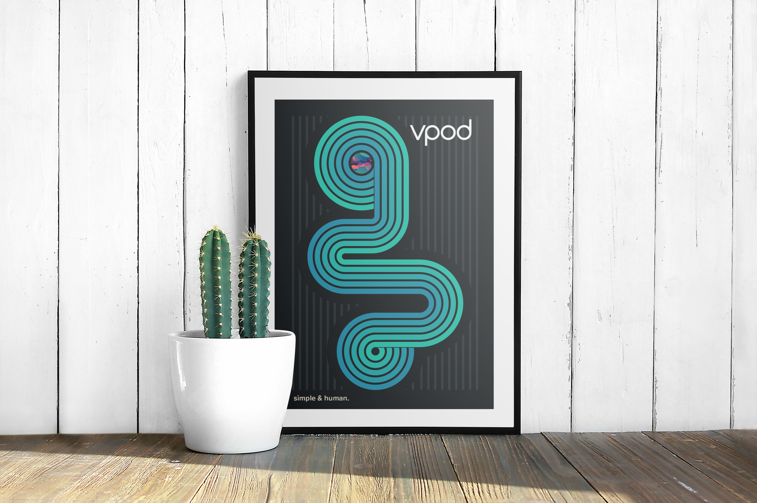
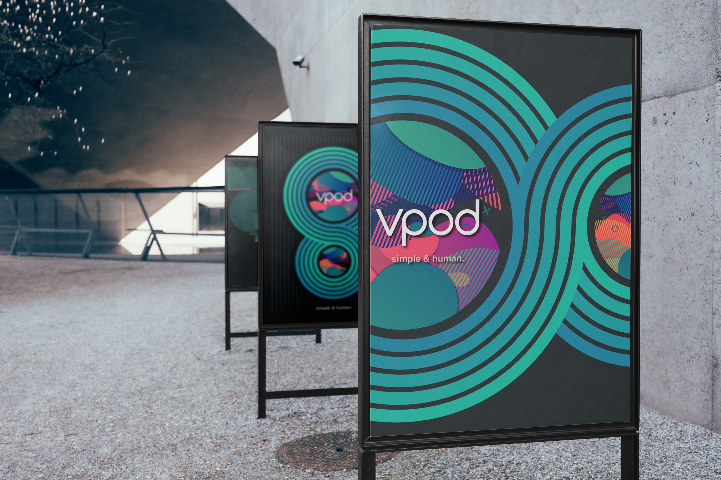
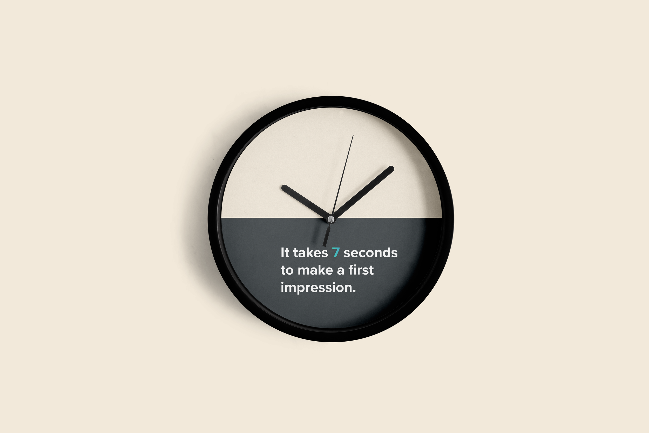
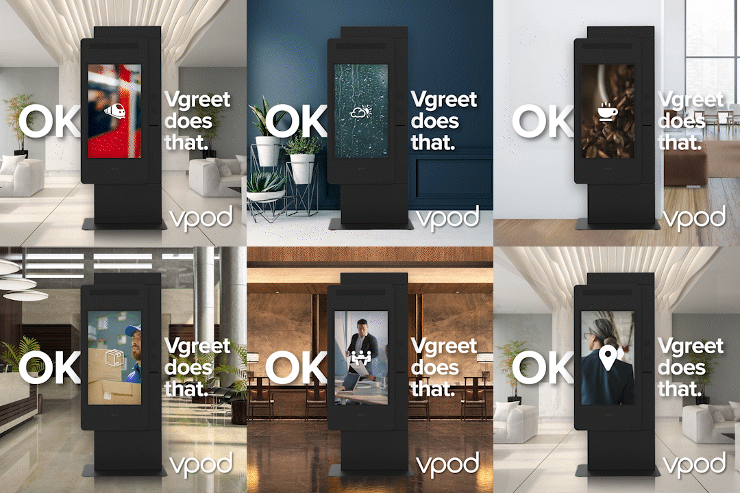
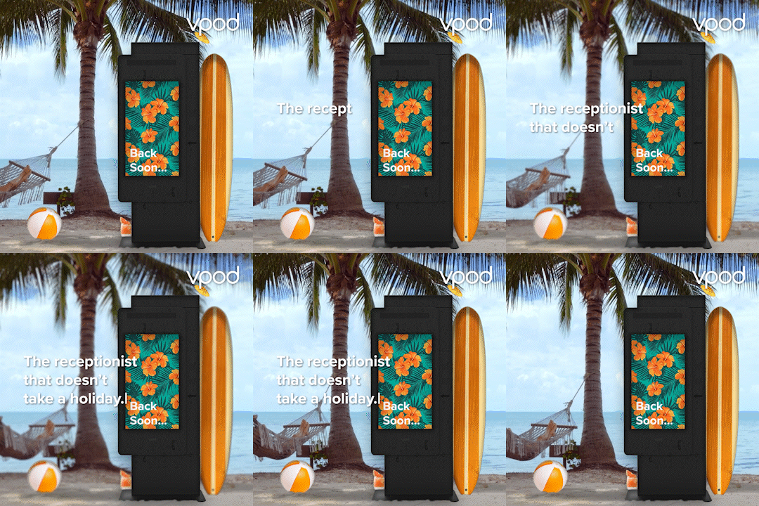
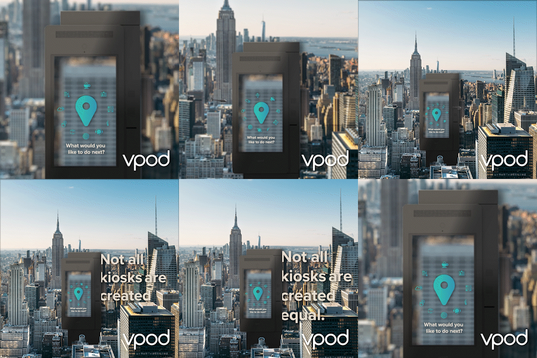
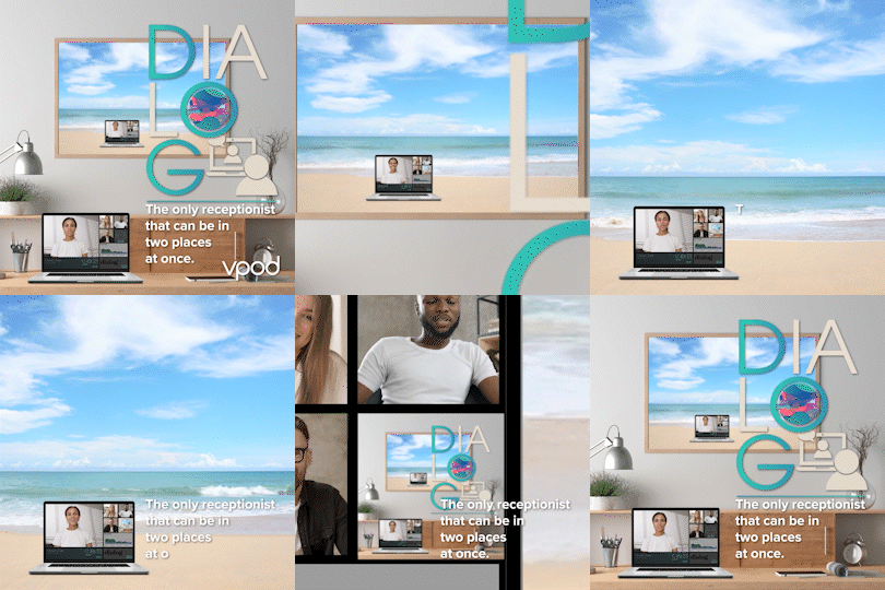
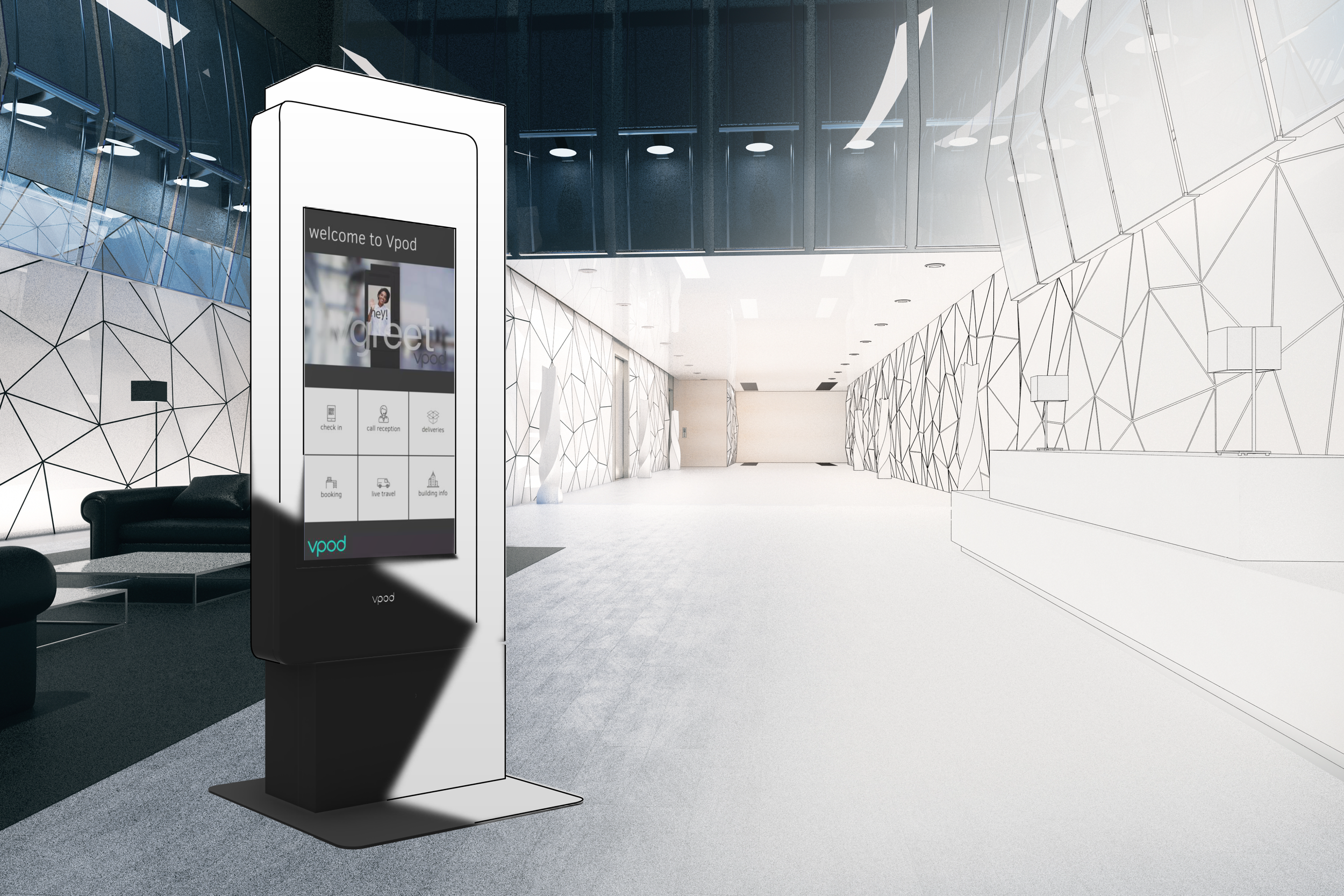
For a company with a history such as Vpod’s, which was established in 2008, this rebrand was incredibly important to everyone on the team. It was a massive undertaking, which involved establishing new fundamental guidelines for colours, fonts and documentation, as well as the design of a new website, brochures, business cards, marketing and sales collateral. With such a large undertaking we decided to go big with the launch of the new brand, I created posters and prints for the launch as well as branding for merchandise.

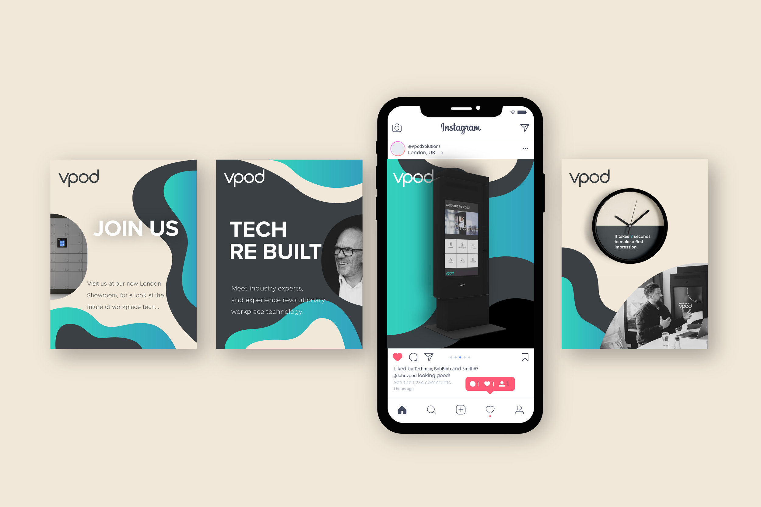
SOCIAL MEDIA
SOCIAL MEDIA
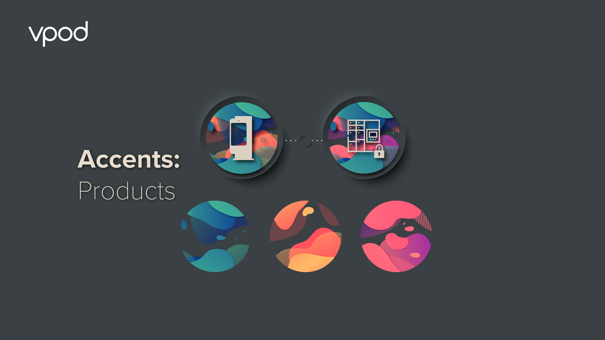
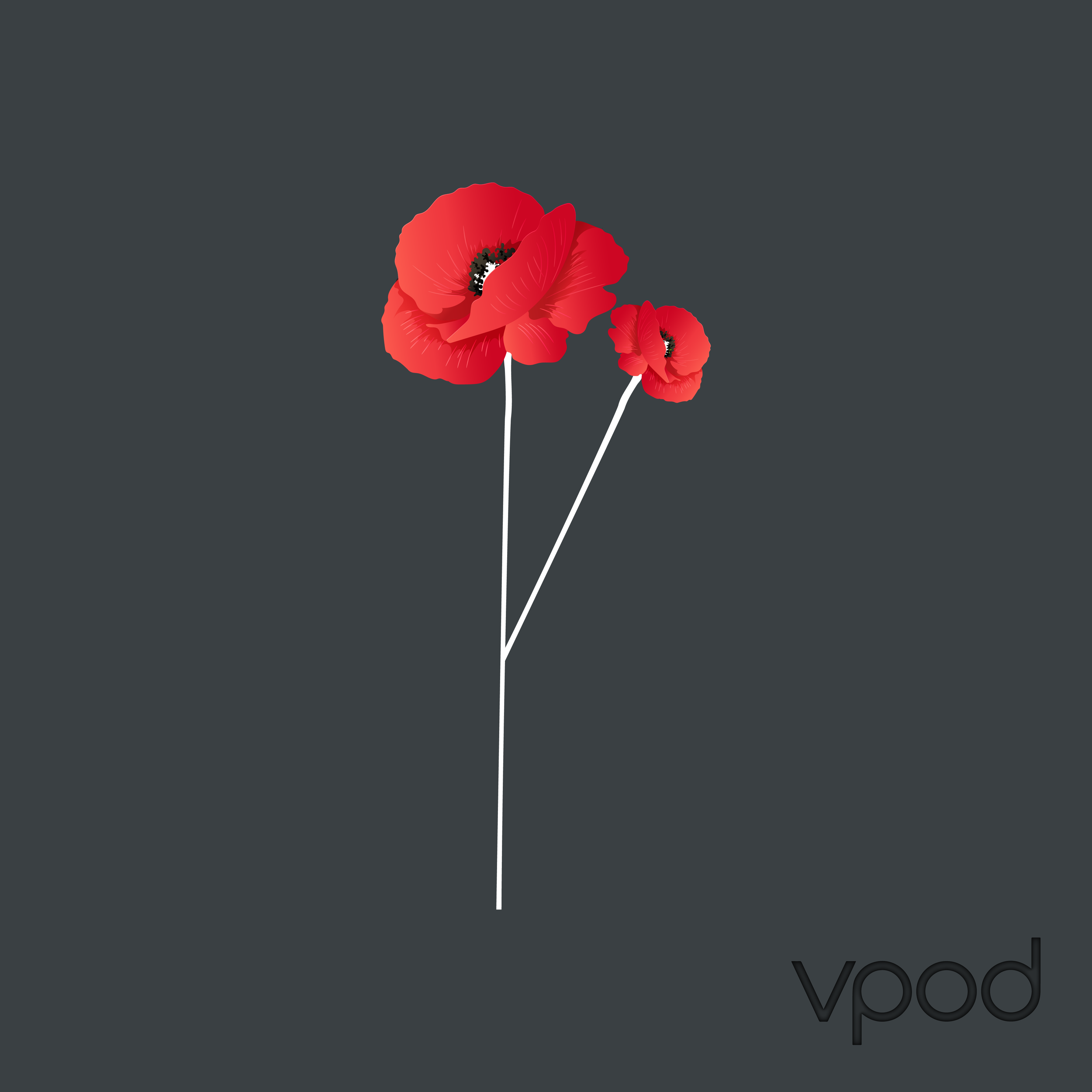
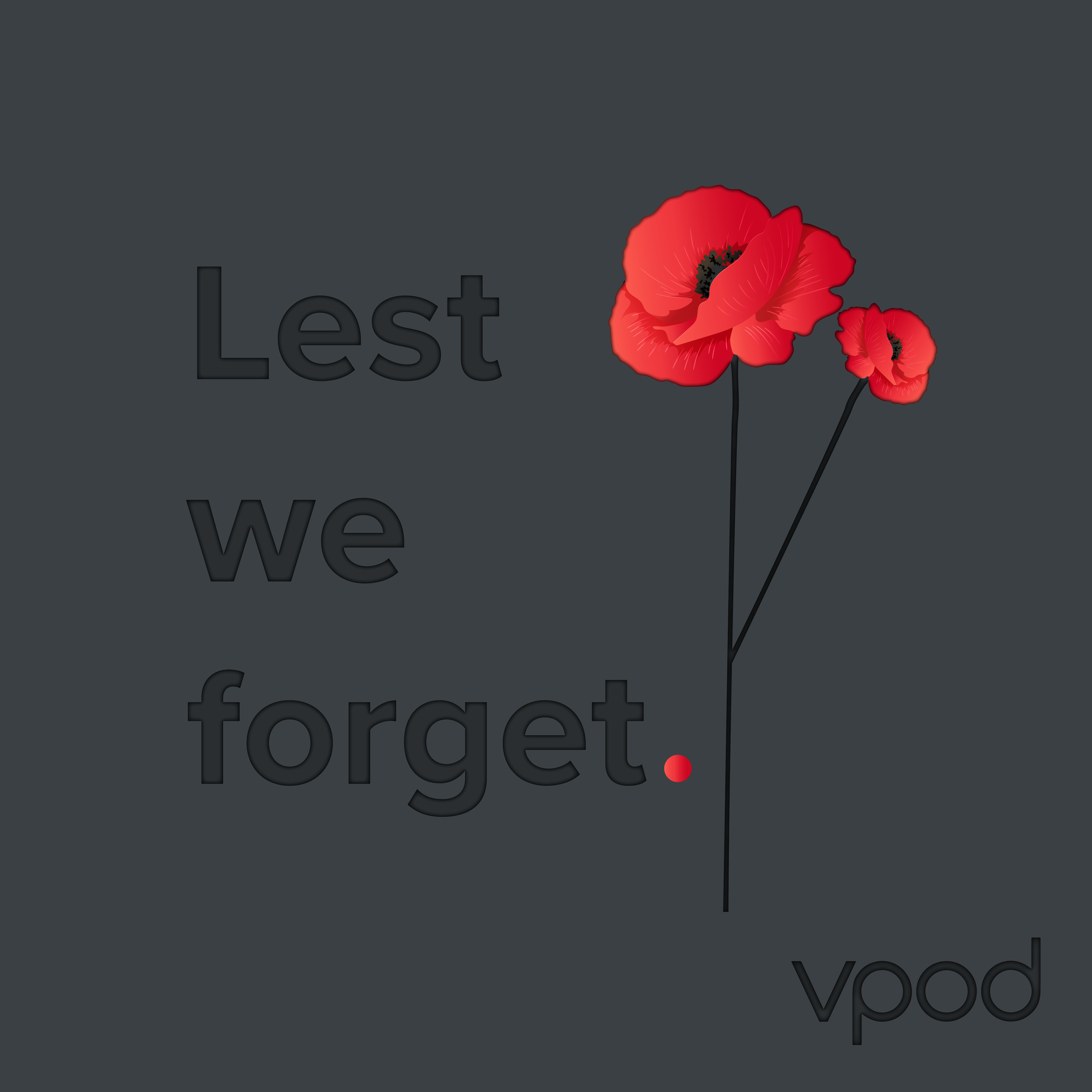
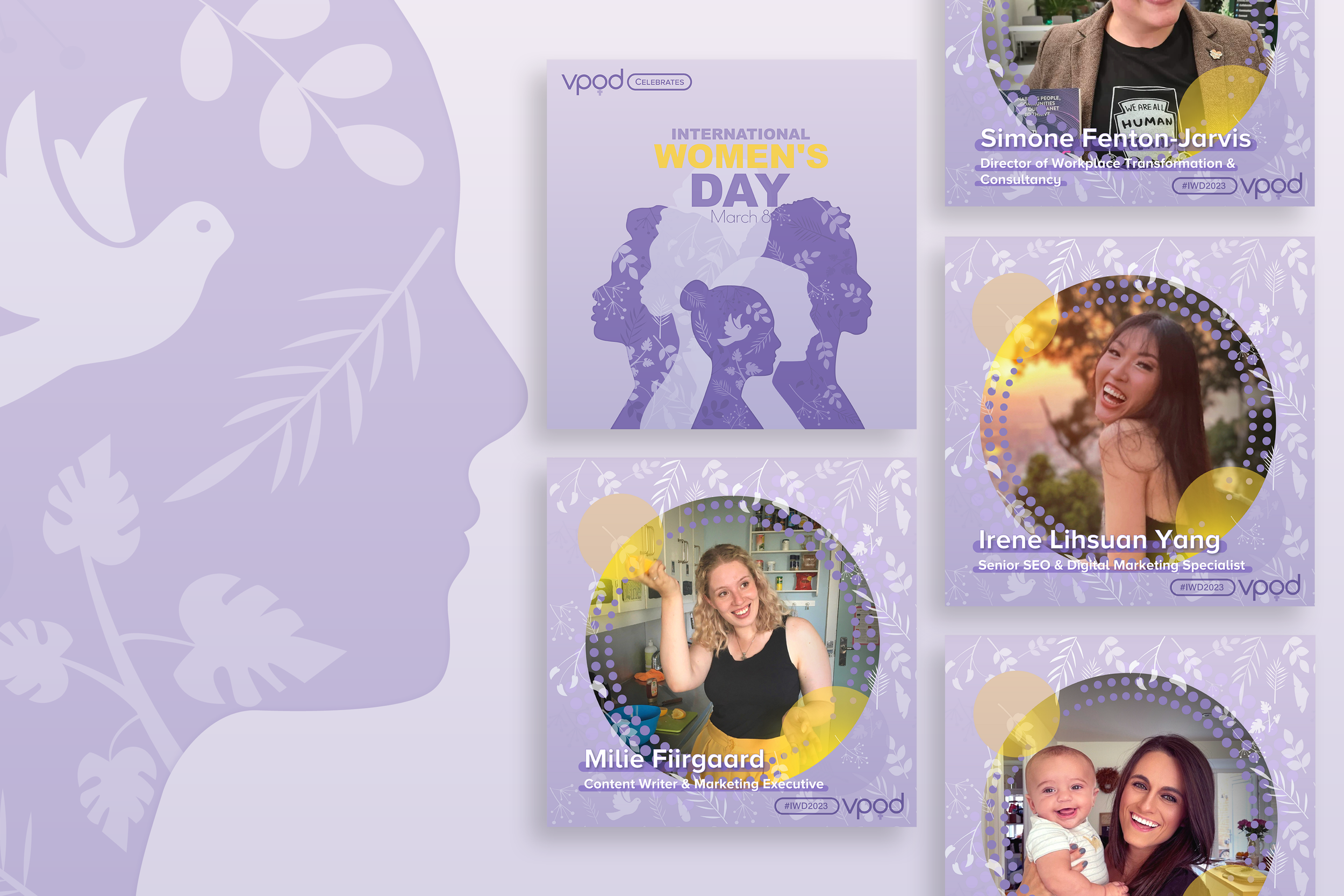
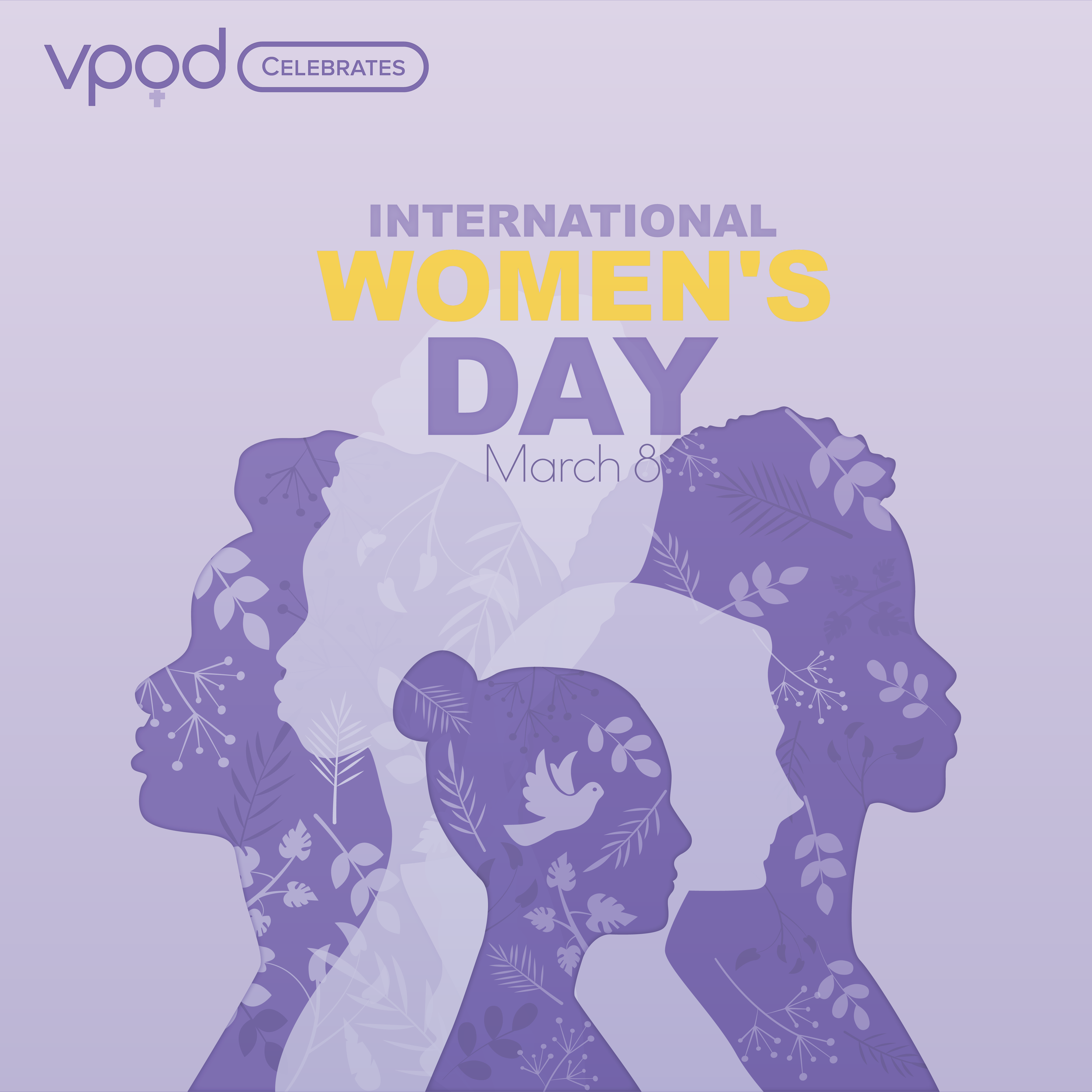
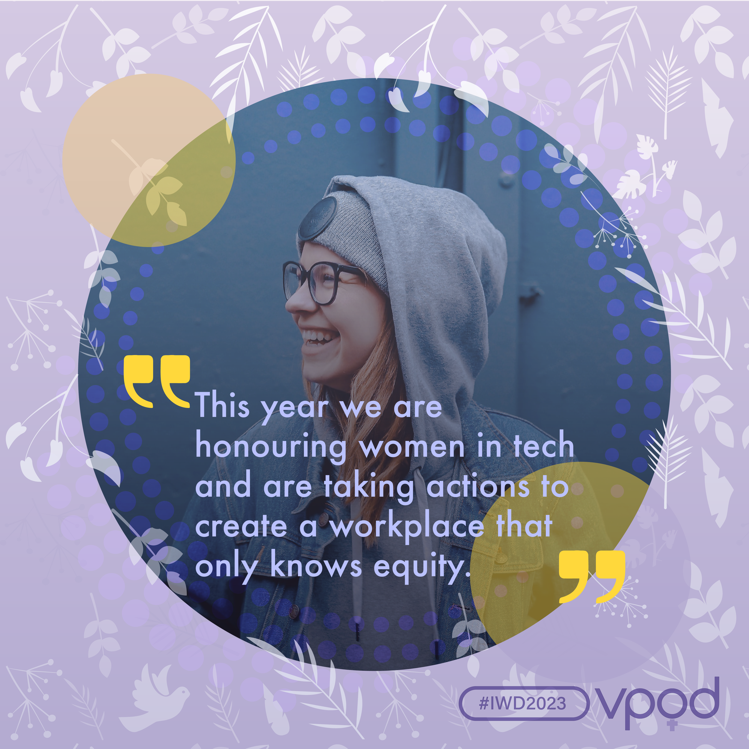
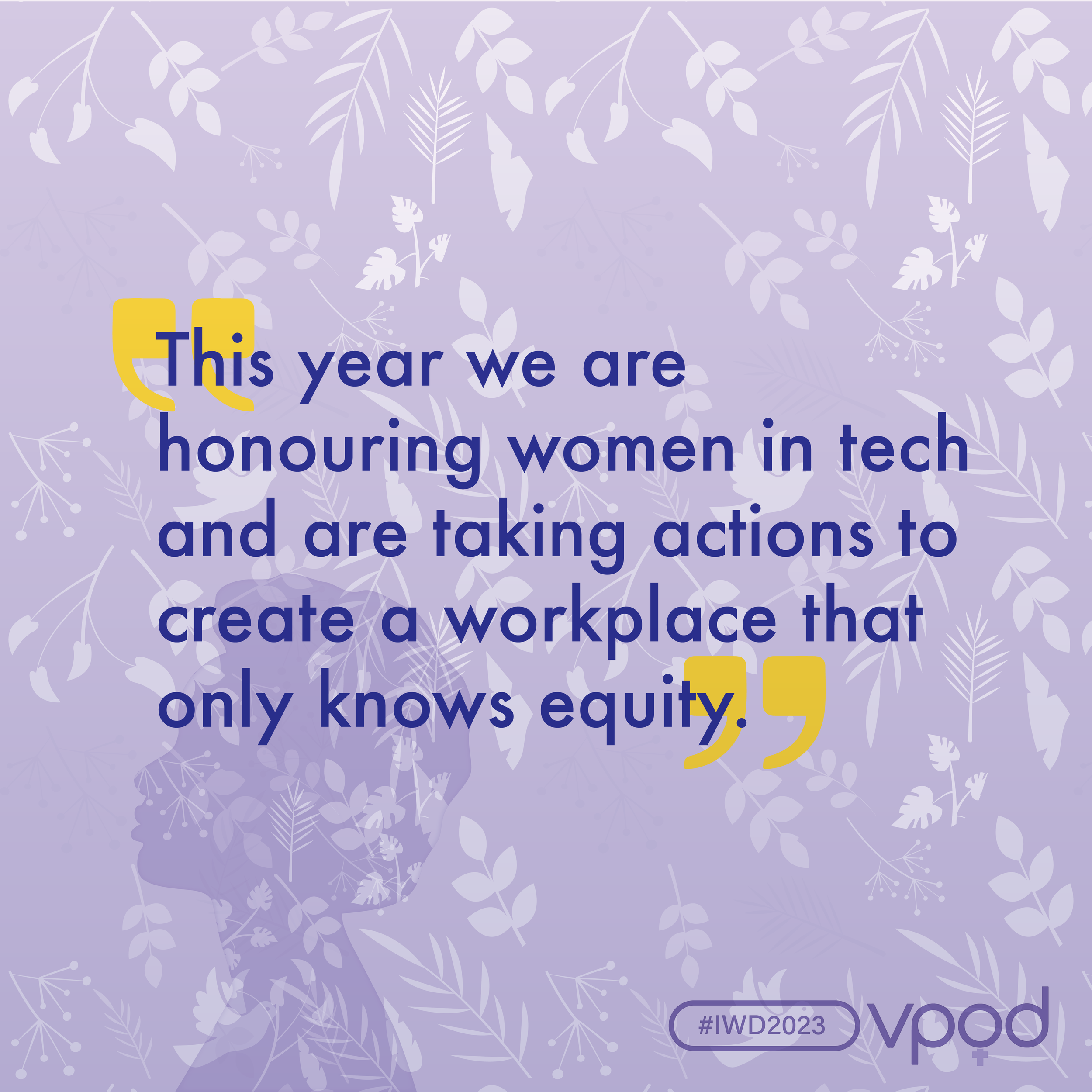
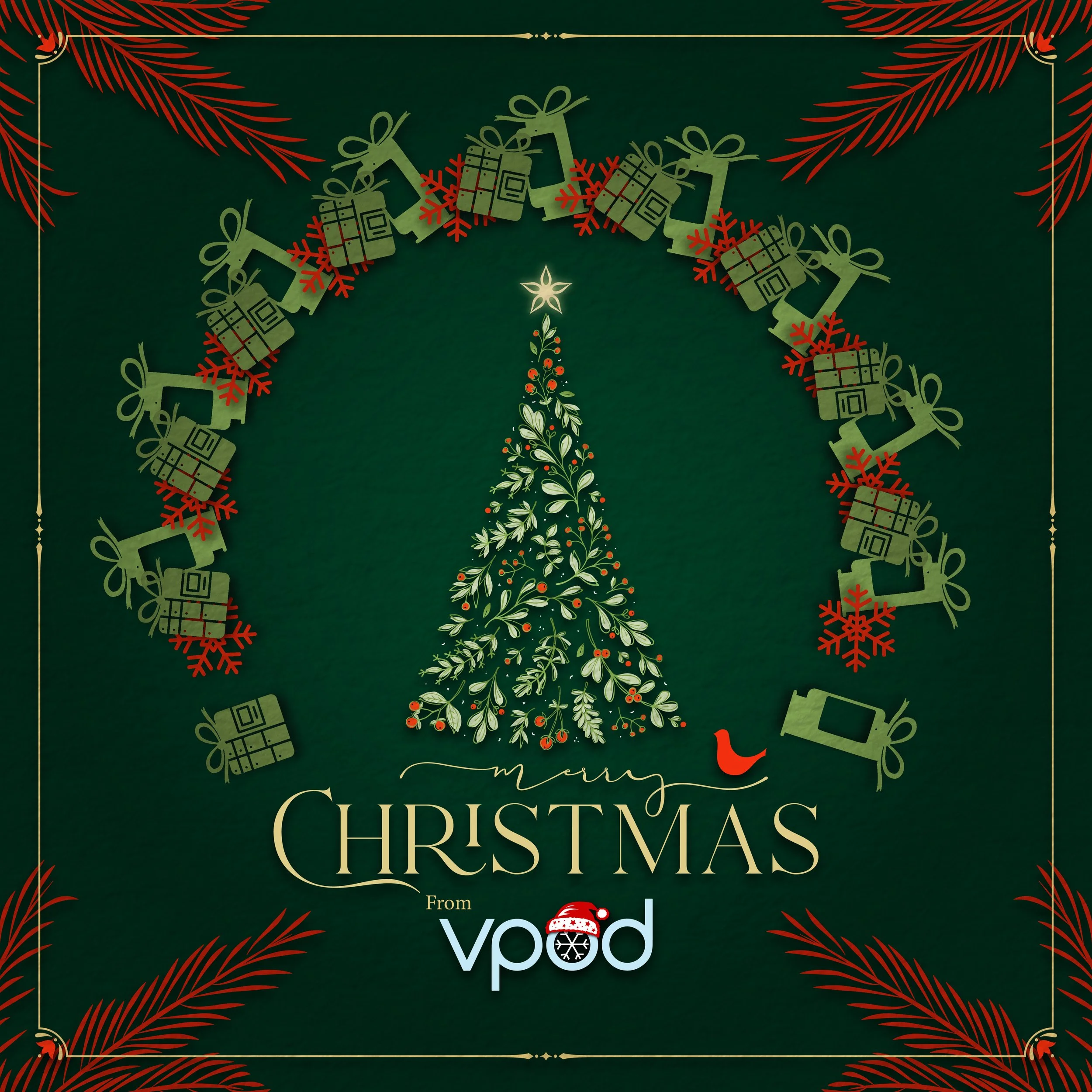
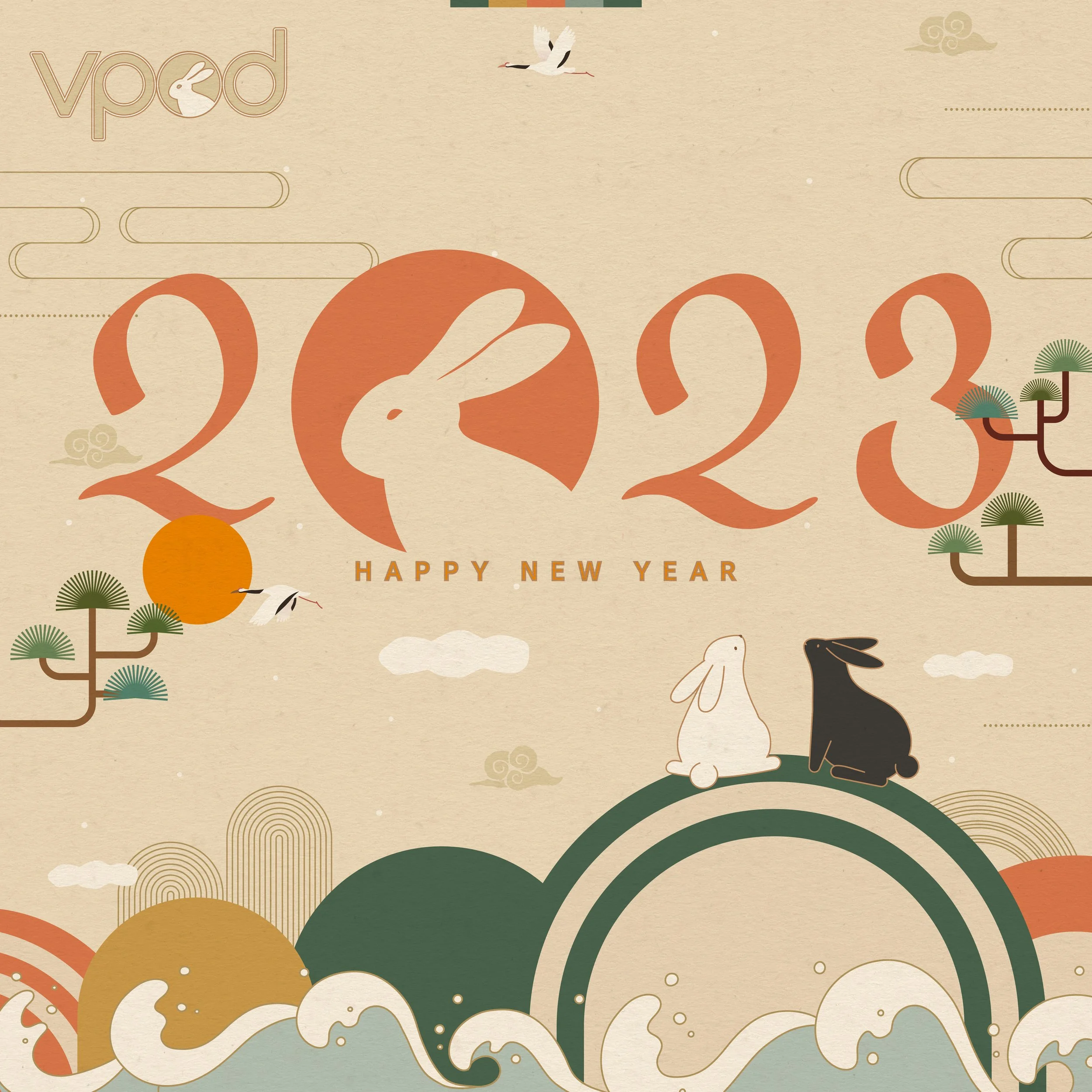
As a designer I’m a believer in creative flexibility, I’ve always liked brands that can retain their sense of identity while being able to push new creative ideas forward. With Vpod I wanted the brand to be recognisable but flexible enough that we could create a variety of creative assets for any occasion and continue to push boundaries. This meant that we could adapt our brand for events and seasonal moments with bold and bright colours and bold design features.
Photography & Videography
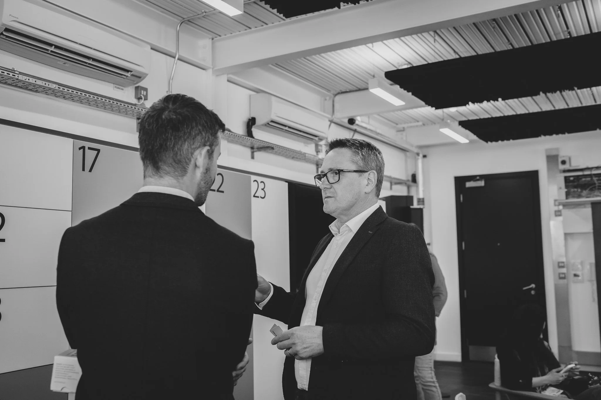
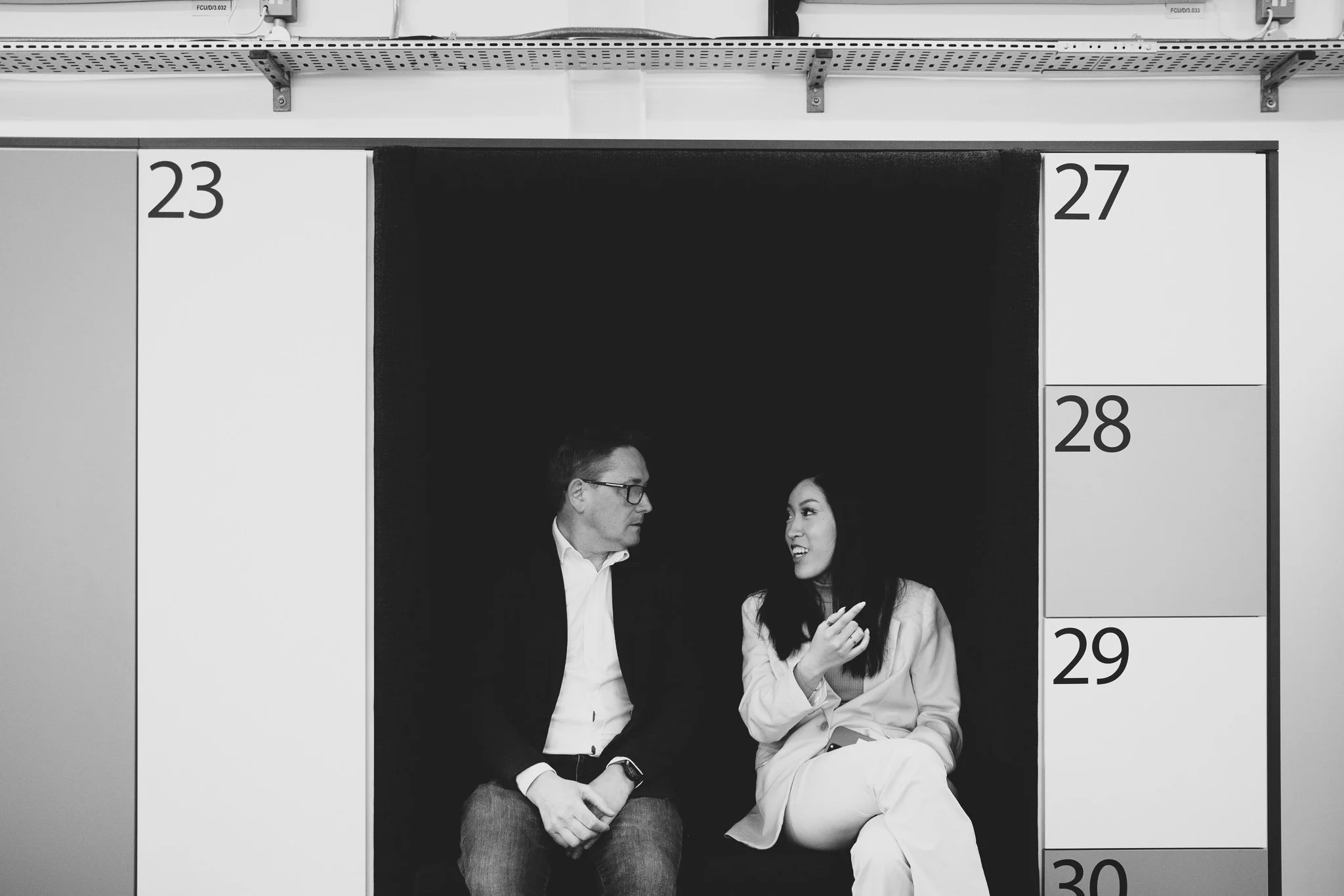
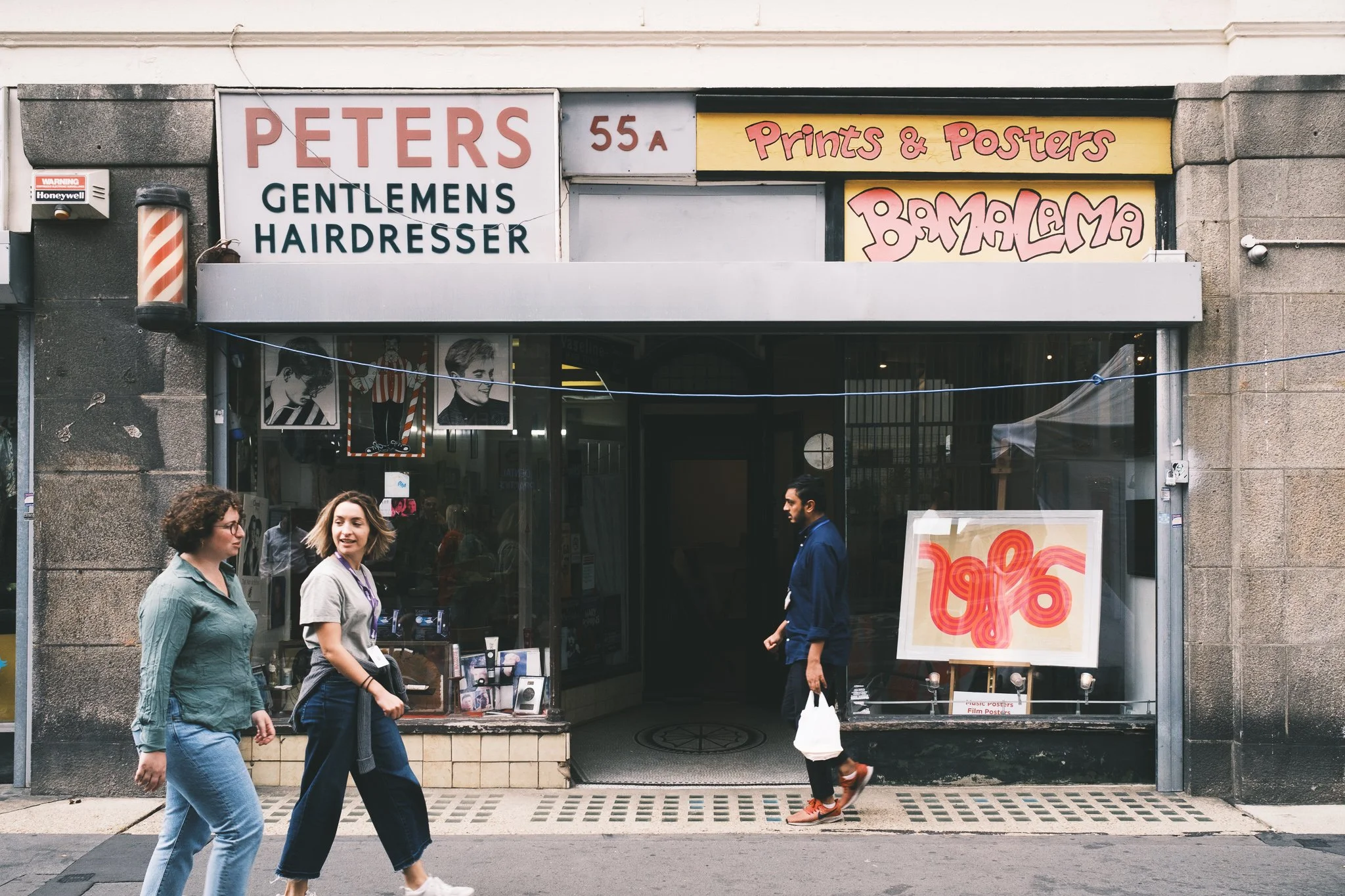
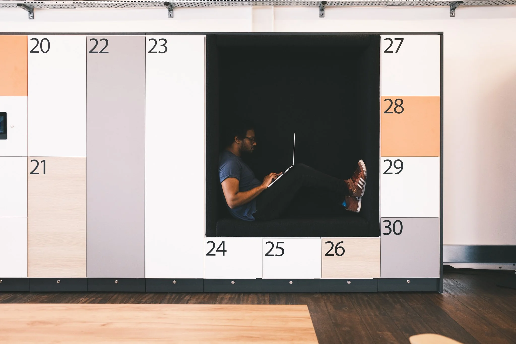
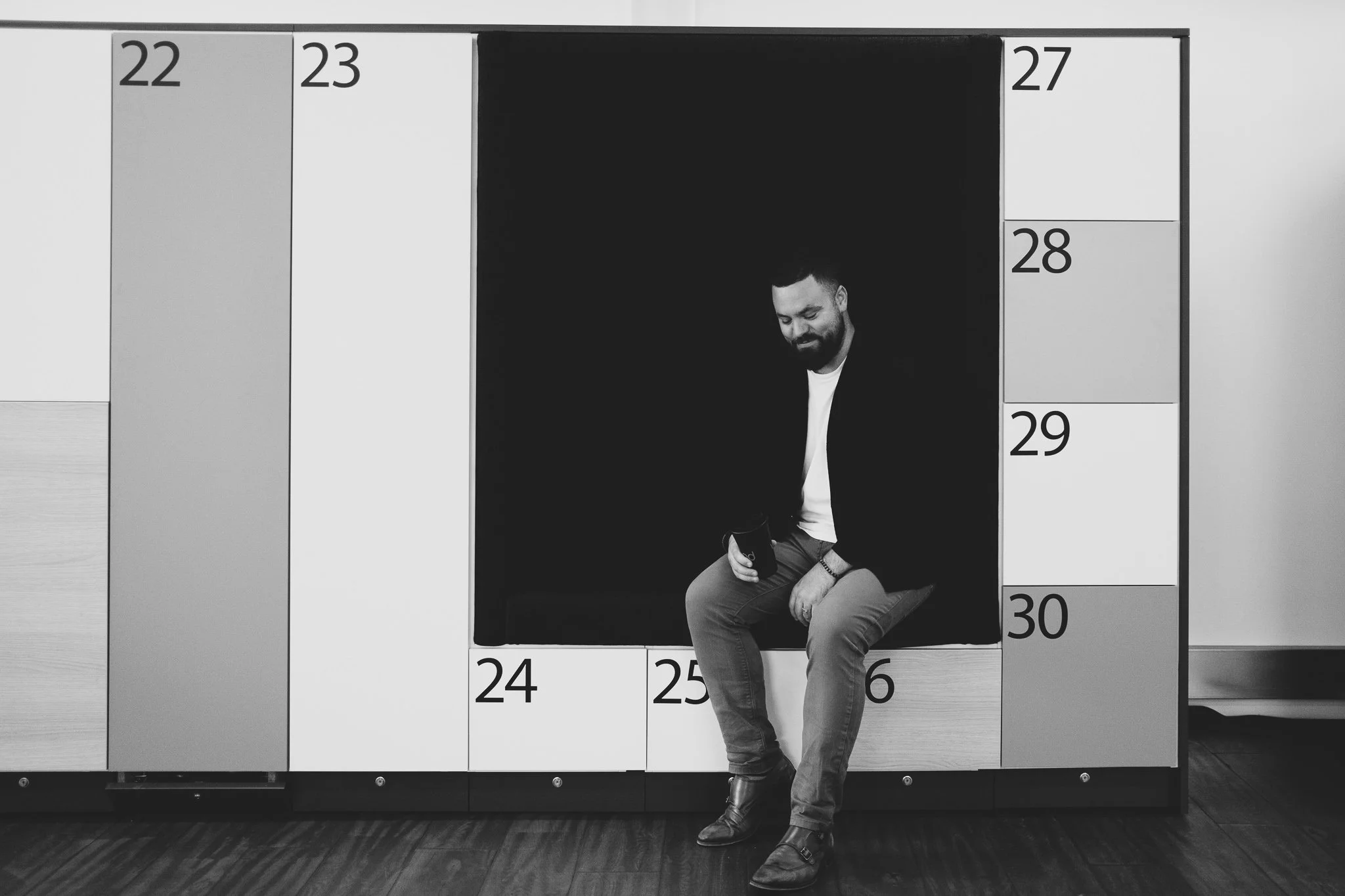
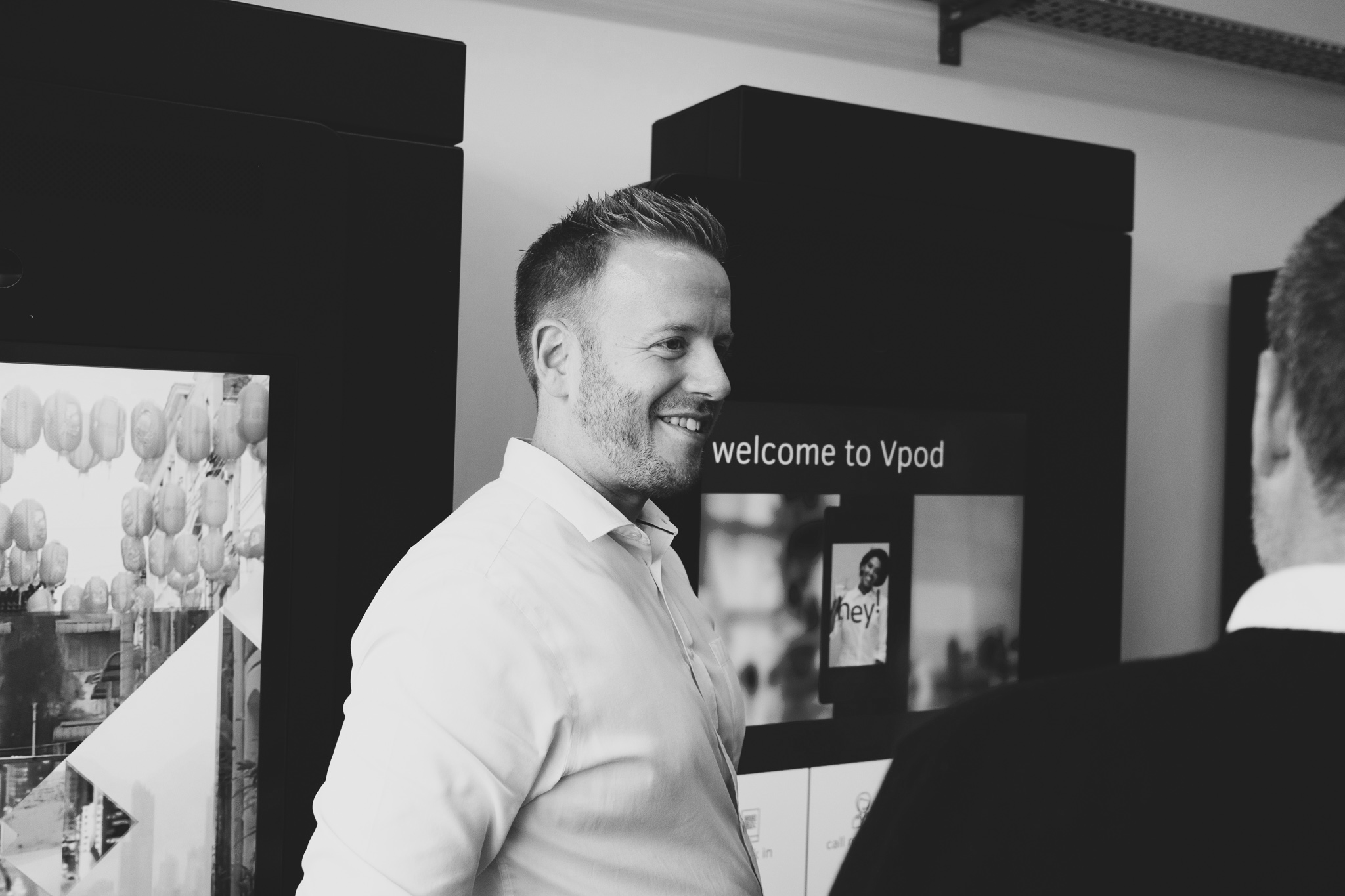
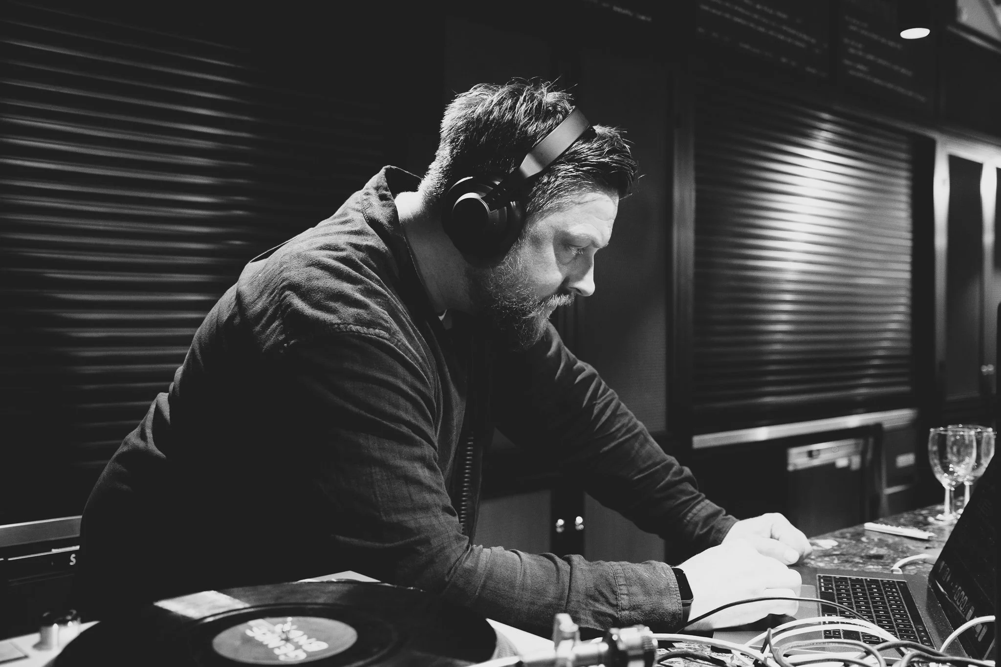
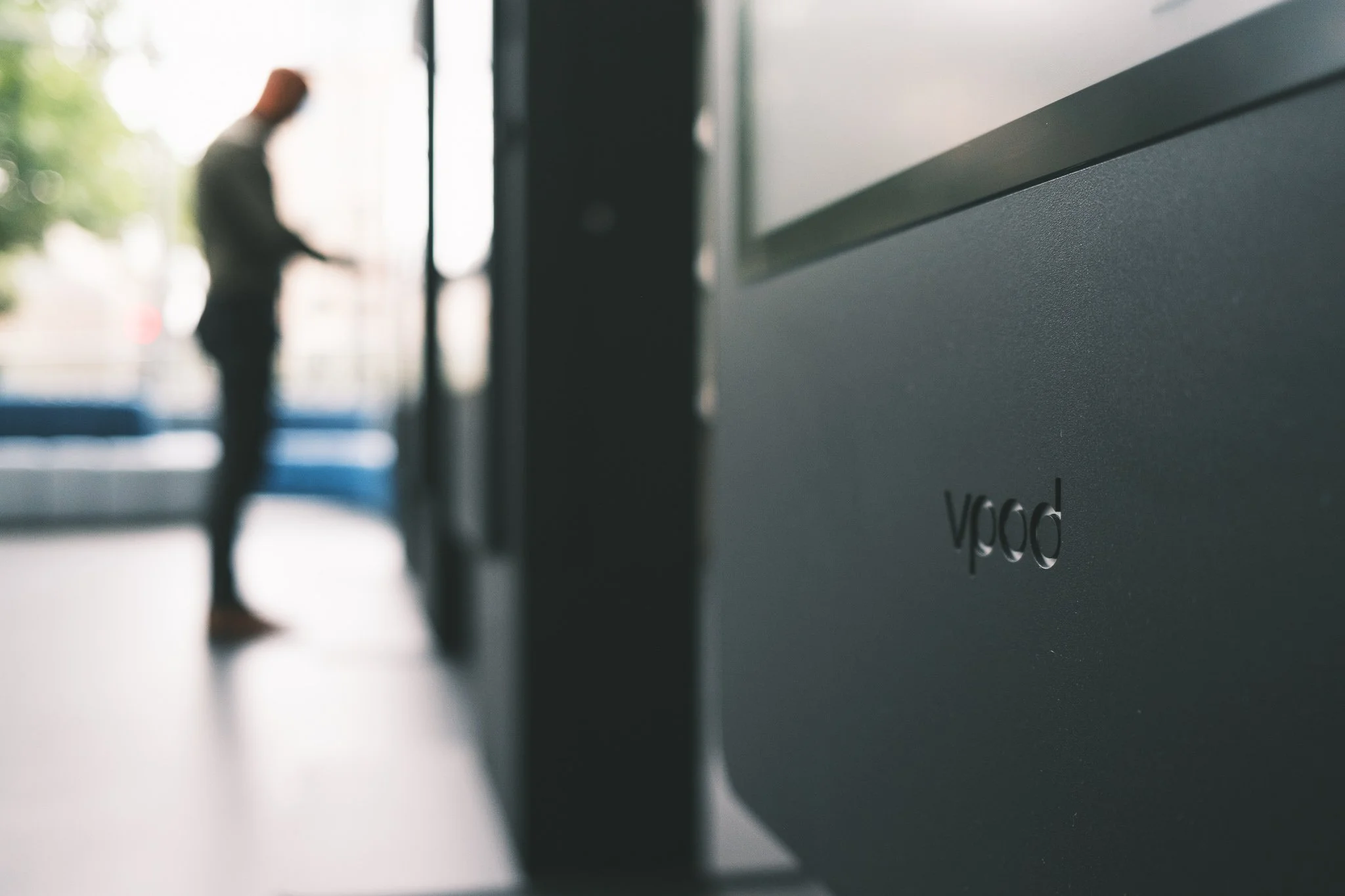
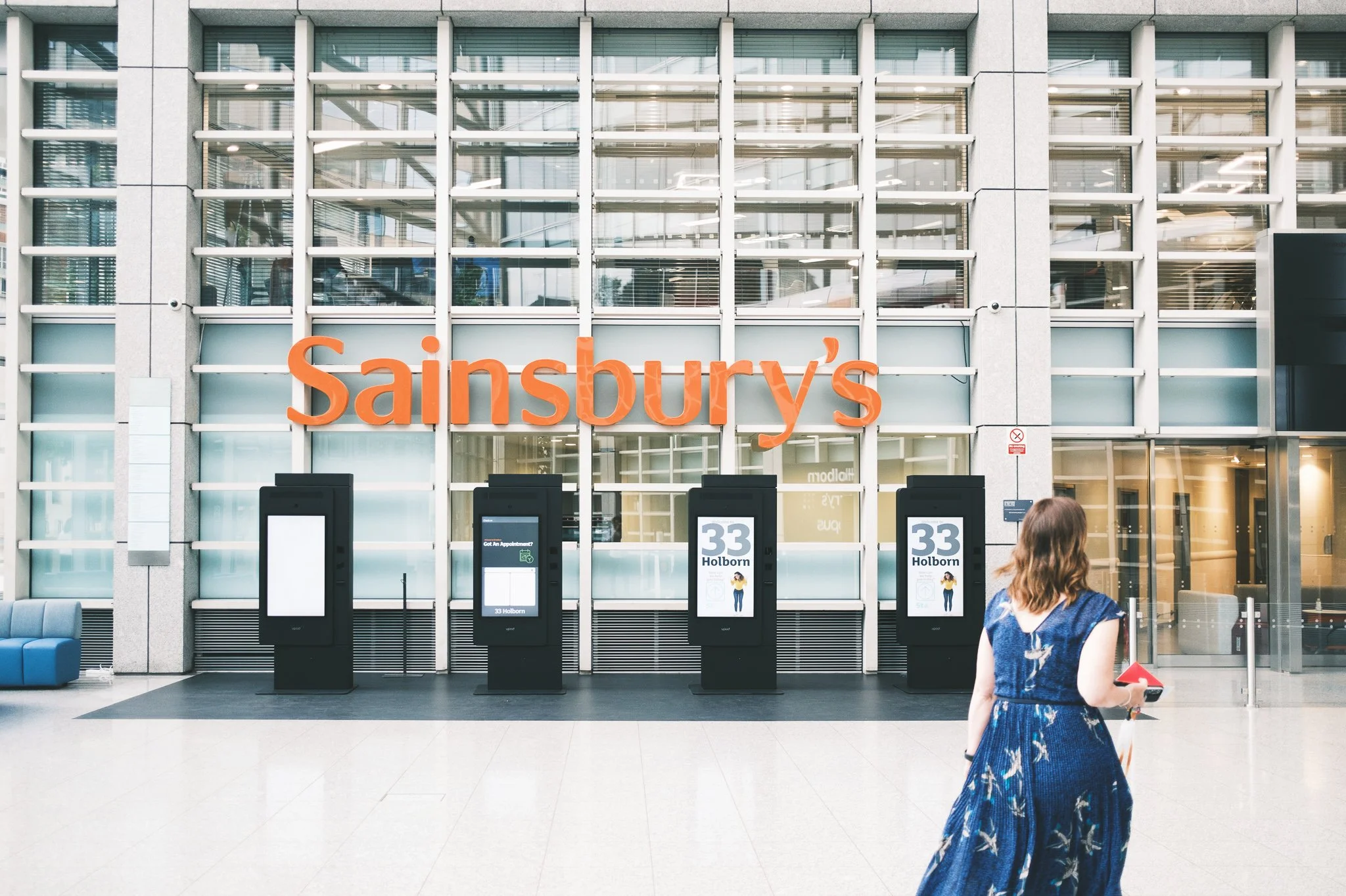
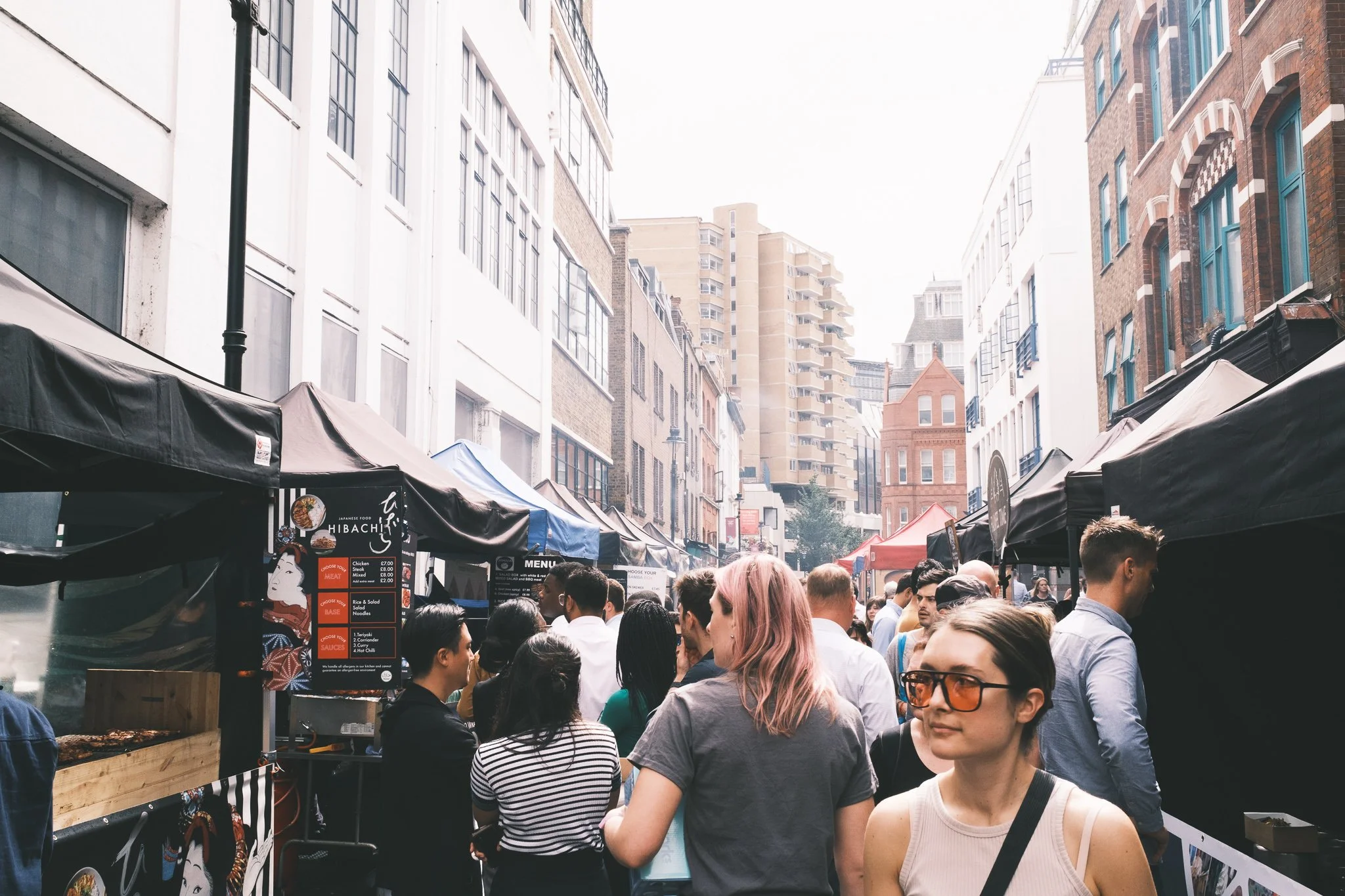
As a multimedia creative and storyteller, I’m always looking for ways to get away from my desk and use my photography and video skills. The rebrand covered everything at the company including videography and photography. One of the things that were important to me was to capture Vpod’s incredible team and culture, I filmed and edited a video with the company’s managing director, as well as editing work from a freelance videographer at one of our customer’s headquarters for a video on Vpod’s relationship with ‘Sodexo’. Over the months we developed the brand I took photos at events and of our team, which would go on to be used in our social media presence and incredible new website which you can learn more about on my UI/UX & Web Design Page.

Sprinklr
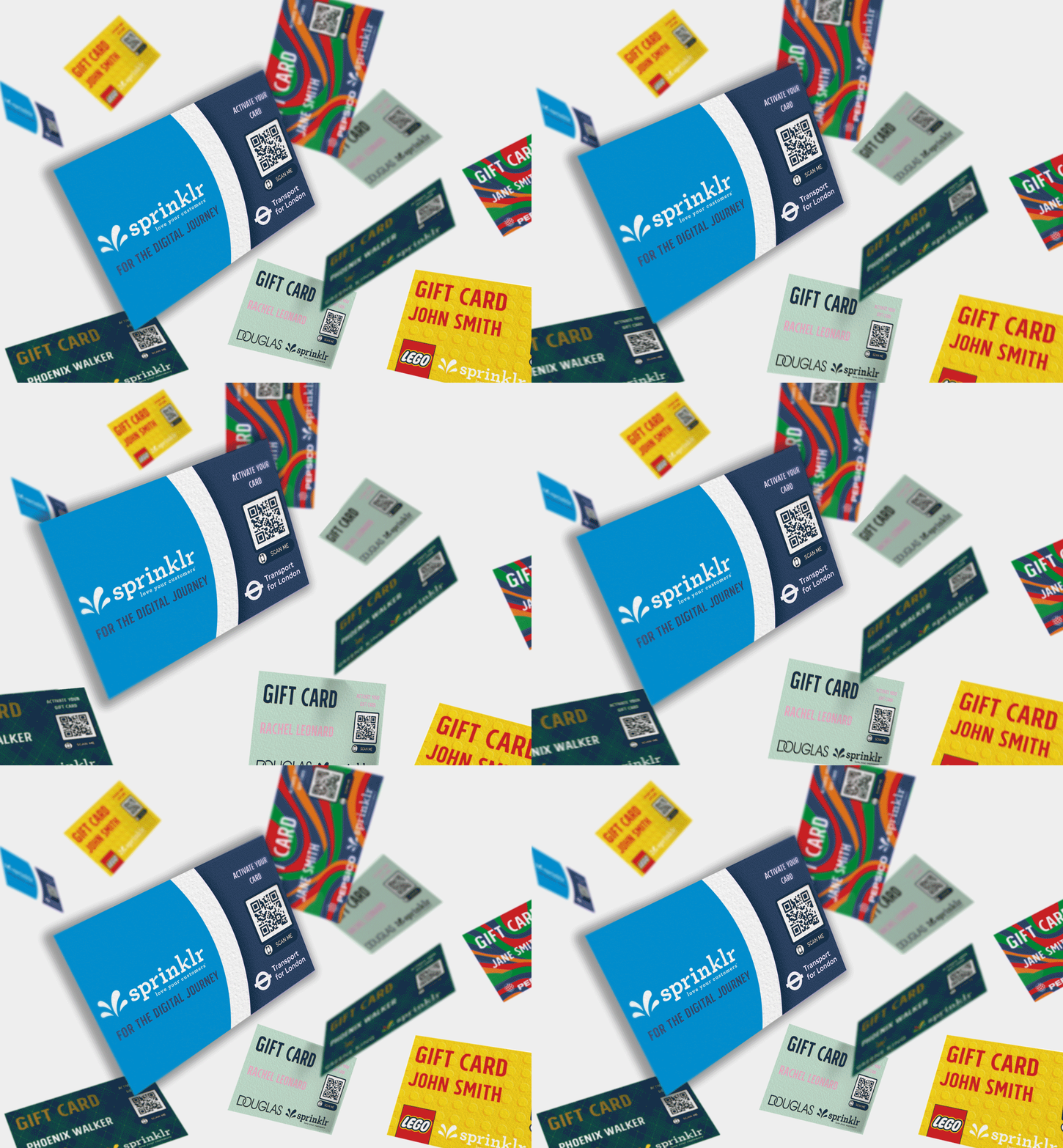
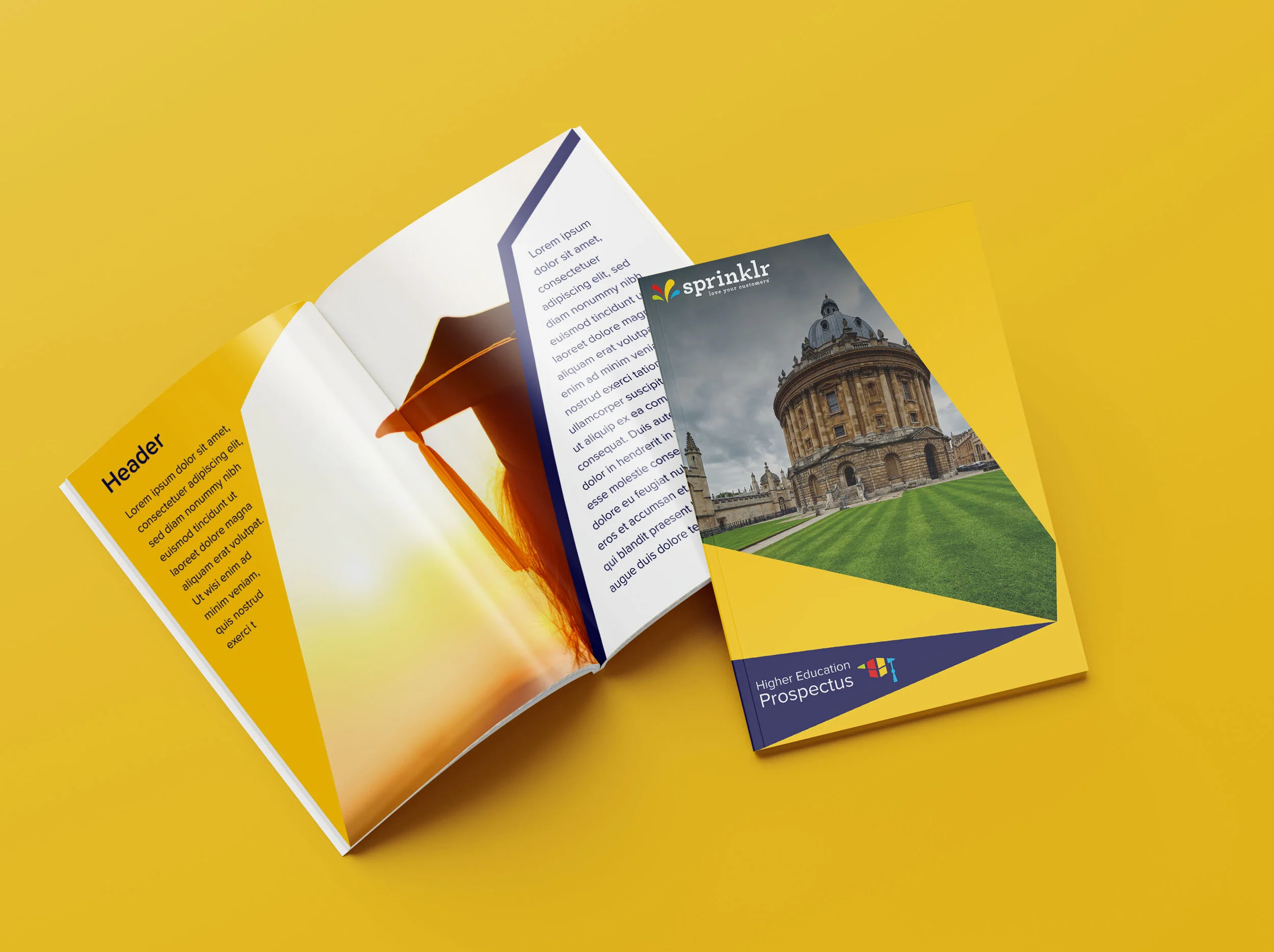
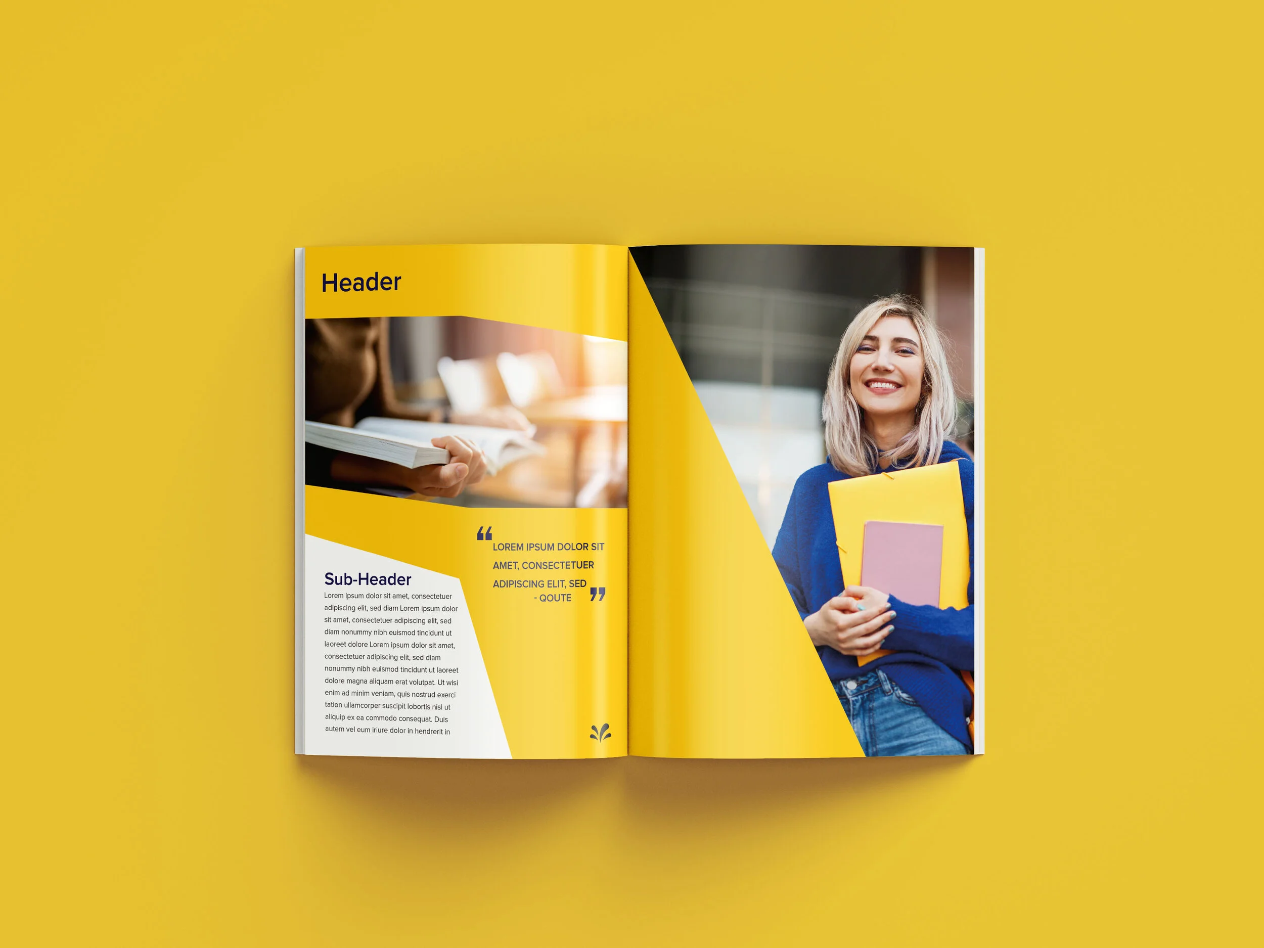
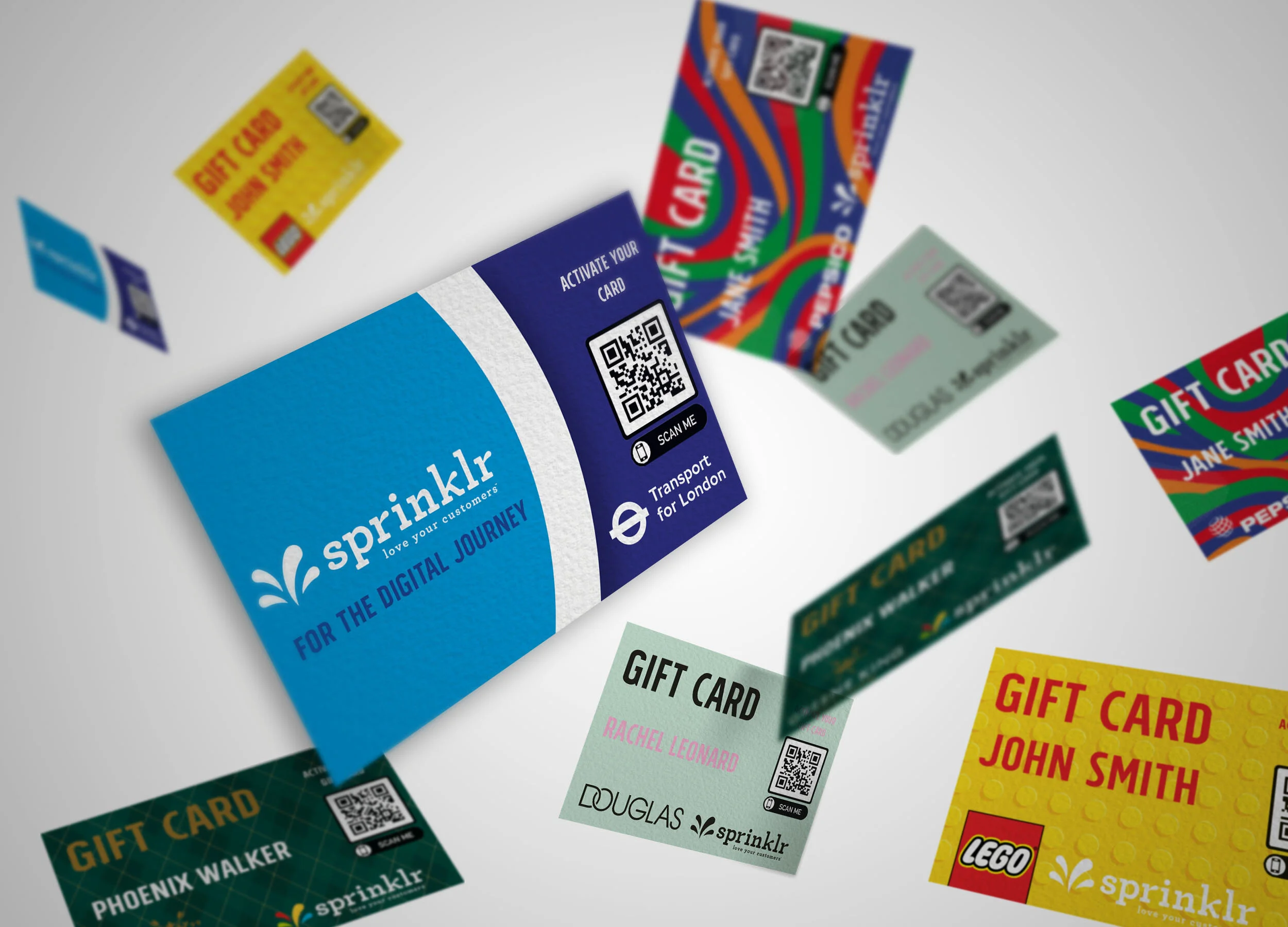
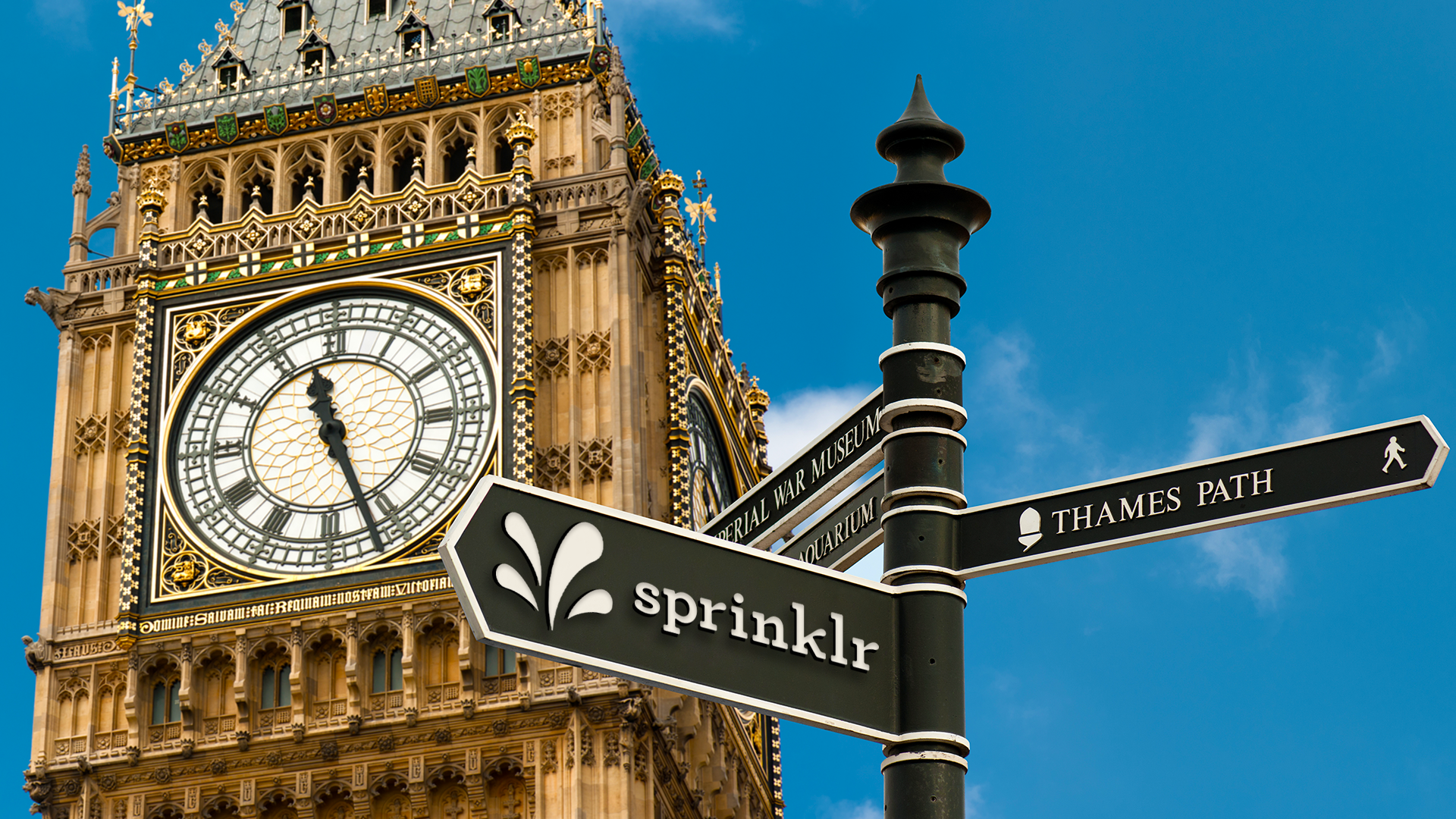
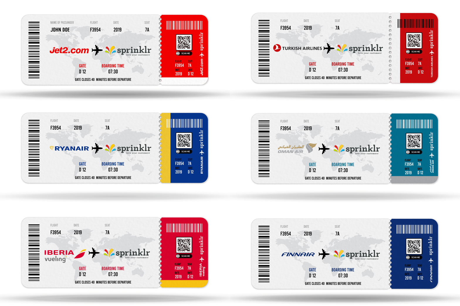
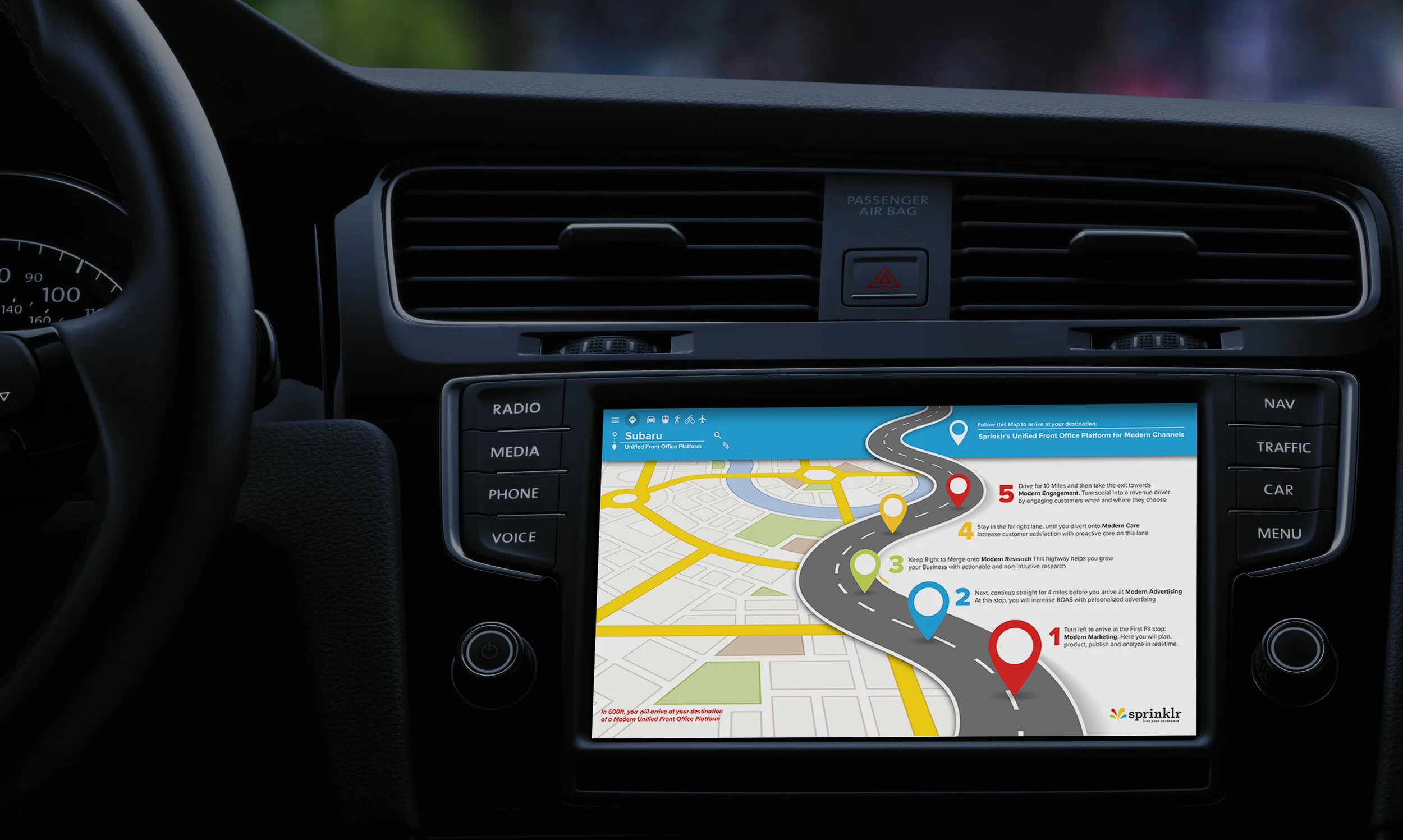
Designing for Sprinklr was a unique opportunity to be creative and playful with branding. The company is constantly finding new ways to appeal to companies in almost every industry. Working directly with members of the global sales team I explored, developed and designed a variety of personalised marketing material that showcased what partnerships with Sprinklr and prospective clients could look like. Projects ranged from unique Sprinklr gift cards for potential partners such as Lego, Unilever and Transport For London, to promotional boarding passes sent to airlines such as Ryanair and Qatar; or higher education prospectus styled product books, for universities such as Cambridge and Oxford. These projects were an interesting challenge from a design perspective requiring Sprinklr’s branding to stay true to itself, while also sharing the styling and characteristics of the intended brands.
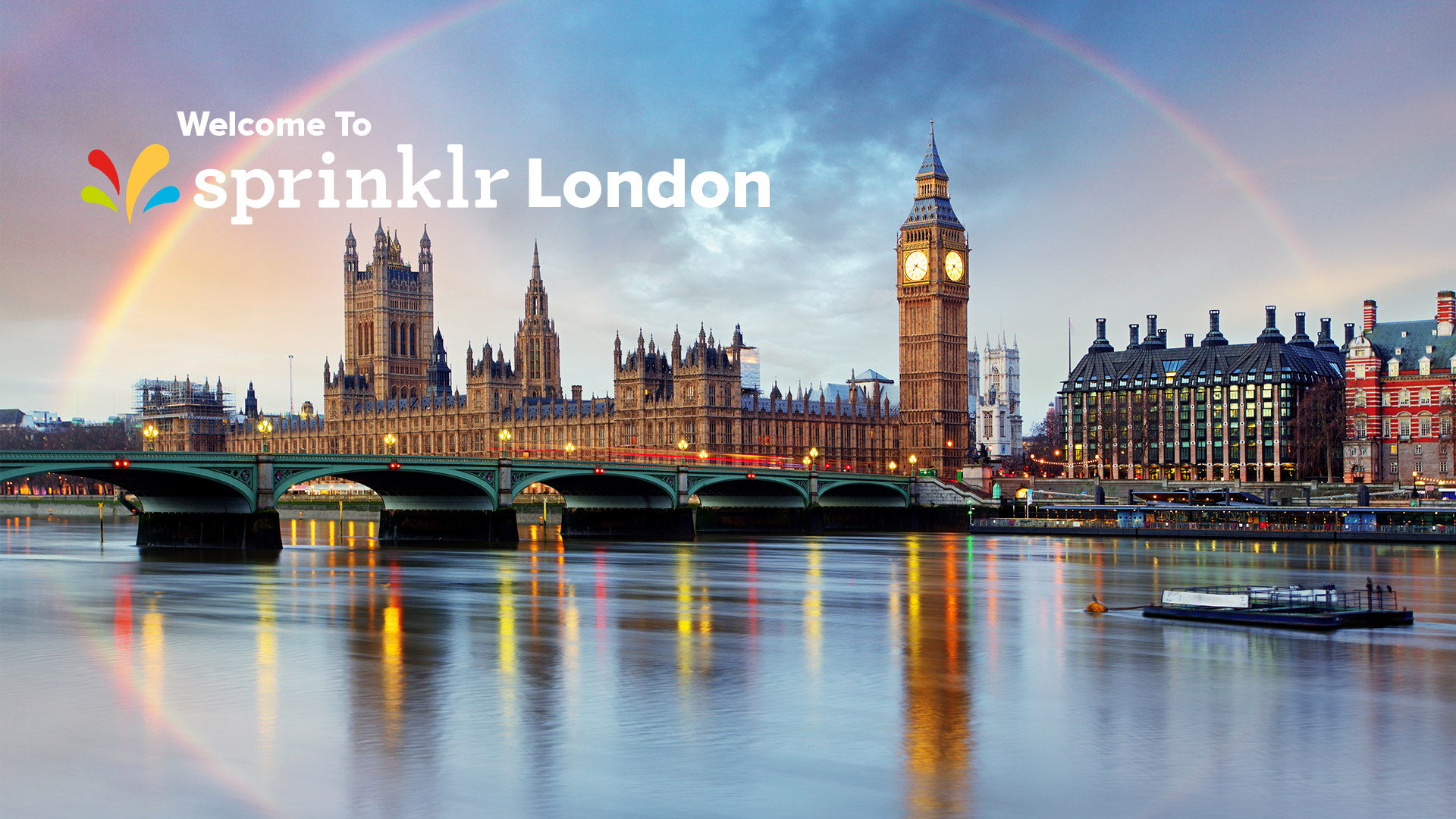
In addition to designing creative for marketing I also worked with Sprinklr’s UK facilities team and Global Head of Workplace to design branding for the London office which included posters for print as well as standard and seasonal welcome screens for the reception area.
Social Media
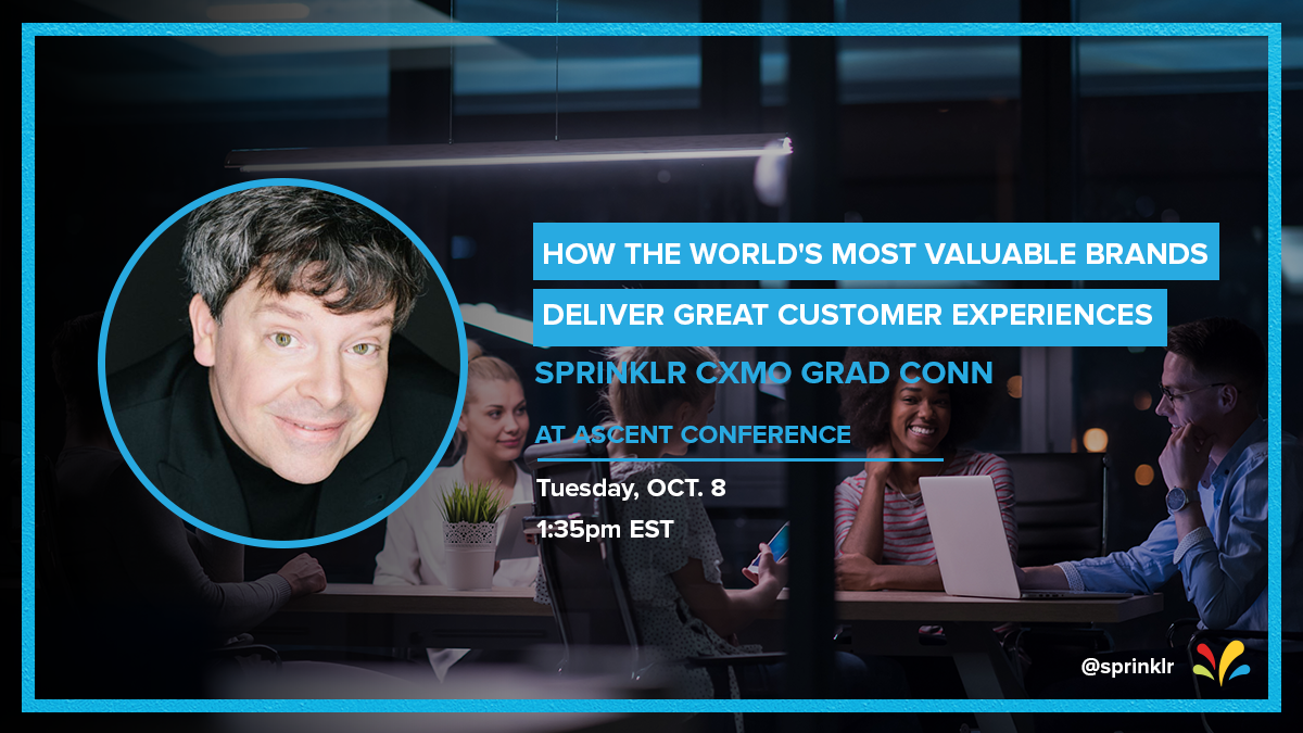
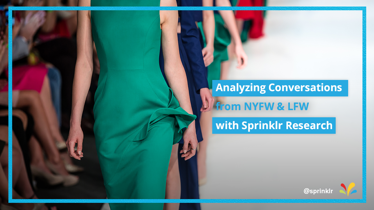

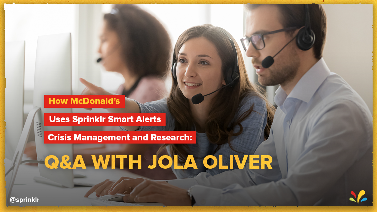
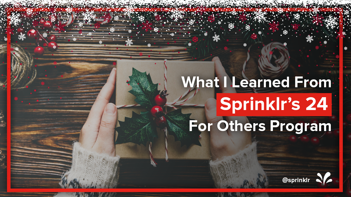
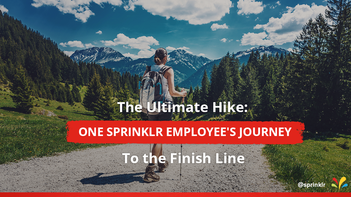

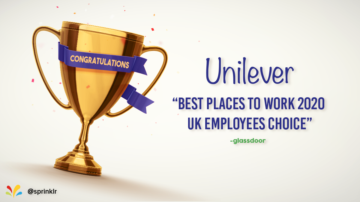
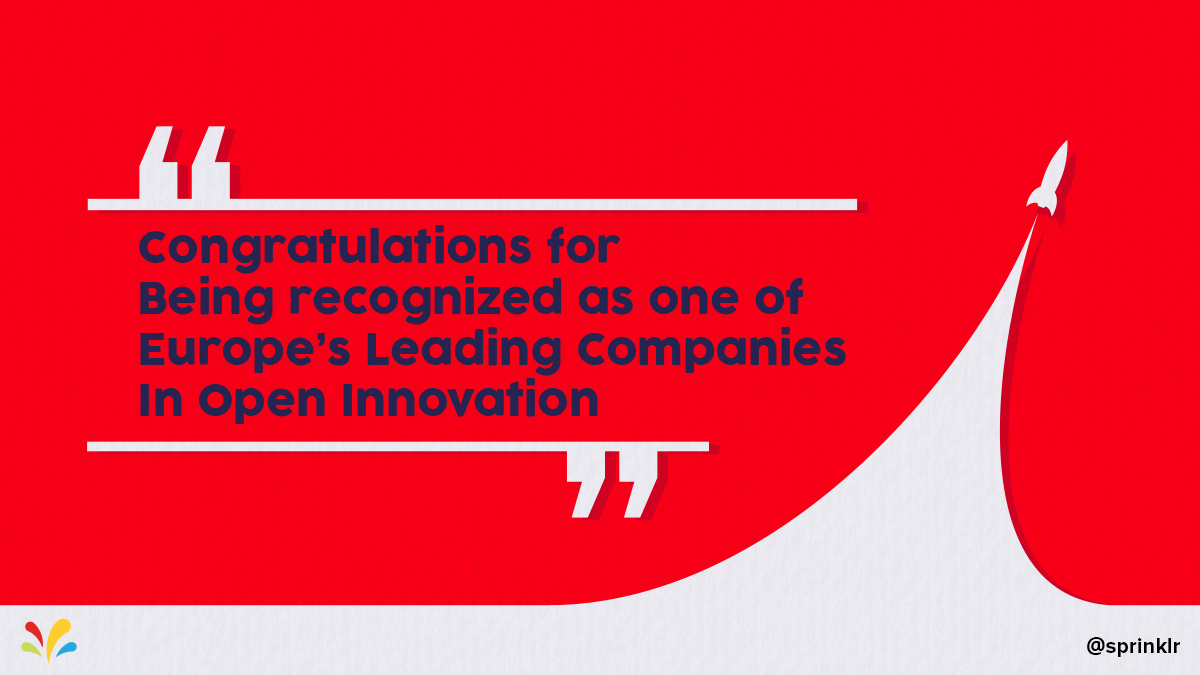
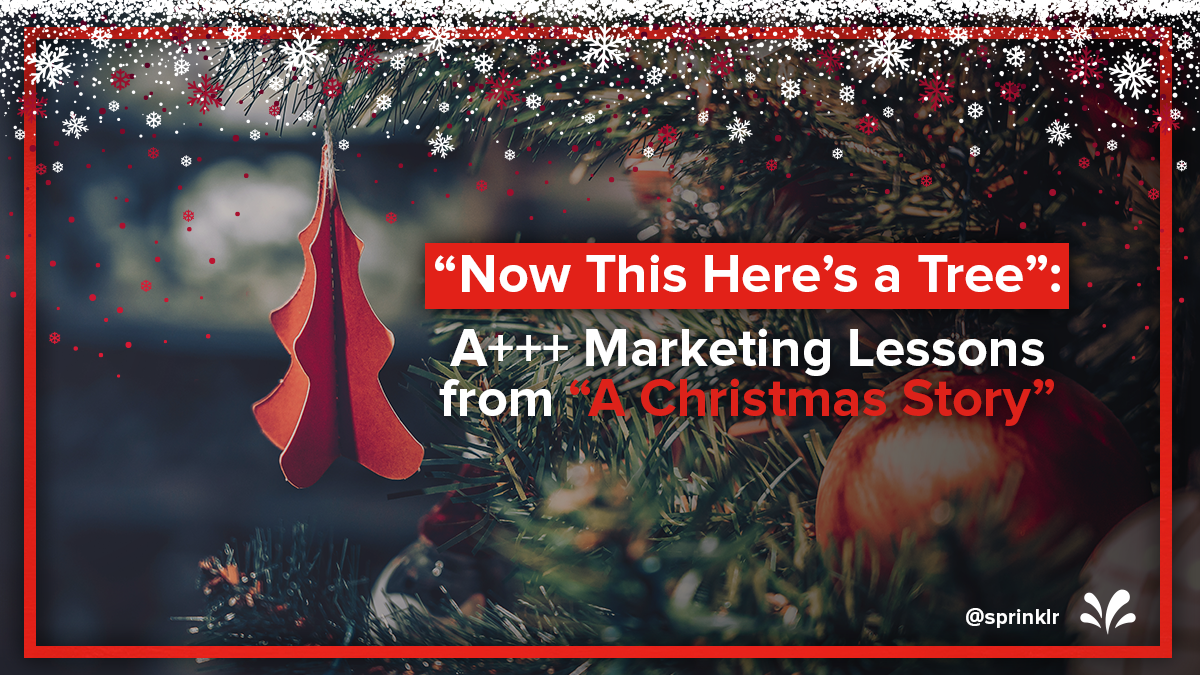
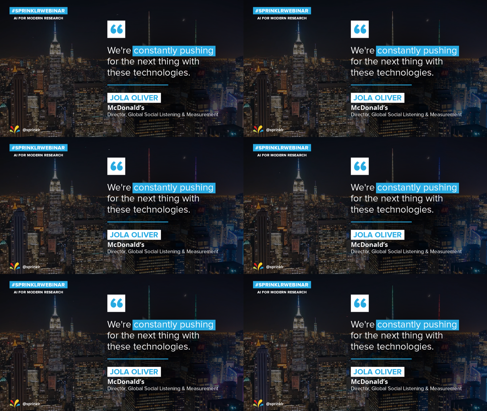
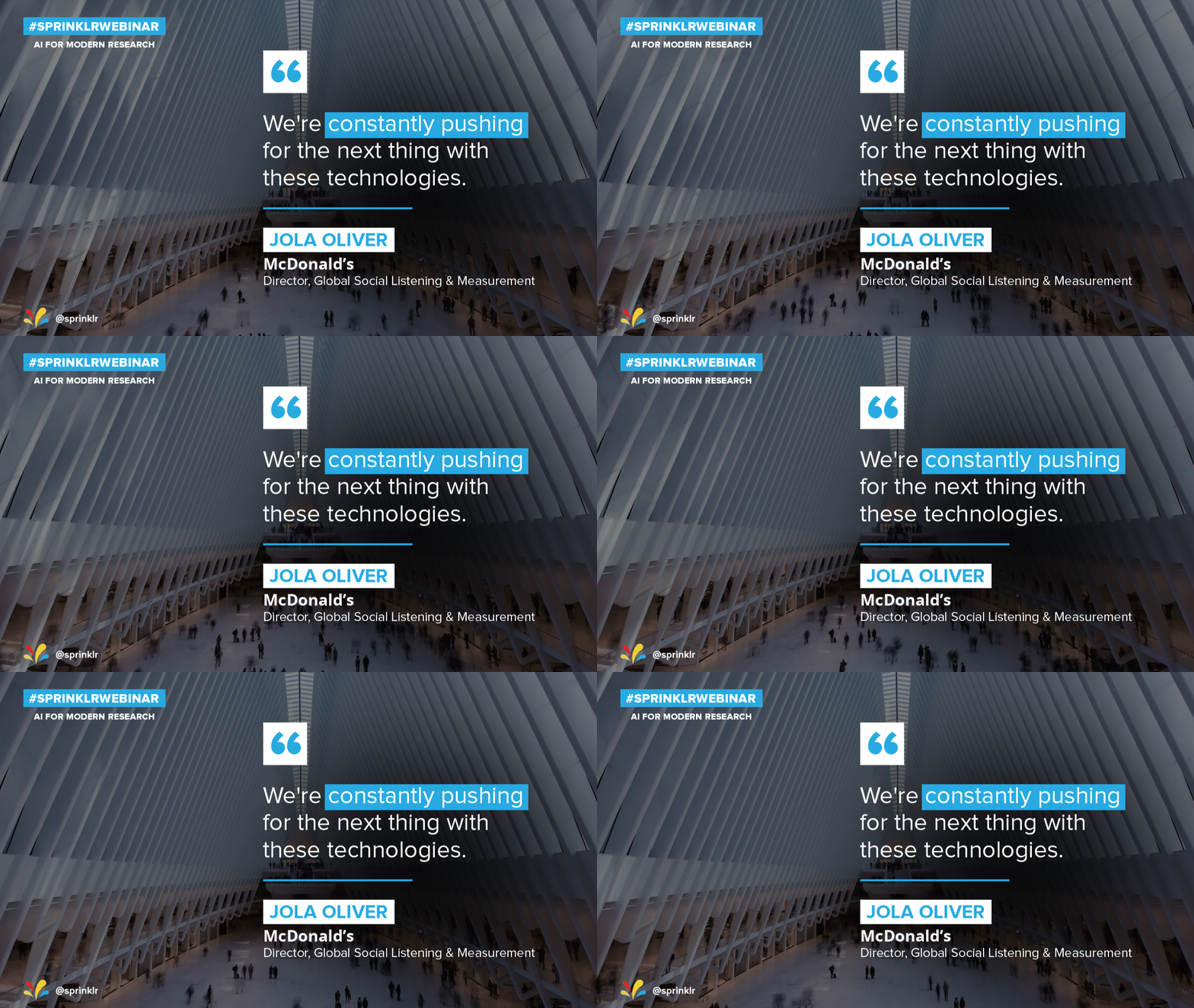
Part of my role on Sprinklr’s in house design team involved the daily design of social media posts. Working in tandem with the New York design team and under the supervision of Sprinklr’s social media managers; we built templates that allowed us to quickly and effectively design social media posts within minutes, while maintaining a consistent design language and colour scheme across all posts on all platforms.