
UI/UX & WEB DESIGN
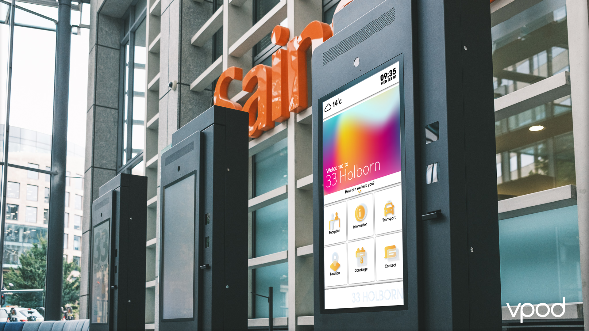
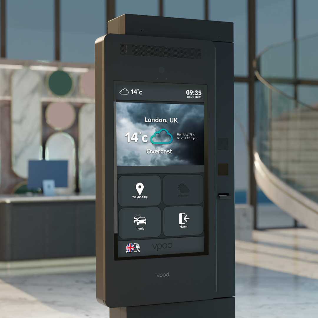
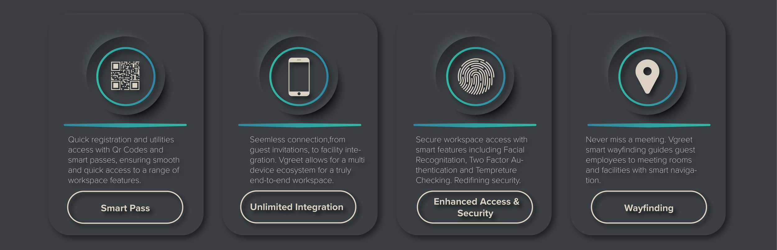
In December 2022, after successfully leading the design for the rebrand of workplace tech company Vpod, I was asked if I would be interested in leading the redesign of the UI/UX for the company’s flagship product, Vgreet. Vgreet is a smart kiosk that replaces standard reception desks, allowing guests and employees to check-in, check-out, request help and have a host of information such as traffic, in-building way-finding and booking.
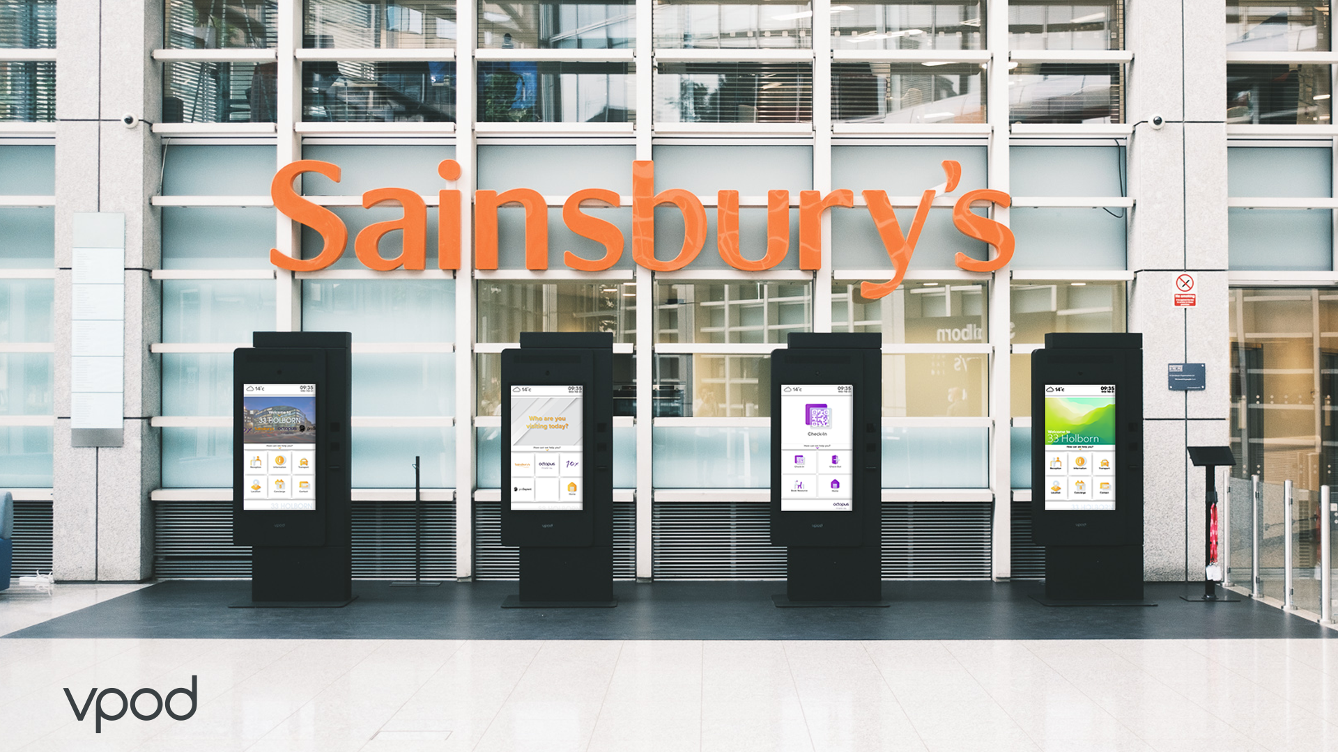
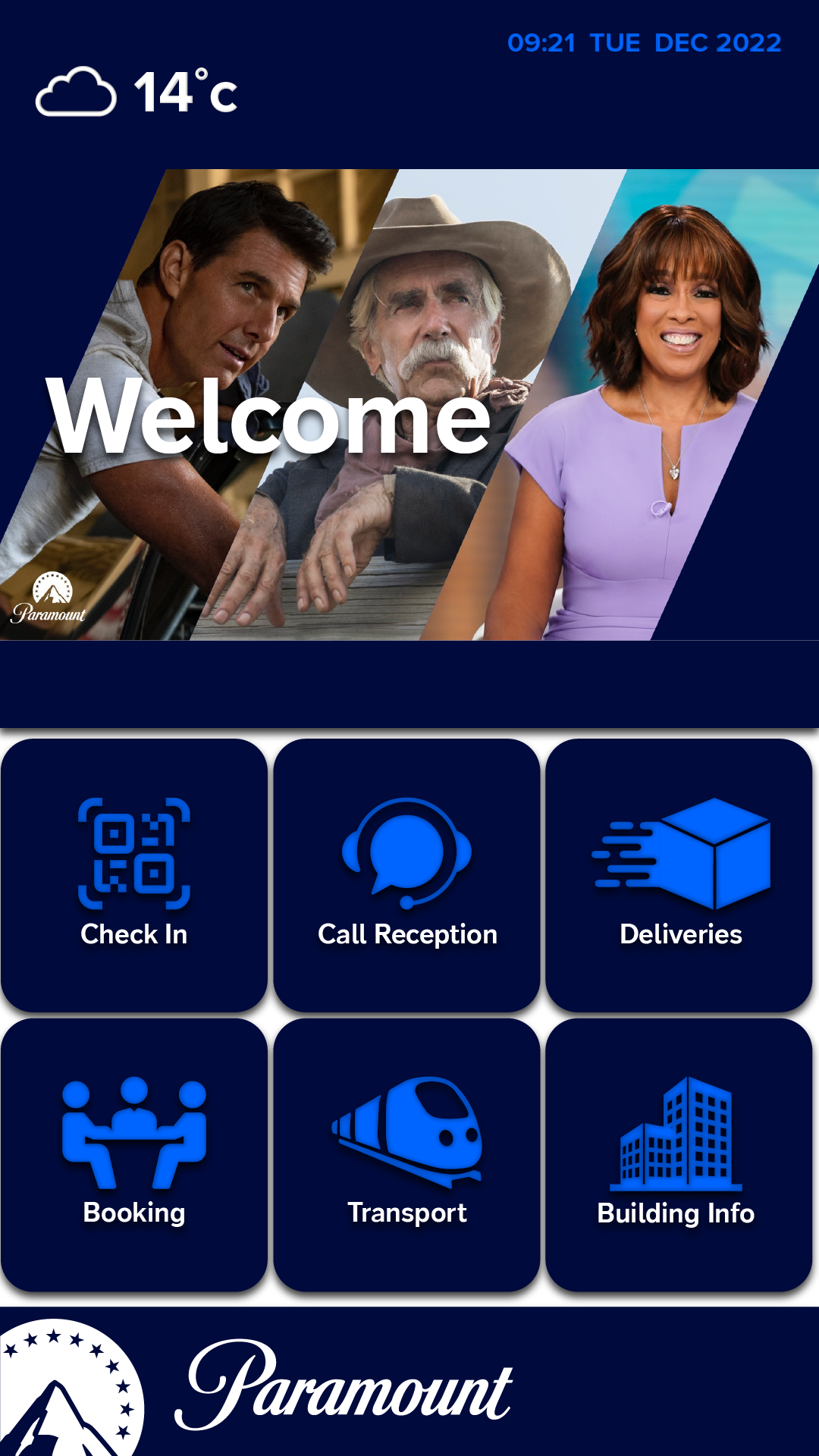
Vpod has multiple customers from banks such as HSBC to the UK retailer Sainsbury’s, the previous versions of the software of the product had limited features. I worked with the company head of software as well as developers to create a completely new UI and user experience, to create software that was not only intuitive to use, but accessible to people with disabilities and future proof, but also to make sure the software could be customised to present each brand better.
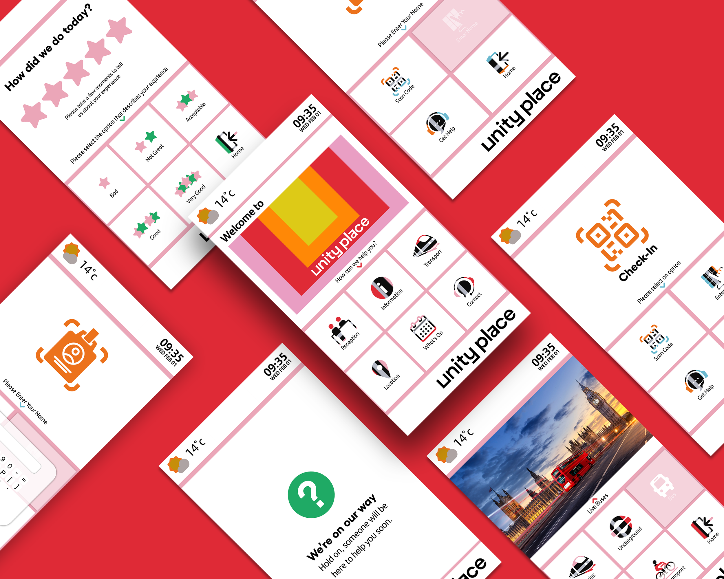
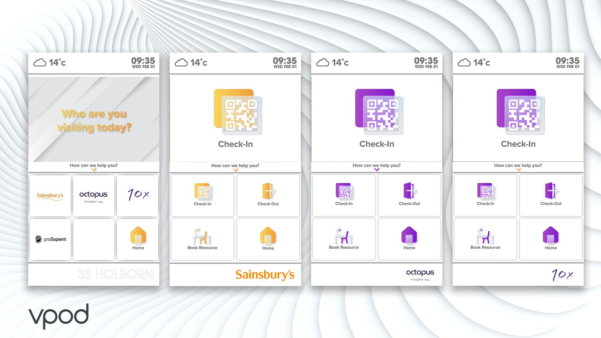
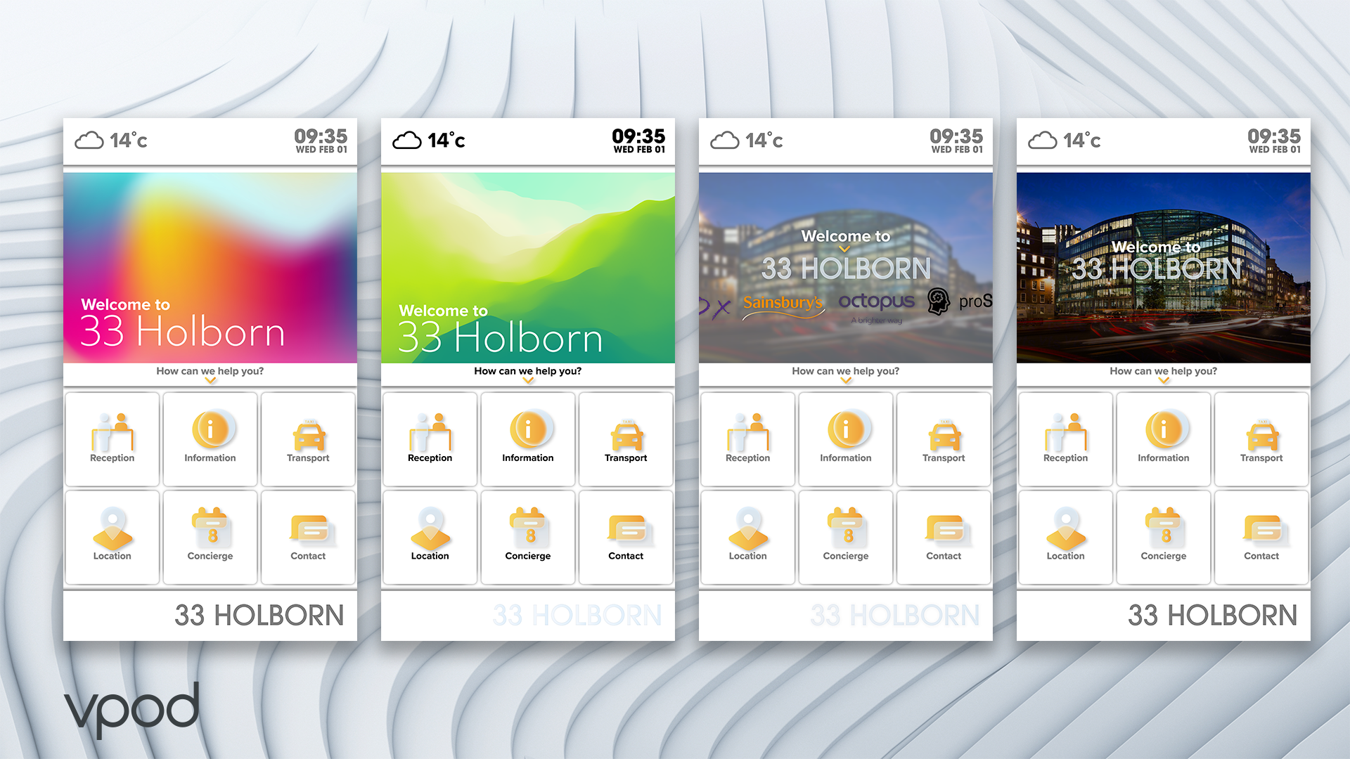
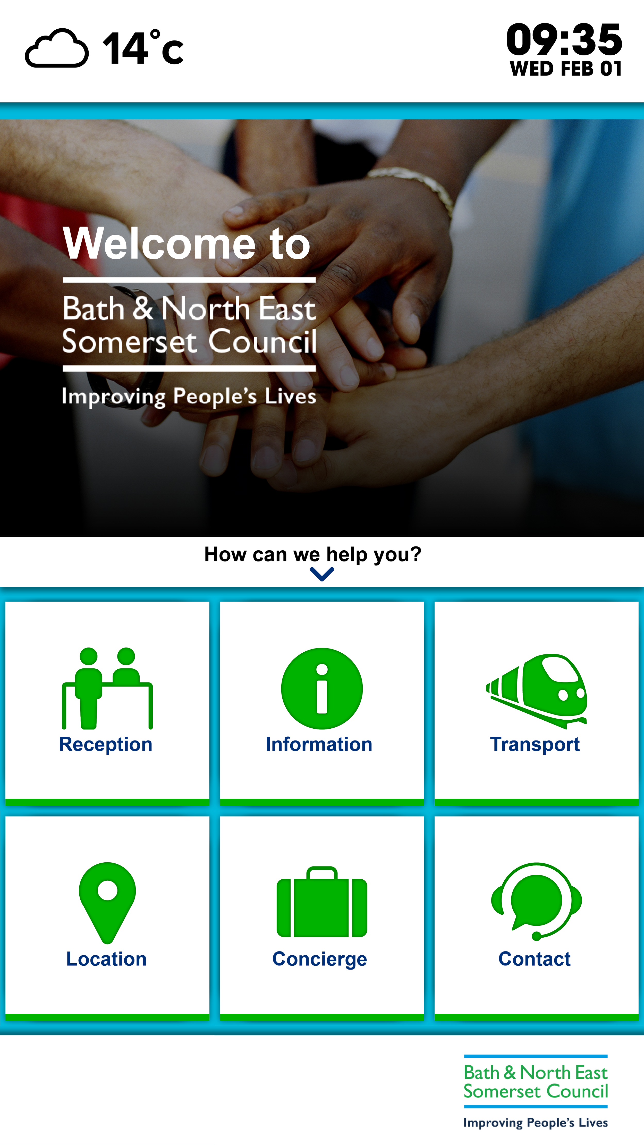
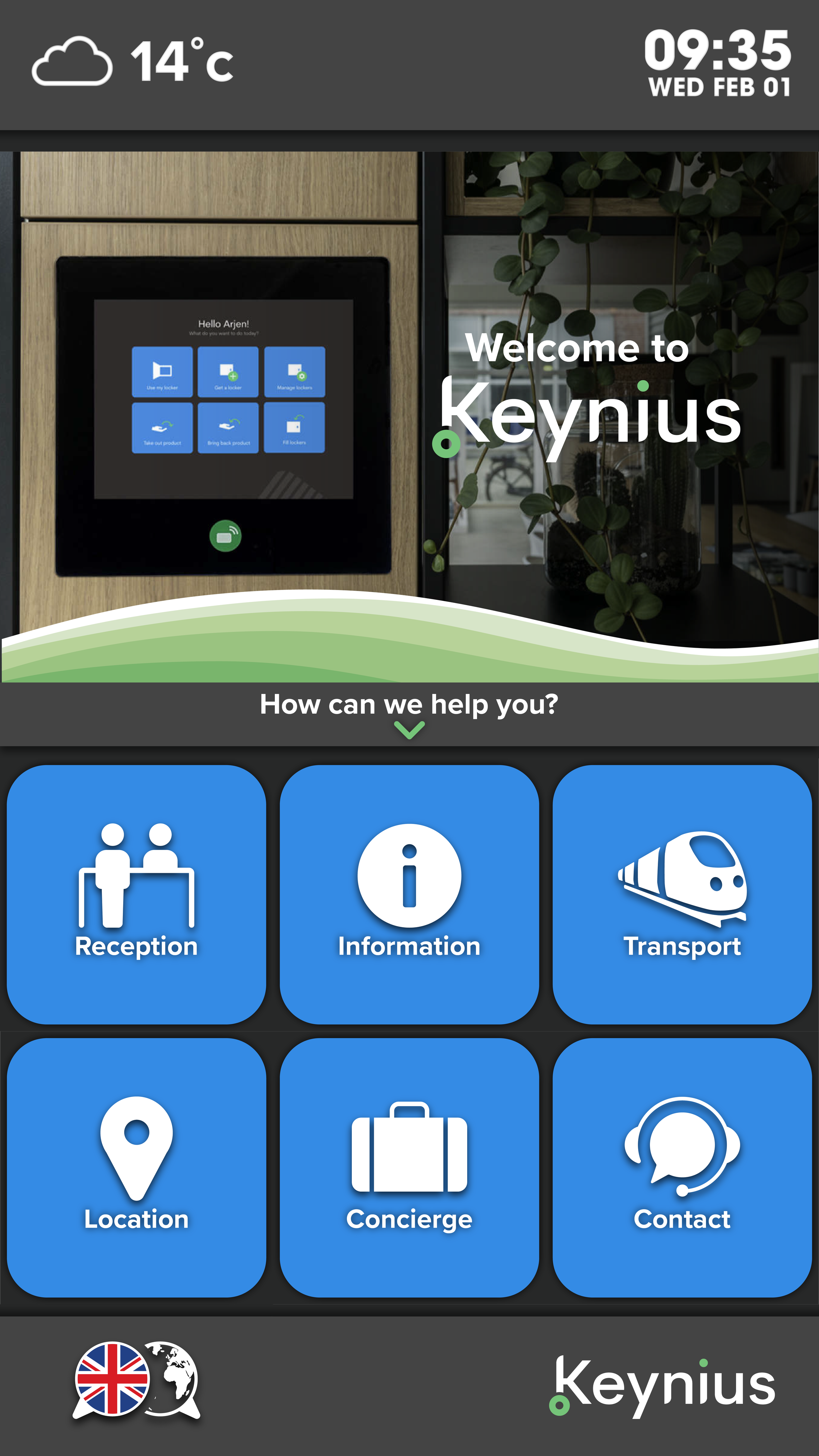
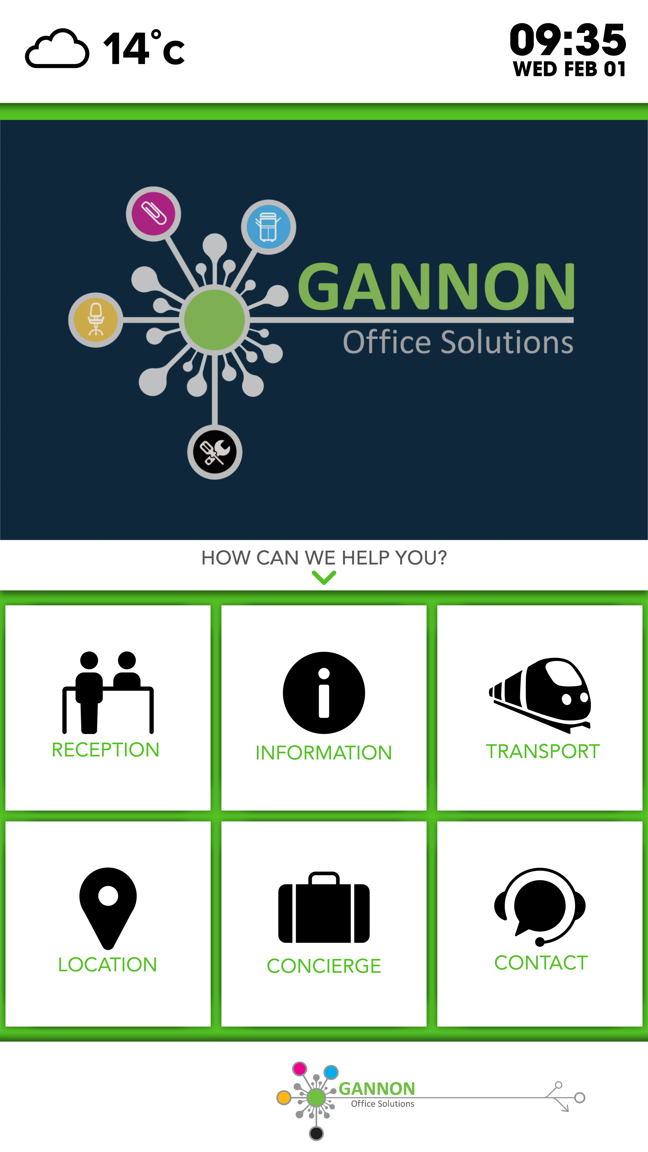
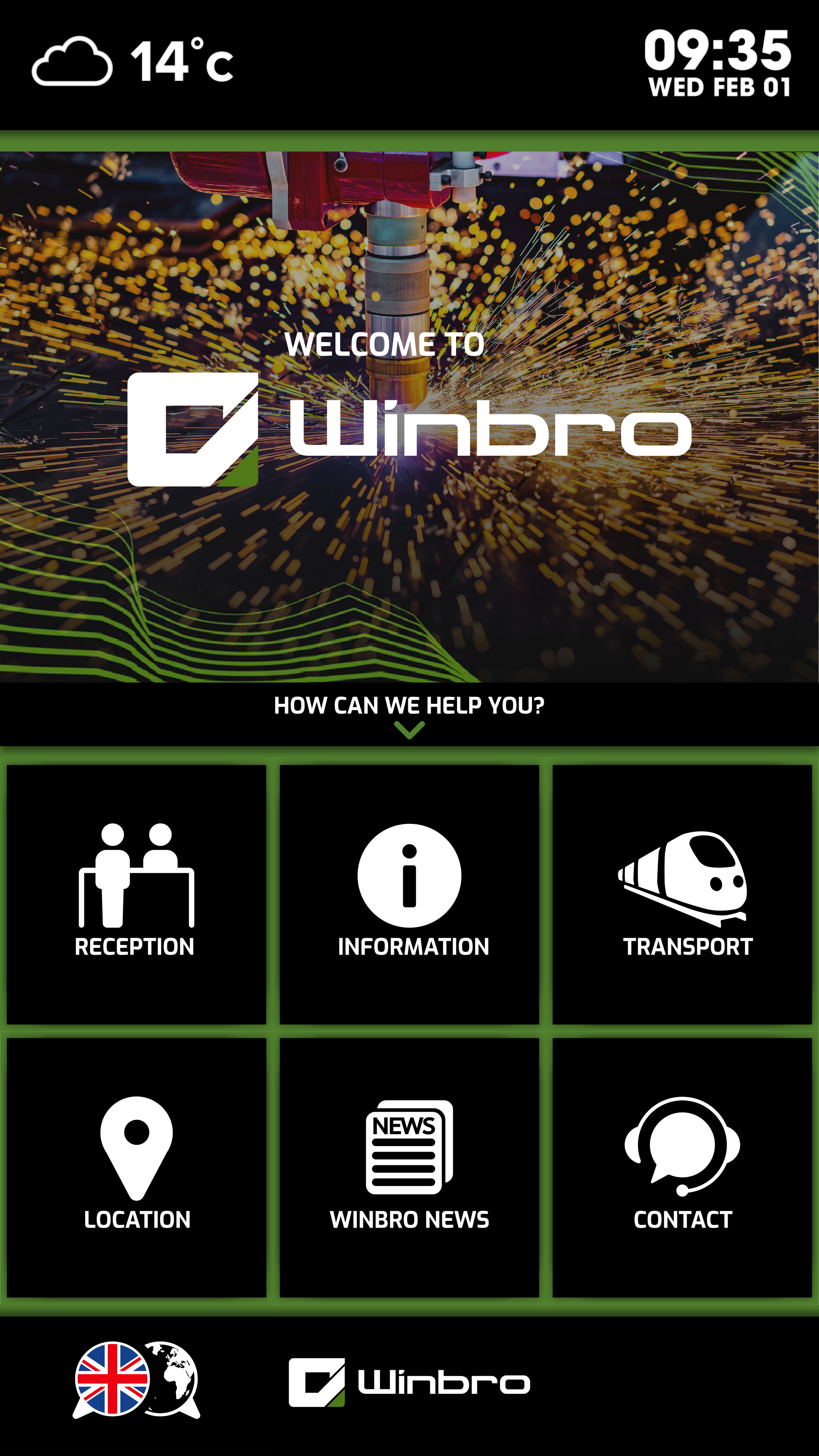
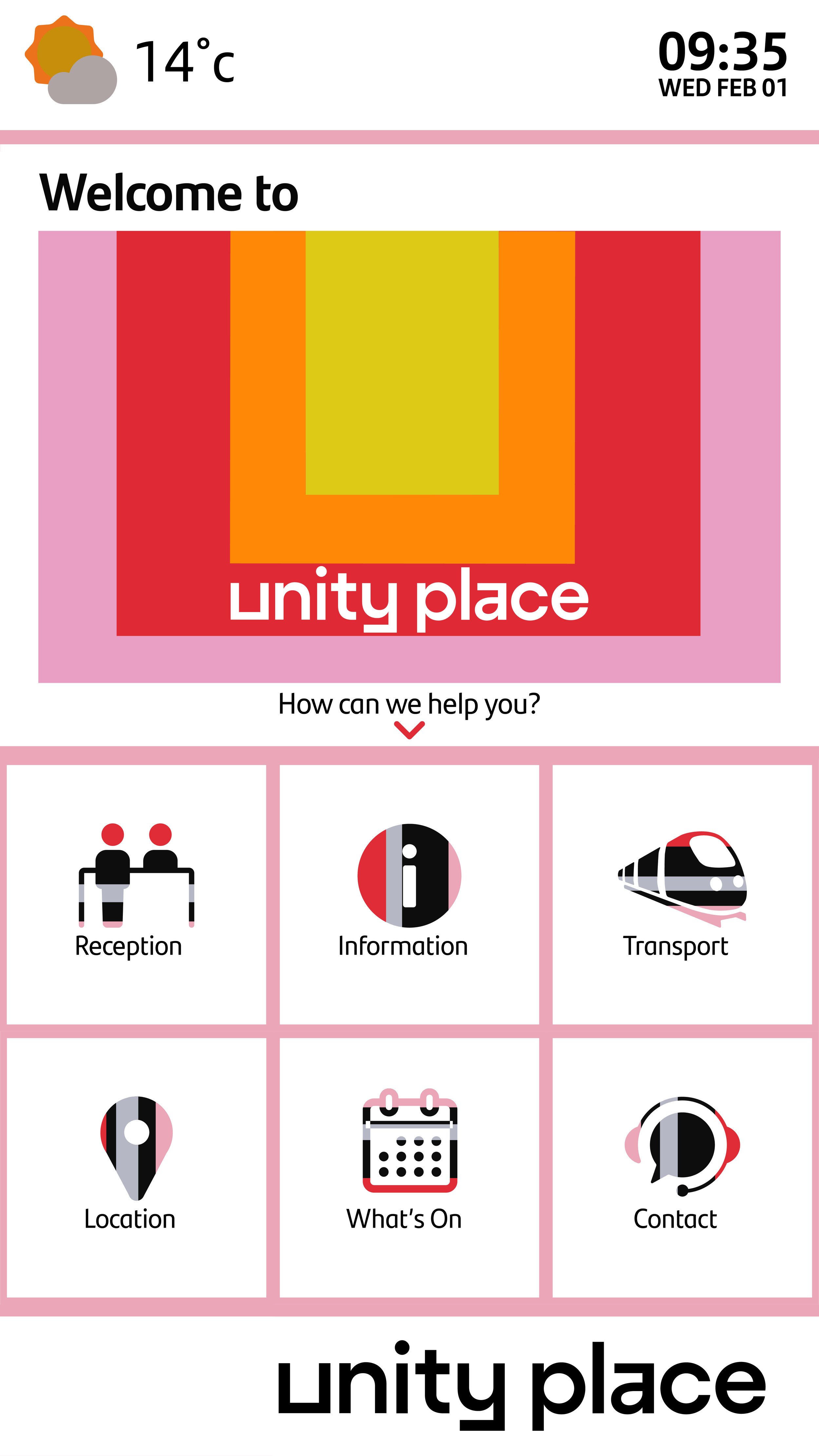
The development took several months before we implemented it to our first customer Santander’s new campus in Milton Keynes, Unity Place. After that I worked with each customer, joining meetings to discuss the designs for their unique Vgreet UI’s, working with their branding to create a variety of bespoke products that reflected their brand identities.
The project was a creative challenge, as I had never worked on UI/UX design, I spent time learning new software and practices and was involved in not just the aesthetics, but also the positioning of buttons, and the user experience and workflow of each part of processes such as check-in and booking screens. I developed the processes for the software to be presented to clients and created templates that could be adapted. It was really important with each Vgreet that customers had ongoing support in adapting the product to their needs, this meant being on hand to make changes and iterations once the product was live to customise and adapt it to each brands unique needs.
CUSTOMERS
DESIGNED TO BE REDESIGNED
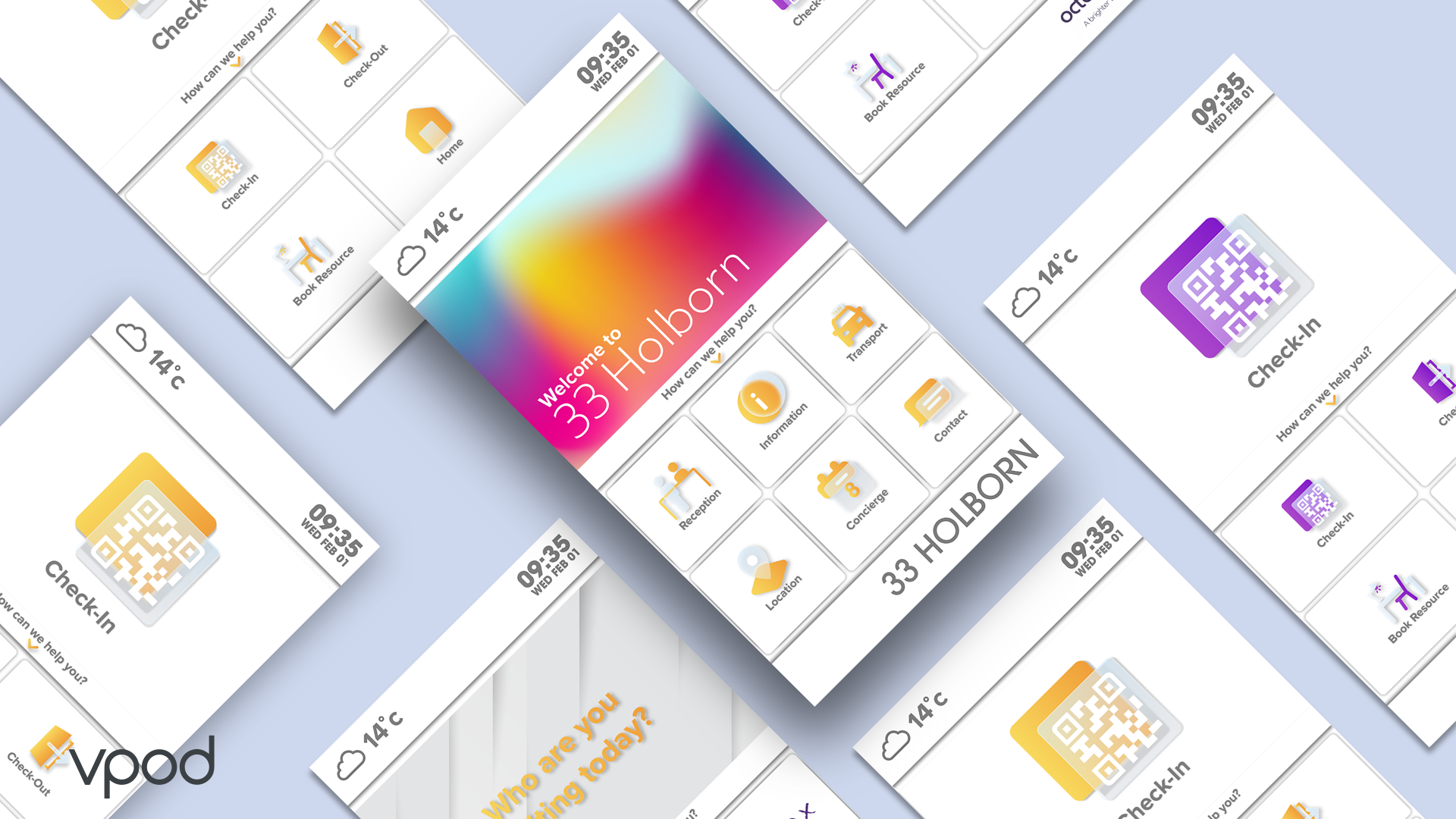
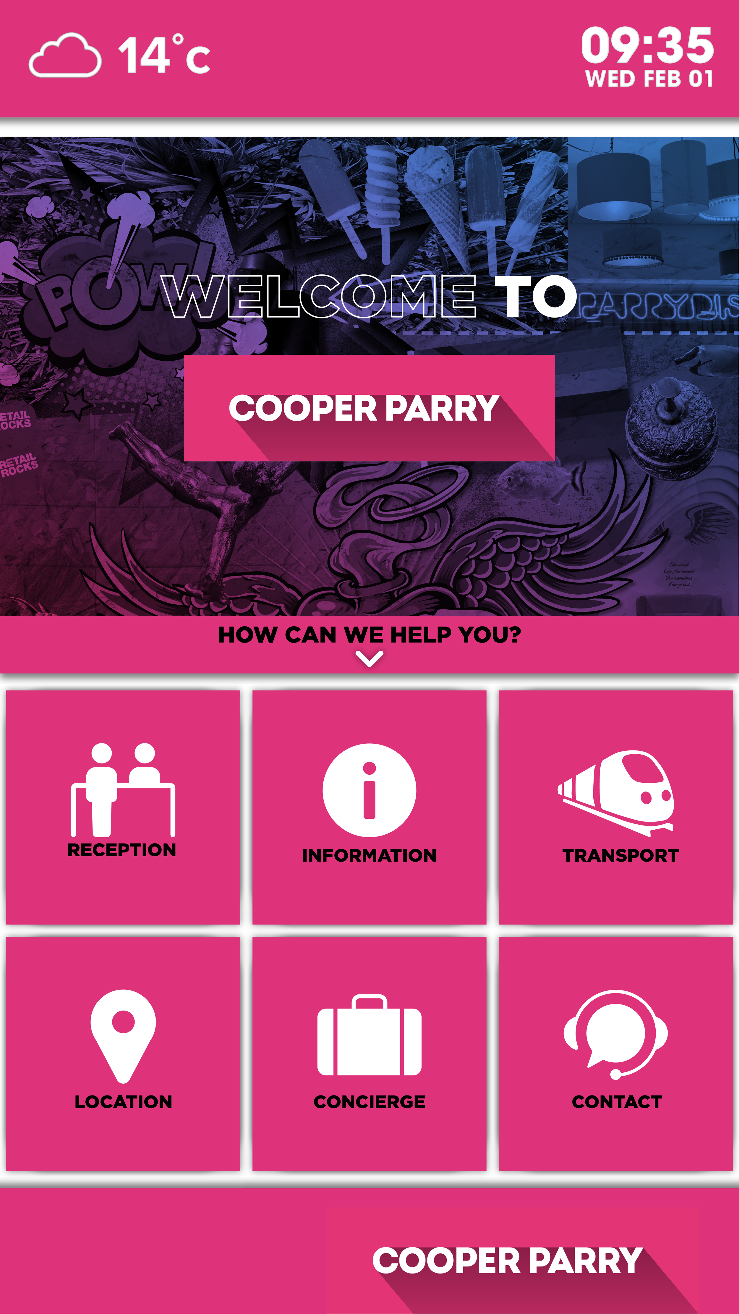
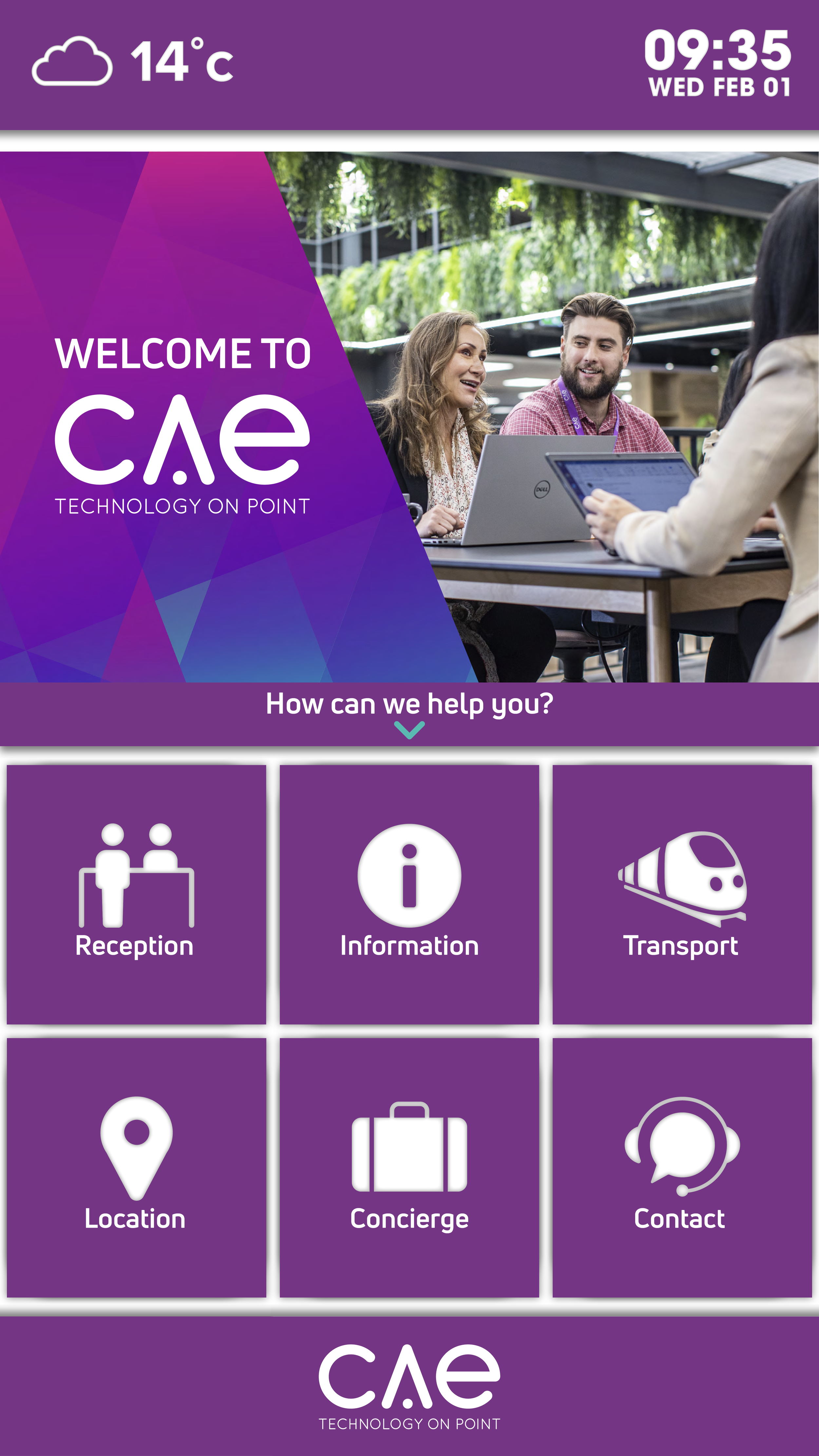
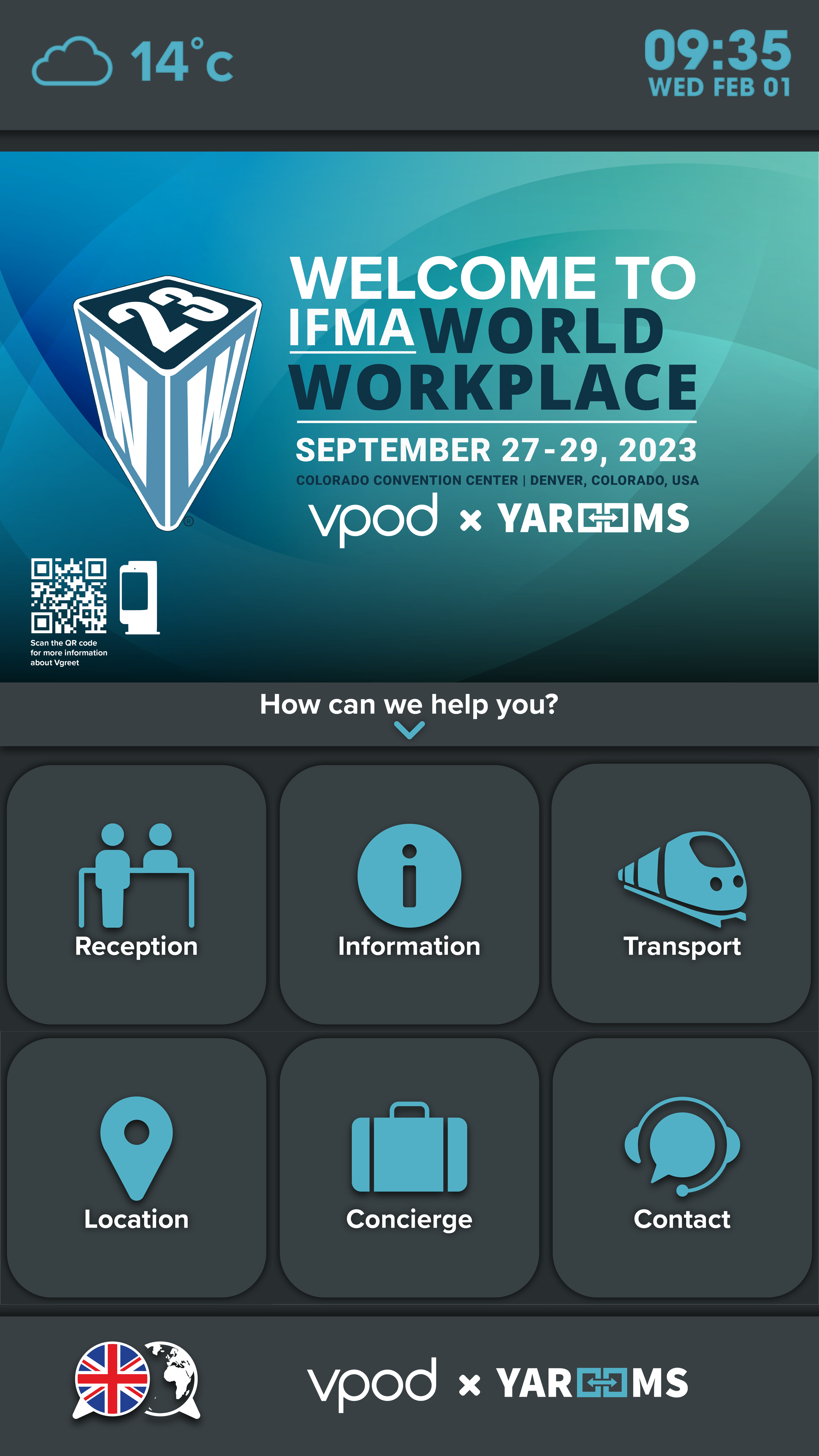
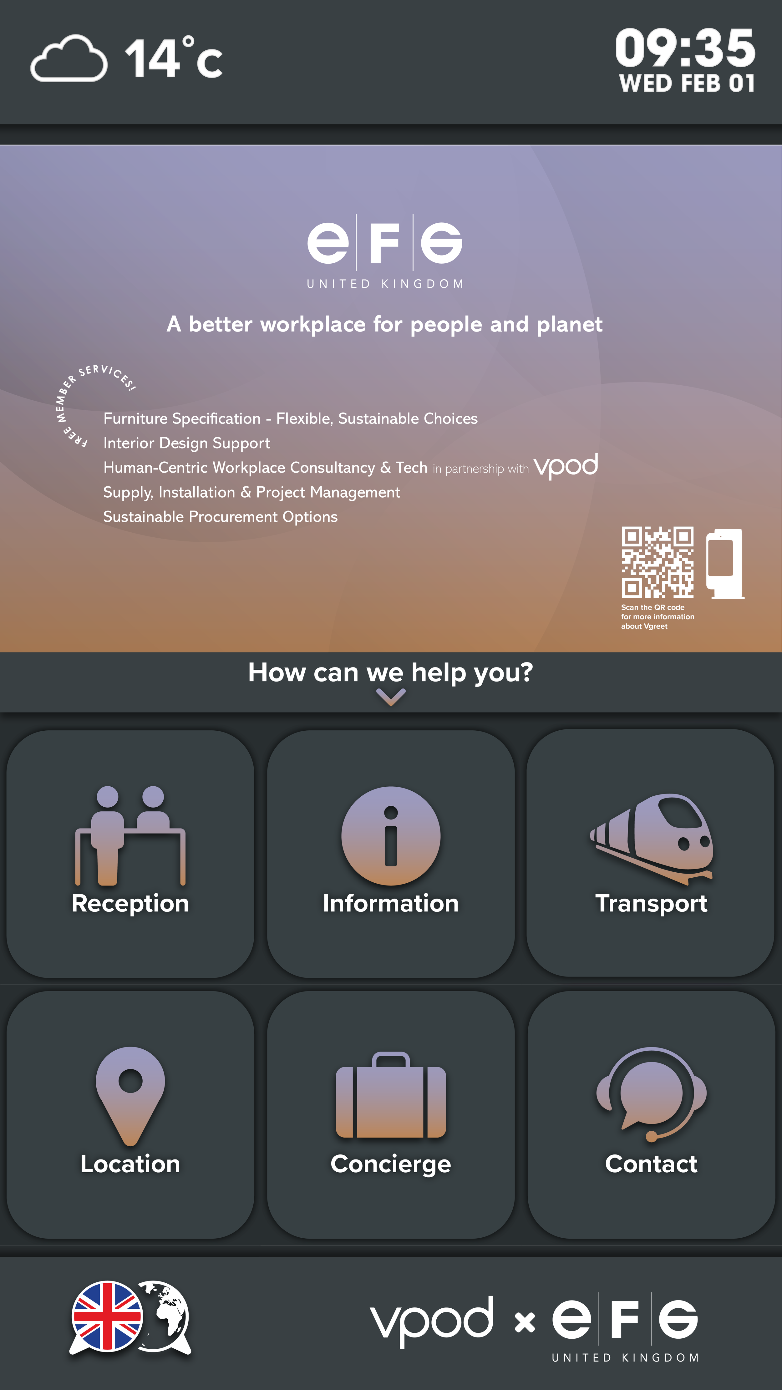
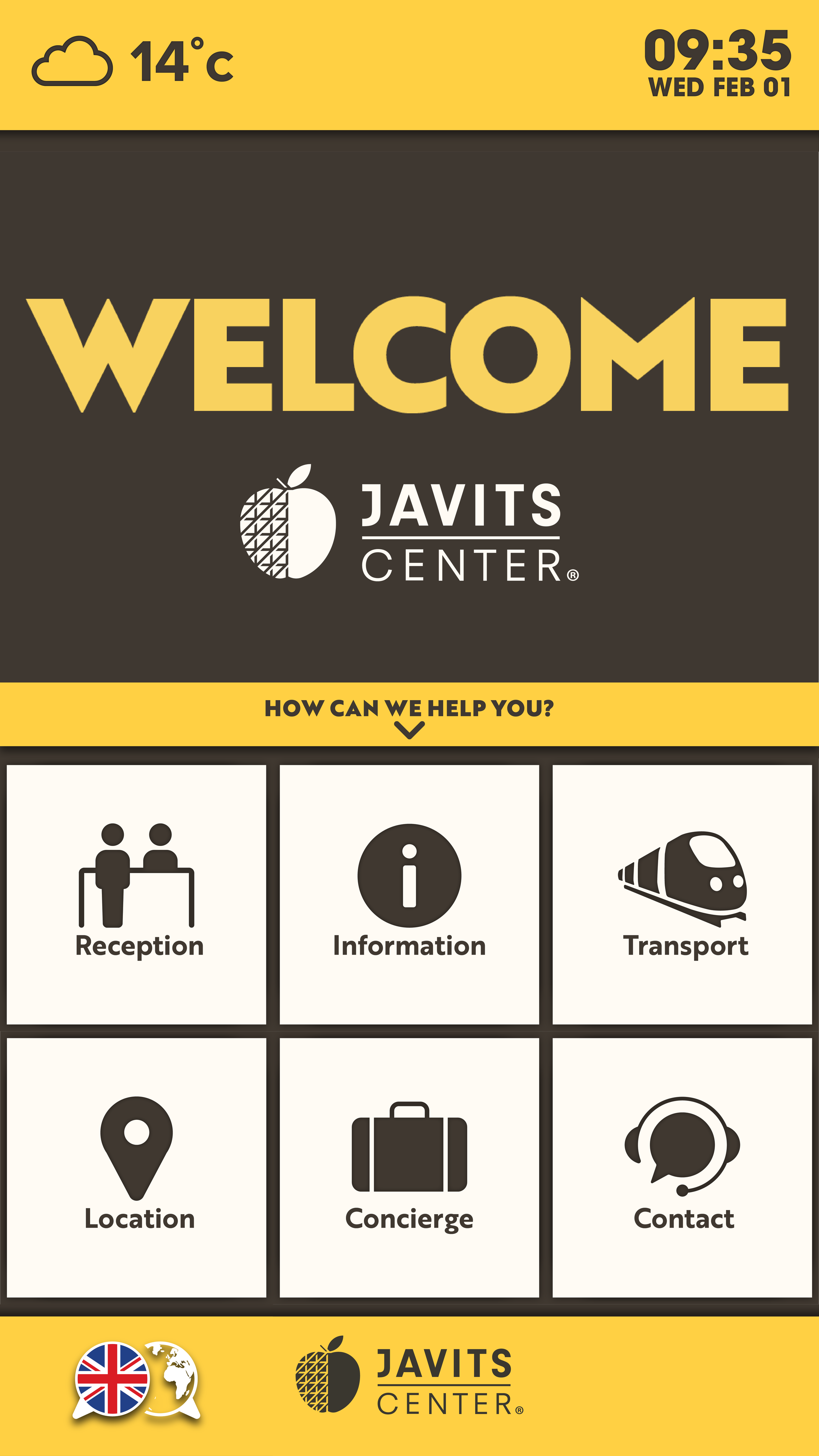
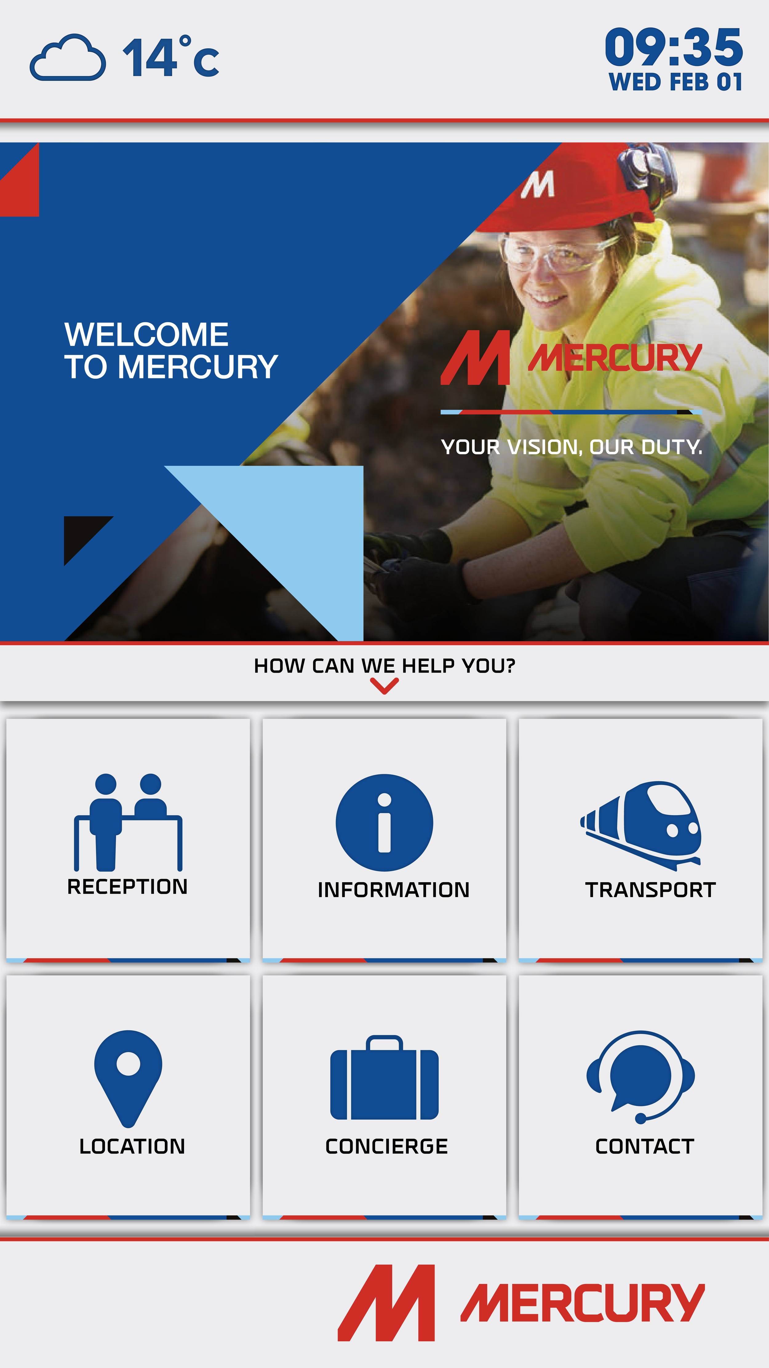
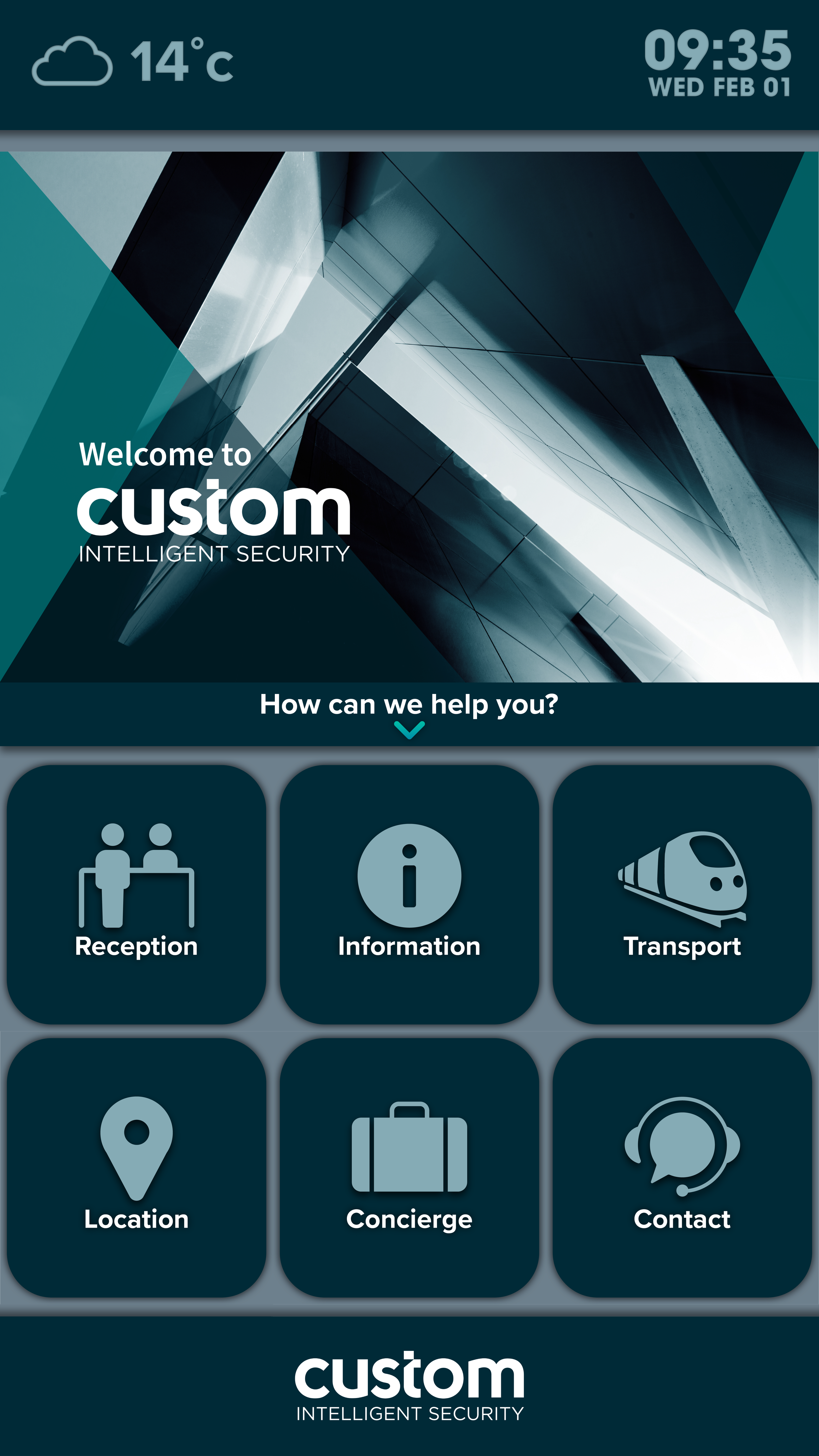
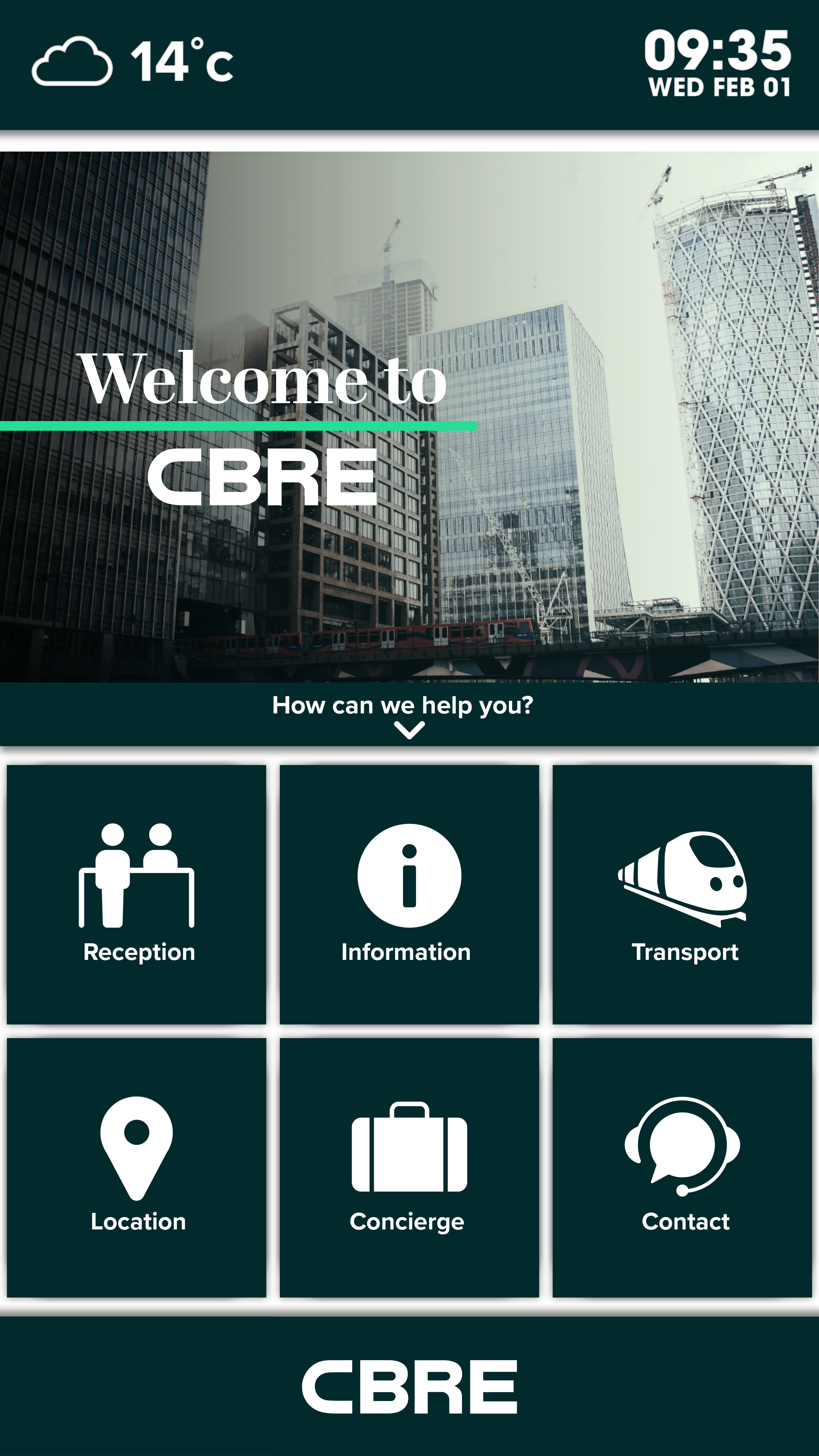
As a designer on the Vgreet project, one of my big aims was to fuse Vpod’s brand with the design of the standard Vgreet, but also make the UI and physical product feel like one, all while creating a design language that was flexible and could take on the identity of different brands. The final product can have depth, with shadows and layering, but can also be flat yet defined, buttons and icons can be tailored to match any brand.
In addition to teaching myself UI/UX design and the software needed to do it, I challenged myself to learn about accessibility, within colour and contrast, and also 3D design to render mockups and animations for the marketing and sales material for the Vgreet.
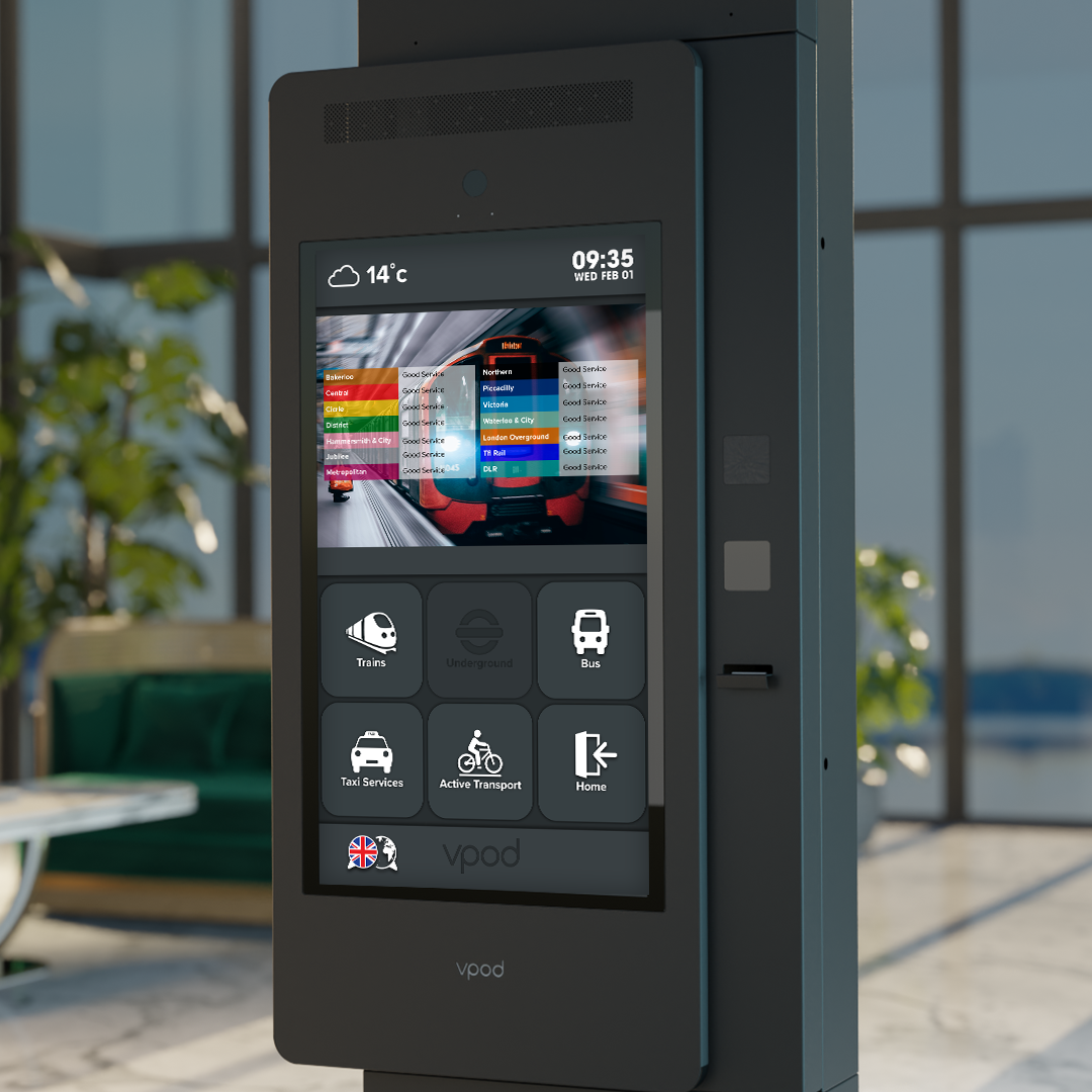
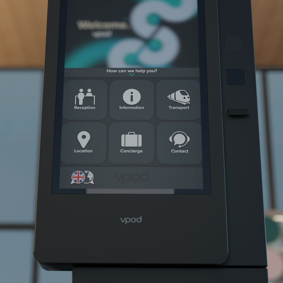
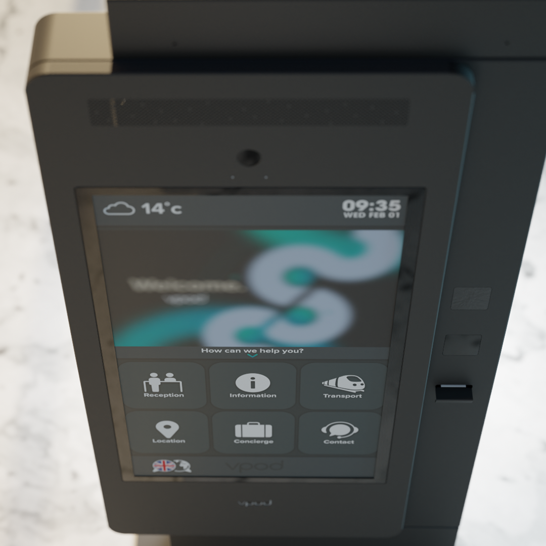
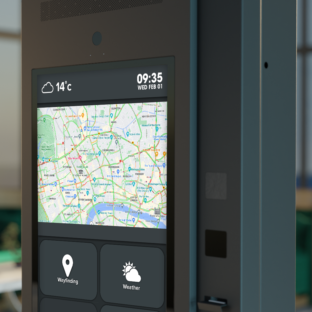
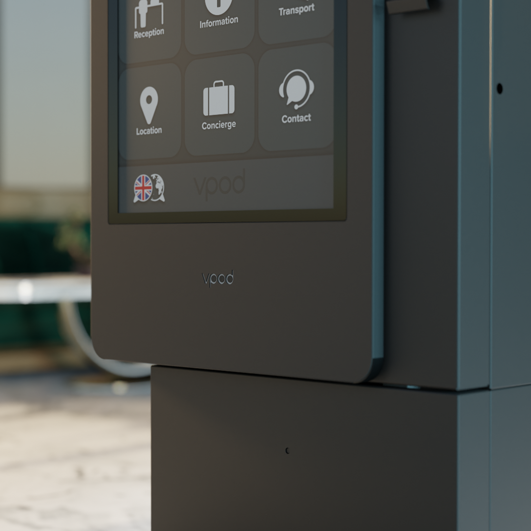
YOUR BRAND, YOUR VGREET
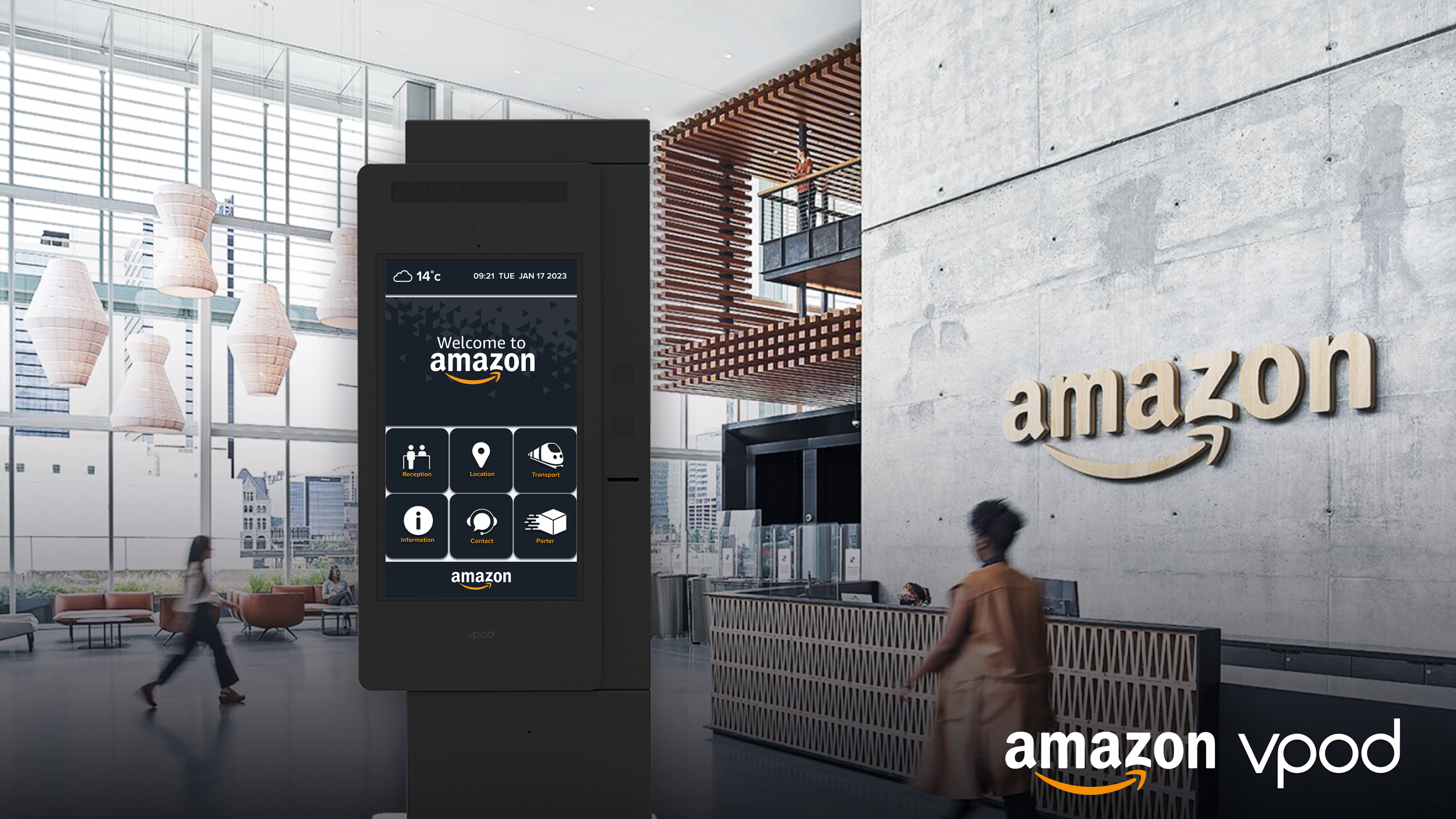
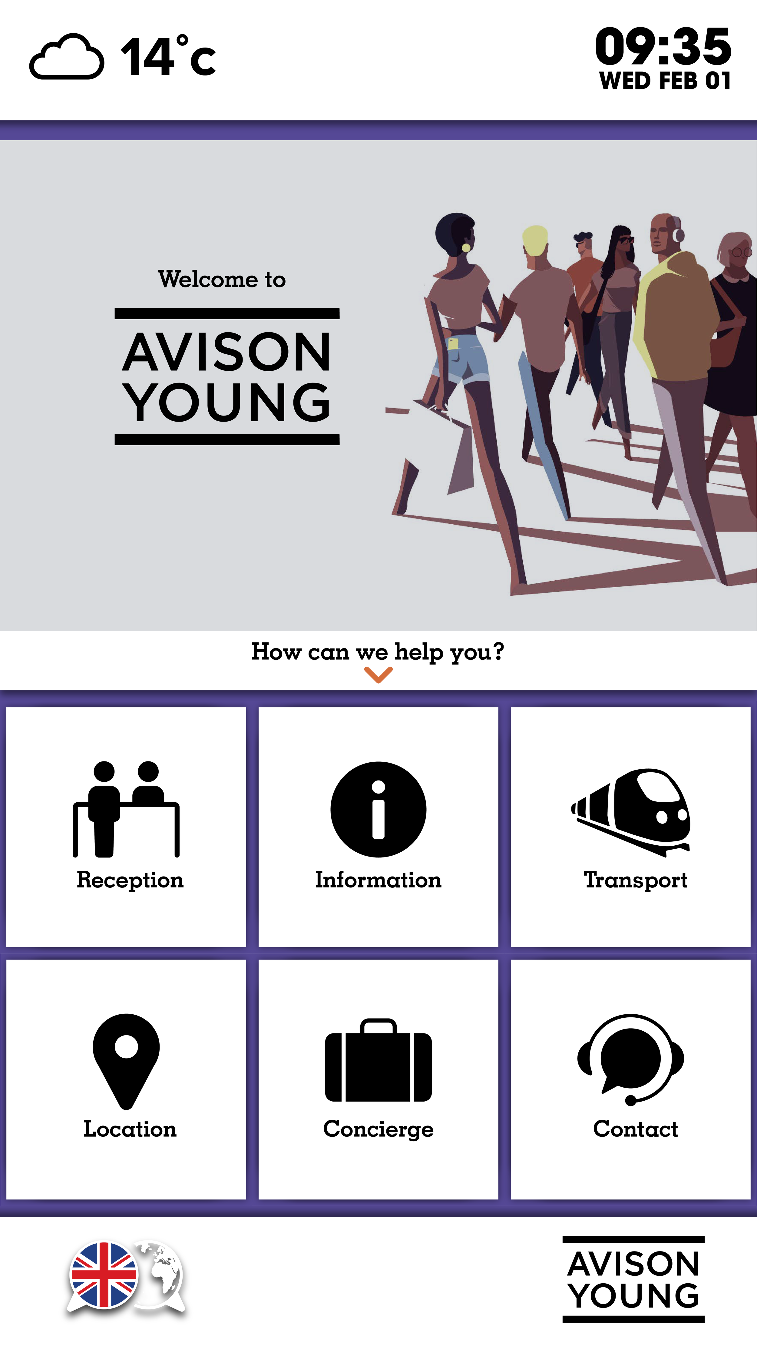
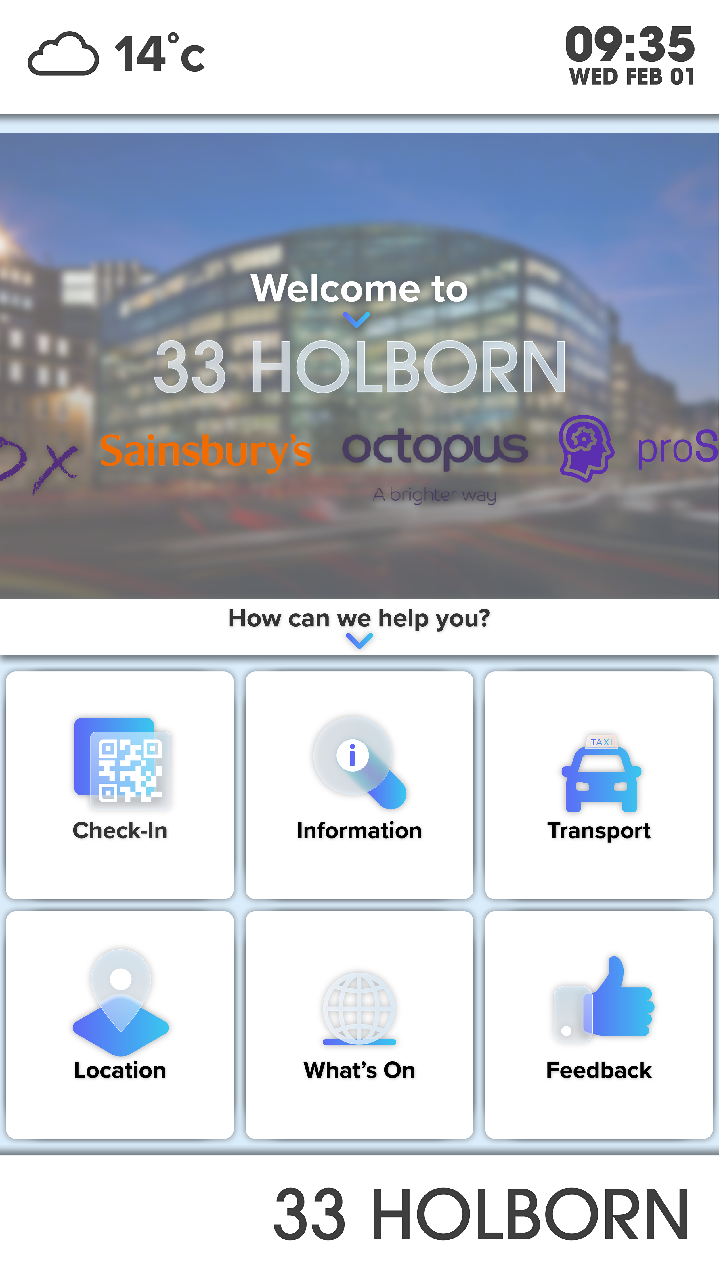
THE BIG REVEAL
As the main UI/UX structure was finalised, we began preparing for the marketing of the new Vgreet software, Vgreet V3. Taking the new knowledge I gained, and combining my skills in animation and motion graphics, as well as new 3D design skills, I created a reveal video for the new project. The result was a culmination of two years of work, rebranding Vpod, creating a new website, and finally a brand new product release to be built upon for years to come.
GO AHEAD, TRY IT
Experience Vgreet V3 with this interactive UI demo.
Web Design
As the creative lead on Vpod’s rebrand in 2022, I was tasked with not only creating the aesthetic for the brand but also designing the places customers interact with the brand, including a new website for the company. This was a large-scale project that offered new creative challenges, up until this project my only experience with web design had been for my own portfolio experience.
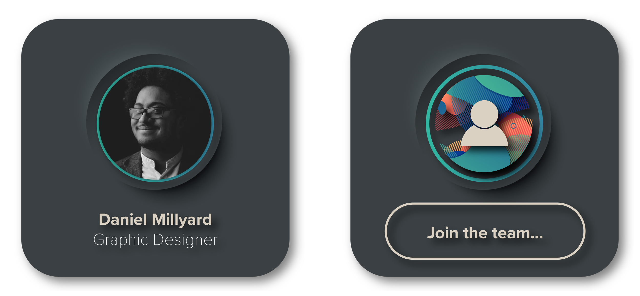
One of the best parts of being the lead in a rebrand was going beyond design to have a vision that covers the identity of an entire team and company. During my process of pitching the direction of the rebrand, I produced various pieces of collateral including a direction for the website. At its core, the branding was always meant to reflect Vpod’s ambitions, its human-centric approach, products and culture. For that reason, there was a distinct minimalism to the design, yet a subtle physicality that reflected the company’s products. Additionally something important to me was reflecting Vpod’s team and the company culture, modern design was combined with beautiful photos of individuals at the company, and the ‘About’ section which includes headshots and descriptions of each member of the team includes an icon that encourages people to people to apply and become a part of this group of extraordinary people.
The project was large, and involved months of revisions, each page was designed by me, with collaboration from Vpod’s marketing team and management, I collaborated with a team of developers to implement the design. The site involved unique pages for each product, a customer section, a partner page, a case study library and unique imagery and iconography across the site. The final result is a site and brand that has a consistent voice and aesthetic, one that not only reflects the technology but also the people involved involved in bringing the company to life.
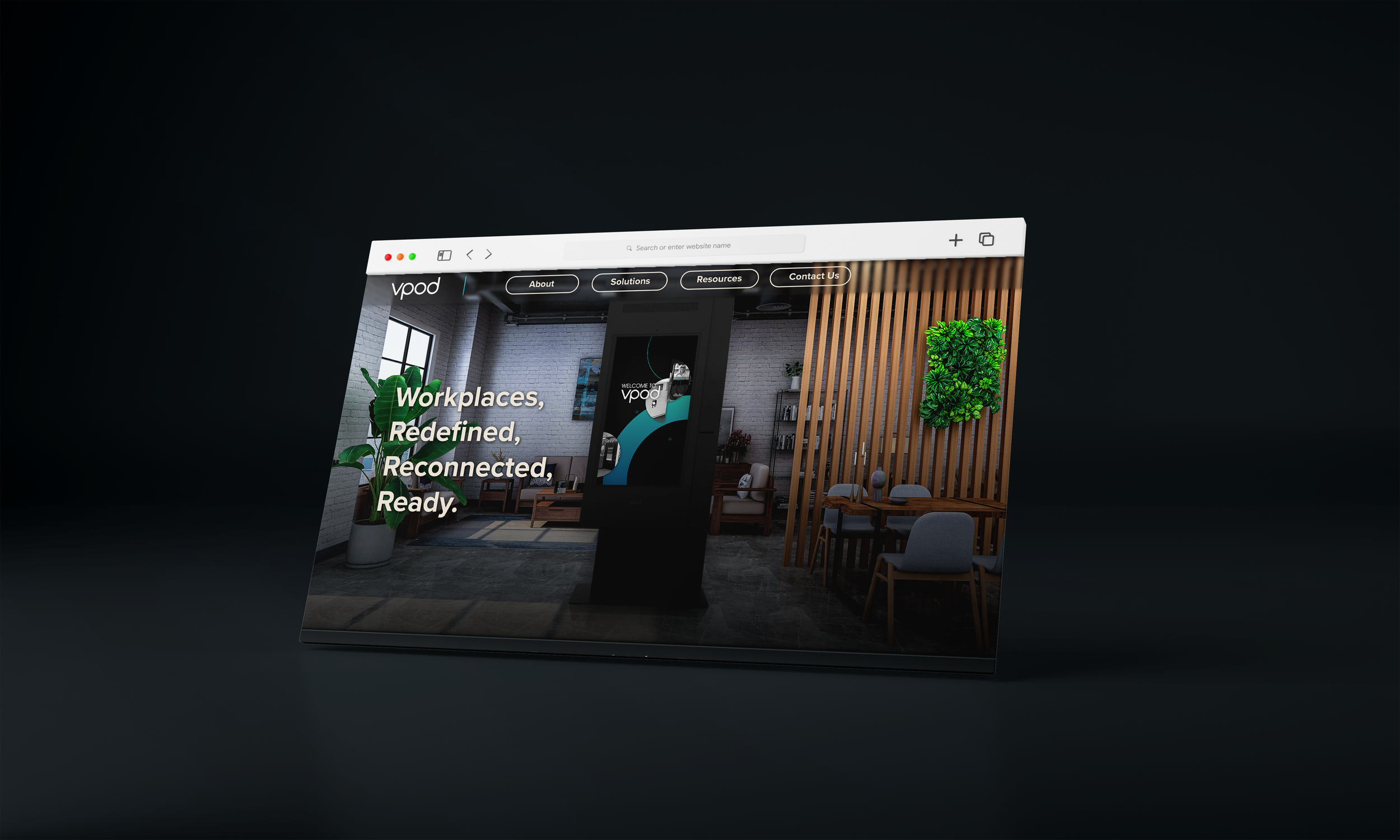
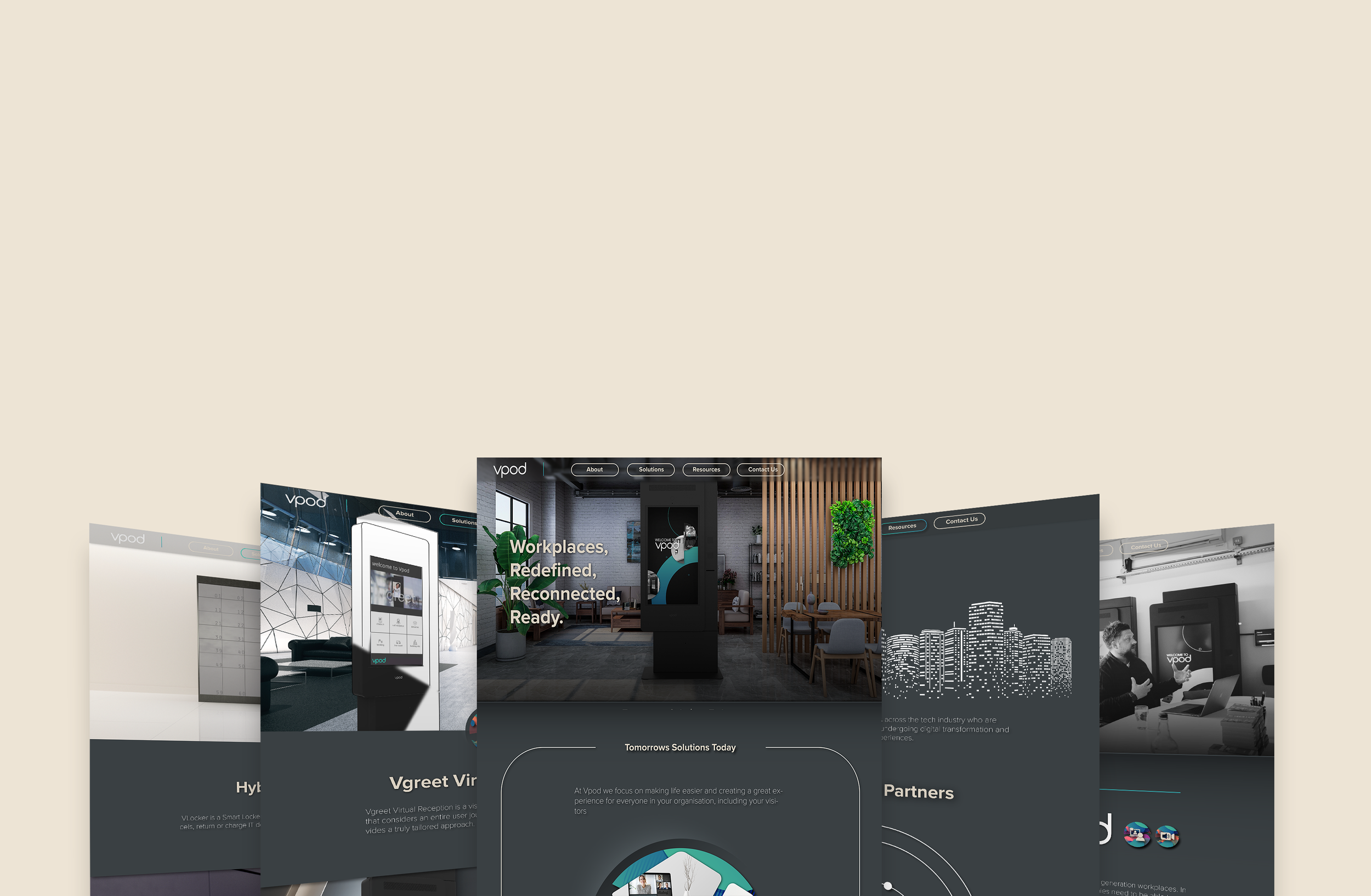
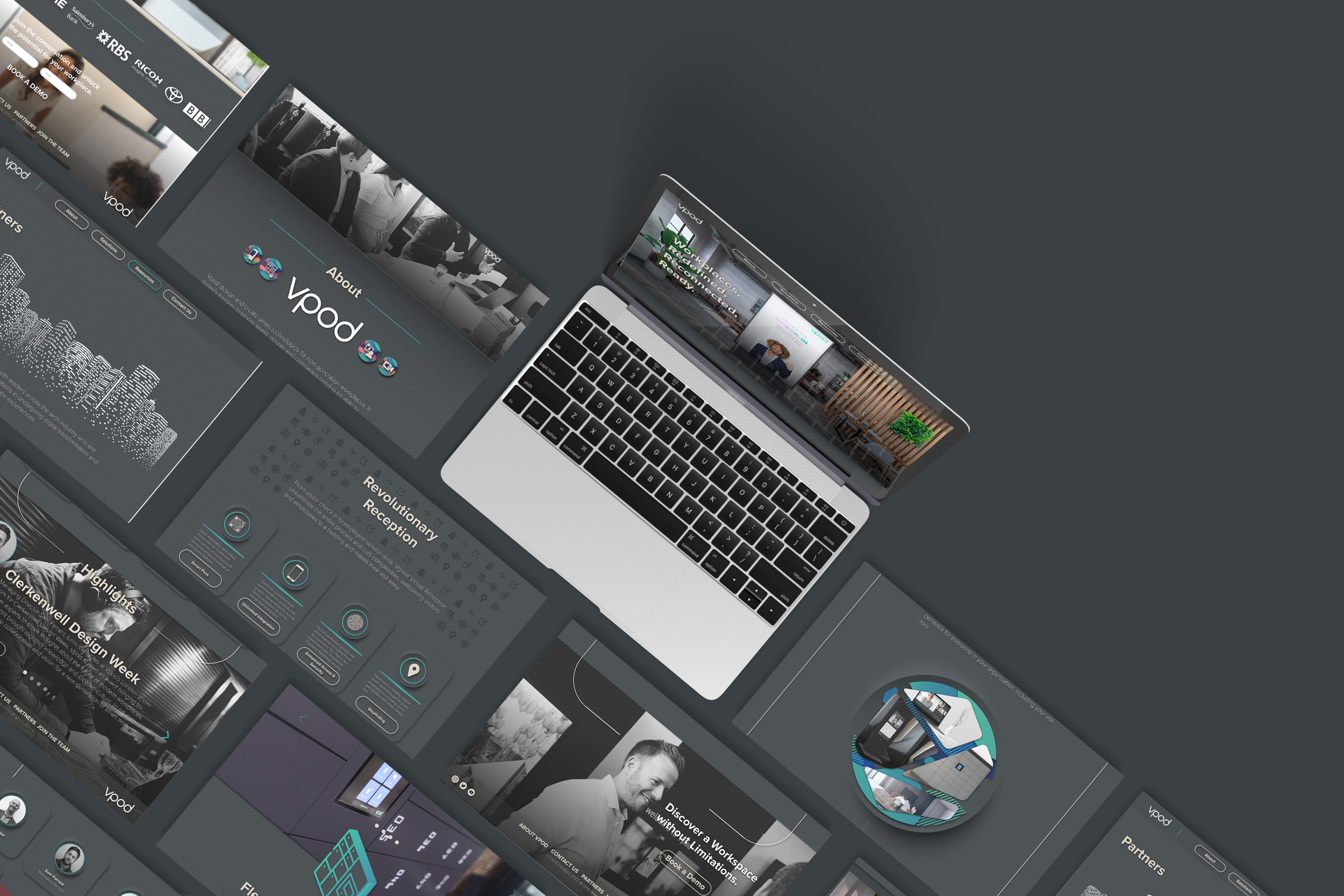
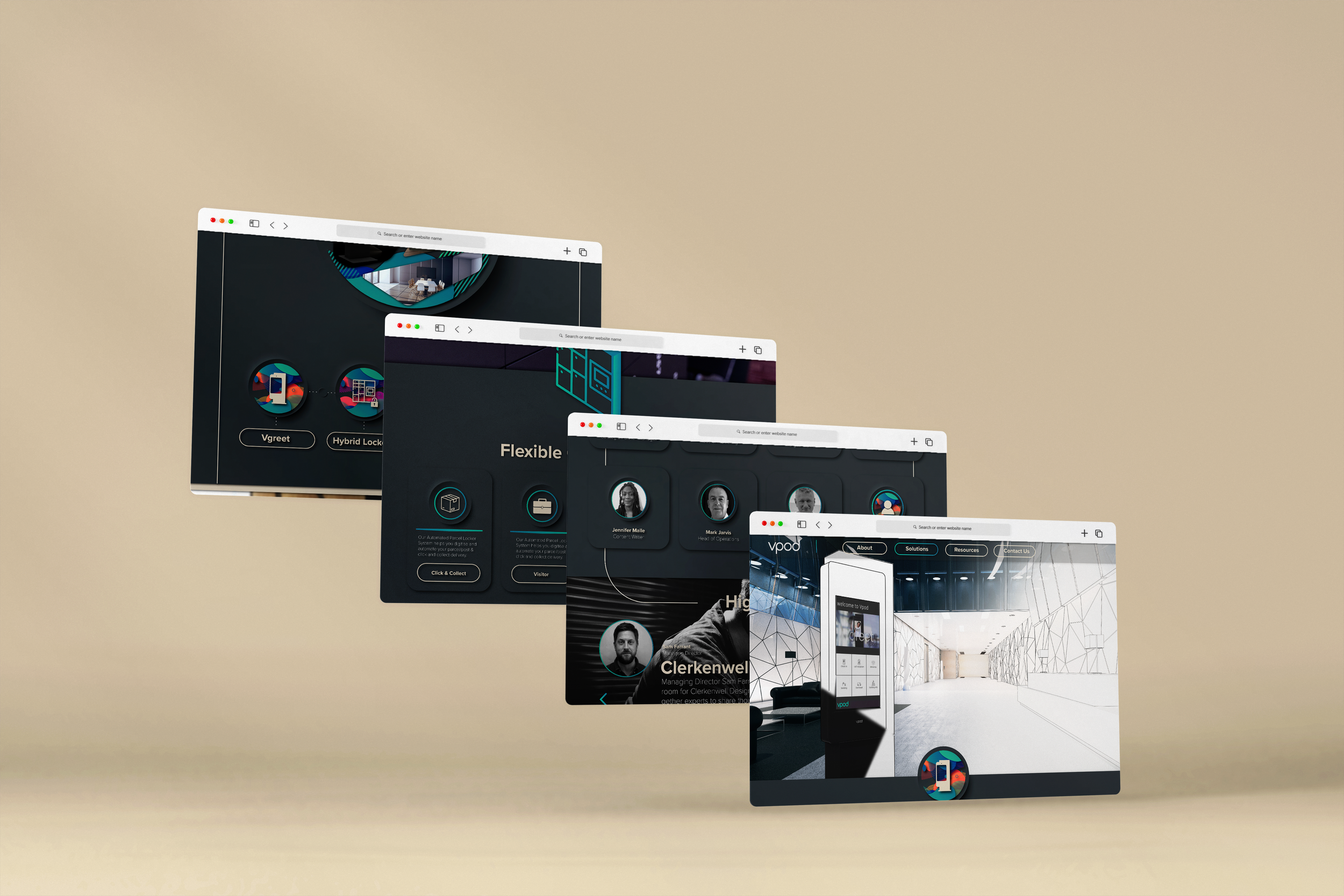
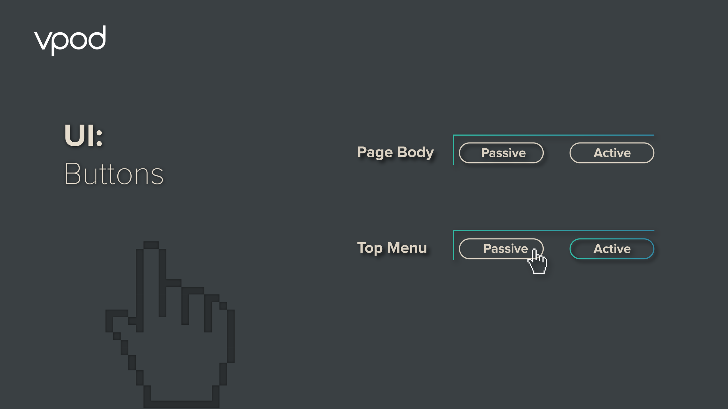
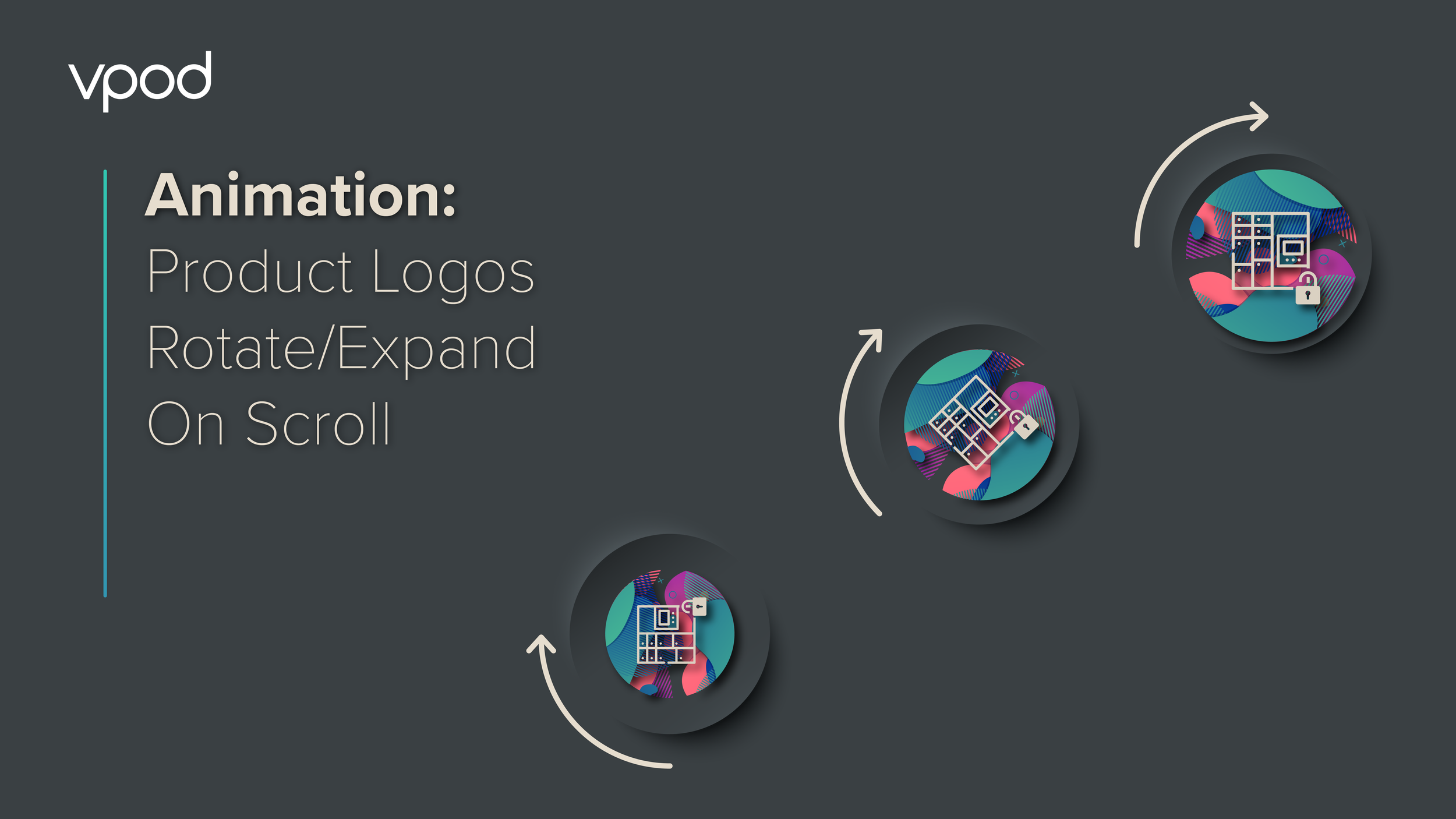
The project involved adapting the new branding for the web while creating defined rules for text styles and hierarchy, animations and unique iconography to reflect the brand its products.
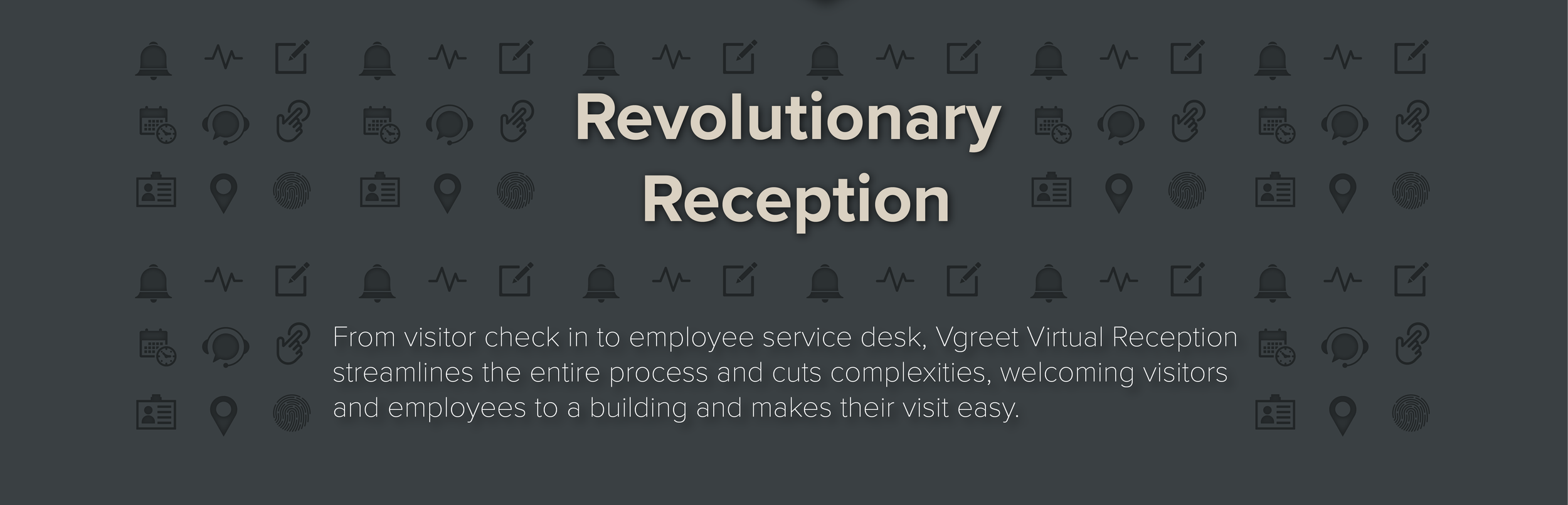
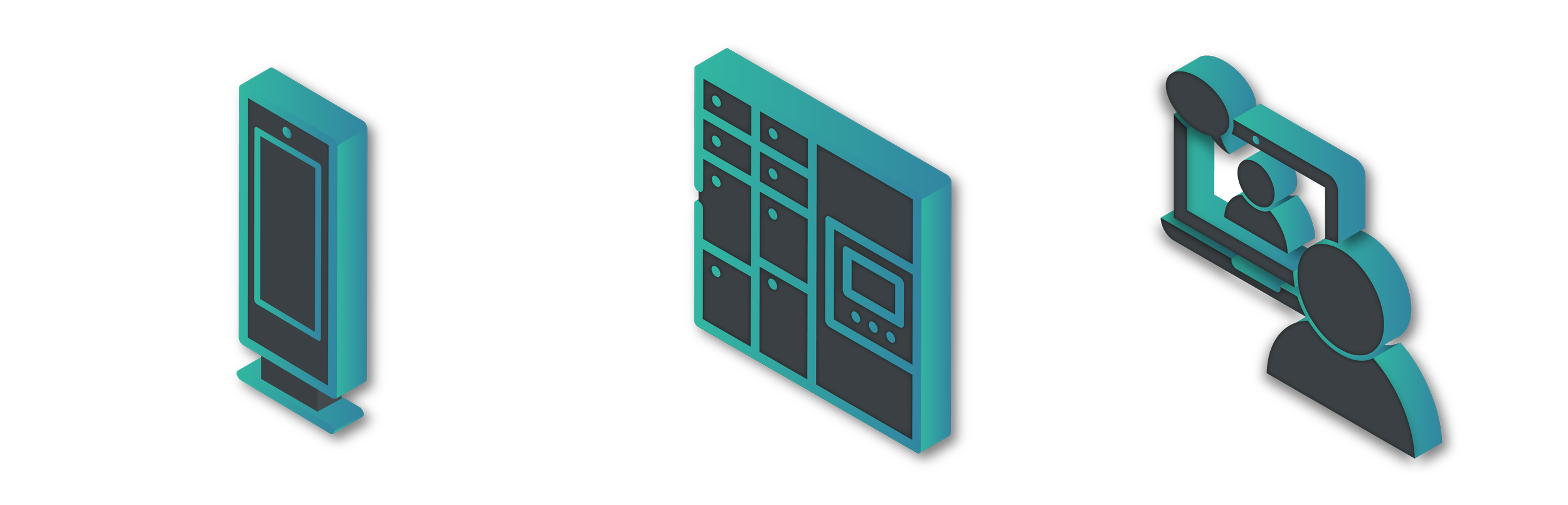
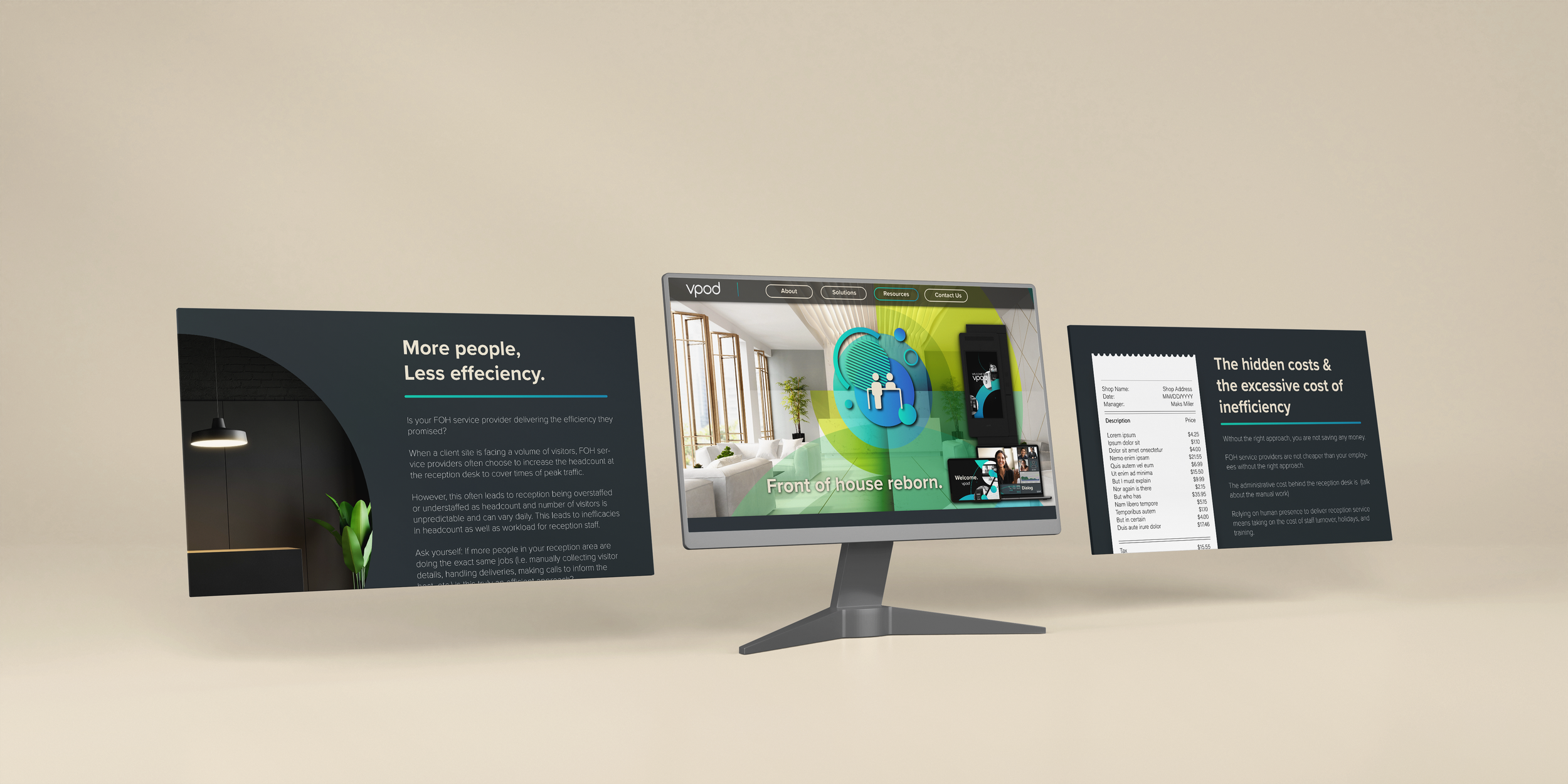
With all the projects I worked on at Vpod, I wanted there to be room for the branding and design language to stay flexible and be able to evolve, the website is a live project that is constantly involving and building on what we created, for example when we launched a new campaign for Front of House (FOH) services I created a new page design that was able to do something different while staying consistent with what came before. Our developers could then use components on the new page design to build new pages or adapt existing ones.
HELLO, WORLD…
Vpod’s new website went live on September 21st 2022, to celebrate the launch I led on the creative assets for the marketing of the launch, with the final creative asset created being a beautiful motion graphics video that highlighted the little elements that we felt made the website unique and different.